Author:
Boris Pocatko
Changed on:
23 June 2025
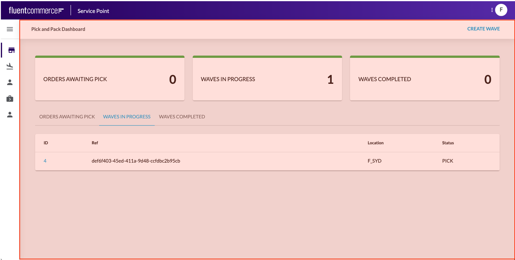 Page Components are the primary foundation component, as they layout the page area and provide a content area for child components to be displayed.Page components are mobile responsive, so the screens render perfectly for any device.Different Page Components are available within the Library, and you can create your own too. For example, you may wish to use a simple, clean page component with minimal header information or a more advanced wizard-style page to help users through a step-by-step process.Learn more about the Foundation Components:
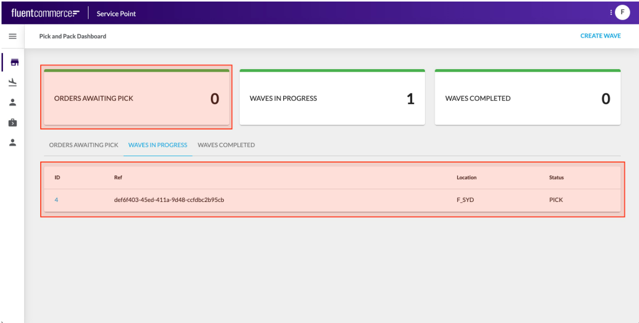 Content Components typically display data from the configured Page query, but some may display information retrieved via a component-specific API call.Content Components are typically added as descendants to Page components to form screens.Learn more about the Content Components
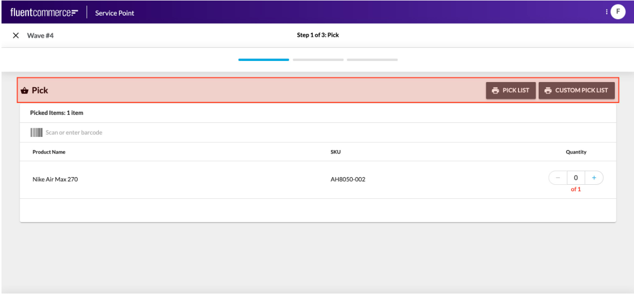 Or, you may want to display tabs that show different components or data based on which is active.
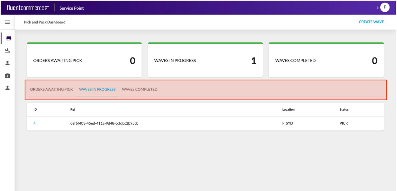 Another example is to conditionally display components, based on an entity type for example.Like Foundation Components, Layout Components have descendants, which identify what should be displayed for that layout.Learn more about the Layout Components
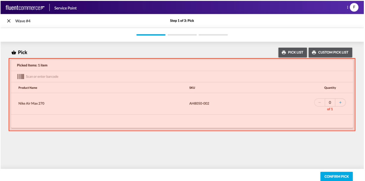
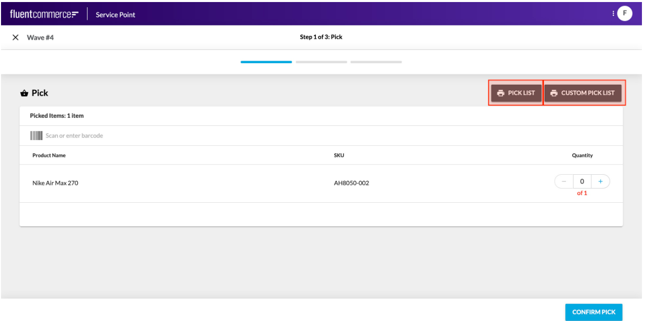 These are not to be confused with the standard user actions, which display buttons in the page header, and slide out a right hand drawer for form display.Rather, these components can be added directly to a screen just like any other component.Learn more about the Interaction Components
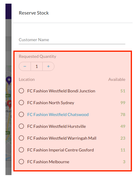
`{`` "name": "StockReserveDetails",`` "value": {`` "locationRef": "F_NSYD",`` "requestedQuantity": 2`` },`` "type": "STOCK_RESERVE_DETAILS"``}`Since Field Components are rendered automatically based on the User Action definition, there is no configuration reference required.Learn more about the Field Components