Tab Card Component
UI Component
Changed on:
13 Dec 2023
Overview
The tab card is used to put tabs at the top of a group of card-like components (Attributes Card, List Component, etc) and allows users to switch between them. This can help to reduce the number of clicks a user takes when navigating between pages.The descendants of the Tab Card component are used as the content of the tabs, linked by index. The first descendant will be shown while the first tab is active. For cases where multiple descendants should be shown under a single tab, use the Page Section component (or similar) to group them.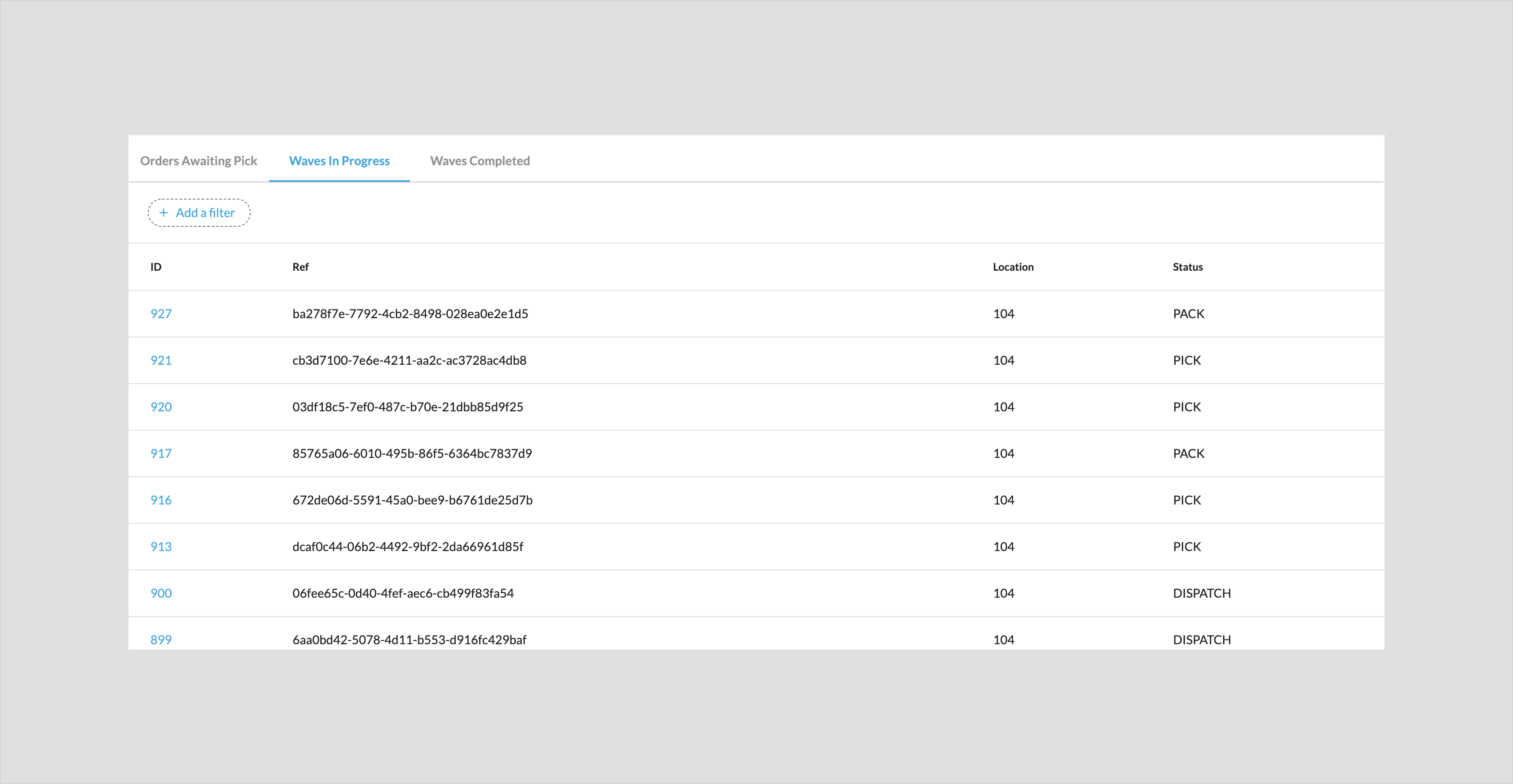
| Plugin Name | Core |
|---|
Alias
fc.tabs.card
Detailed technical description
Deep-linking
Enabling deep-linking on a Tab Card Component will store the current selected tab in the page URL. When another user visits the URL, they will see the same active tab instead of the default (first) tab.To enable deep-linking for a Tab Card Component, you must add the`urlKey` prop to the Tabs configuration in your manifest. This is the name of the Tab Card Component that will appear in the URL.By default, the active tab is referred to by its index number (`0` for the first tab, `1` for the second, etc). However, if the order of tabs may change in the future, or a more human-readable tab name is desired, you may add the optional `urlValue` prop to the descendent tabs and provide tab names to use instead of the index number.When using deep-linking, you will see `?[urlKey]=[index | urlValue]` appended to the page URL. Pages with multiple Tab Card Components must use a unique `urlKey` for each Tab Card Component.Properties
| Name | Type | Required | Default | Description |
| tabs | Tab[] | yes | List of tab definitions to show in the Tab Card. | |
| width | CardWidth | no | "full" | The width of the Tab Card. Note that this component sets up a new internal grid, so descendants of the Tab Card should usually be \"full\" width to avoid unexpected results. |
| descendants | component or component[] | yes | The descendants of the Tab Card are matched by index to the tabs defined in the tabs prop. So the first descendant shows when the first tab is active. | |
| urlKey | string | no | The name of the Tab Card Component in the URL used for deep-linking. |
Tab
| Name | Type | Required | Default | Description |
| label | string | yes | Text label to show on the tab | |
| urlValue | string | no | The name of an individual tab in the set. If it isn’t set for a particular tab, it uses its index (0+) in the set of tabs. |
Configuration example
1{
2    "component": "fc.tabs.card",
3    "props": {
4    "urlKey": "order-status",
5    "tabs": [
6        {
7        "label": "i18n:fc.sf.ui.waves.detail.dashboard.ordersAwaitingPick.title",
8        "urlValue": "order-awaiting"
9        },
10        {
11        "label": "i18n:fc.sf.ui.waves.detail.dashboard.wavesInProgress.title"
12        }
13    ]
14    },
15    "descendants": [
16    {
17        "component": "fc.card.attribute",
18        "props": {
19        "title": "Content matching the first tab",
20        "attributes": [
21            {
22            "label": "Order ref",
23            "value": "HD_3285"
24            }
25        ]
26        }
27    },
28    {
29        "component": "fc.card.attribute",
30        "props": {
31        "title": "Content matching the second tab",
32        "attributes": [
33            {
34            "label": "Order ref",
35            "value": "HD_8965"
36            }
37        ]
38        }
39    }
40    ]
41}Version History
Recommended Placement
None