Component SDK - Overview
Essential knowledge
Author:
Fluent Commerce
Changed on:
8 July 2024
Overview
General Principles and the Features of the SDKKey points
- General Principles
- Features of the SDK
- Developer setup
General Principles
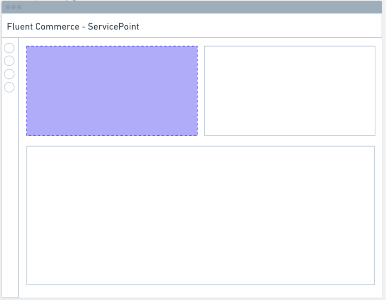
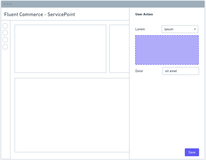
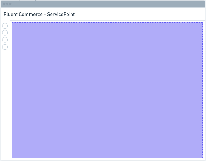
The Component SDK allows clients and partners to develop new components to extend the functionality of the Fluent web apps.Areas of extension include:| new cards to display information from Fluent APIs or external sources | new form field types that work with rules to extend user action capability | entirely new customised pages |
 |  |  |
- configurable via the manifest (which means no-code updates to apps)
- fetching and displaying data from the Fluent APIs
- internationalization of any text labels based on the user profile
- auto-adapt to workflows (generating new user action forms when the workflow changes)
- showing and hiding content based on the logged-in user's roles and permissions
Features of the SDK
Hooks
Custom components can easily interact with OMX functionality via the provided hooks.Utility Components
Some utility components are provided to make building custom components easier and more consistent.Registries
Before a custom component can be used in an OMX web app, it must be registered with one of the three registries:- Component Registry - for standard in-page components
- Field Registry - for interactive form field components
- Template Registry - for adding new template helpers
