Utility Components
Topic
Author:
Fluent Commerce
Changed on:
19 July 2024
Overview
The UX framework provides some "component primitives" that can be used to build more complex components on top. The advantage of this is that these utility components:- provide a consistent look and feel
- update according to theme options
- enable mobile responsiveness
Utility Components
Author:
Fluent Commerce
Changed on:
19 July 2024
Overview
The UX framework provides some "component primitives" that can be used to build more complex components on top.Key points
- Card
- Children
- Dynamic Value
- Loading
- Drawers, Modals and Toasts
- DatePicker
- Quantity Selector
- Quantity List
Card
Standard content card that will take the full width of it's container. Can be used in conjunction with Columns (below) to render multiple cards side-by-side.| Name | Type | Required | Default | Description |
| title | `string` | ❌ | The Title text of the card. | |
| highlight | `MystiqueThemeColor` / `string` (hex value) | ❌ | Show a coloured highlight above the card to denote status in cases like dashboard cards. | |
| width | CardWidth (`"quarter"` / `"third"` / `"half"` / `"two-thirds"` / `"full"` / `number` (1-12)) | ❌ | full | Define the width of this card on a 12-column grid. Can use the named widths for readability or numbers directly. On mobile devices all widths will automatically change to 12 for the best responsive experience. Default is "full" and will take up the full width of the containing component. |
Children
The Children component is what allows complete hierarchies of components to be configured in the manifest document without every component needing to "understand" how to interpret a manifest. It's effectively the same as rendering {children} in a typical React component, with a few additional features:- Component props are taken from the manifest rather than the rendering component needing to provide them
- GraphQL data is passed in based on the
`dataSource`configured on the child in the manifest - Role restrictions configured in the manifest are enforced here. If
`roles`are configured and the user doesn't have them, the component will not be shown. - Exceptions are caught and handled here, so that a misbehaving child component won't break the parent
Index-based children
Some components will only want to render some of the descendants, for example`fc.card.tabs` which only shows the descendant matching the selected tab.The `index` field can be used to achieve this:Overriding the descendant tree
By default, Children will render the`descendants` of the currently rendering component in the manifest.In some cases it's beneficial to override this behavior and directly provide a `MystiqueComponentInstance` array.Example use cases include:- where a single component can have many "sets" of descendants, for example the Wizard component which can render a different set of descendants for each condition.
- allowing customization of components that aren't directly configured in the manifest, like custom form fields. In such cases the manifest fragment that defines the children of a form field might be configured in an account setting.
Overriding the data context
The data context represents the page query response, narrowed by the`dataSource`This can also be overridden with the Children component, allowing developers to decorate the page query response with extra information, or event run a second query and replace the data context entirely.The value provided will be passed into each descendant (and their descendants, and so on) as the `data` prop. Any `dataSource` configurations of those descendants will be applied to the override value instead of the usual page query response.Dynamic Value
DynamicValue is the component responsible for mapping a single query response value to html and forms the basis of many other components, like cards and tables.It's built to be easily configurable via the manifest and understands data mapping, i18n.| Name | Type | Required | Description |
| attribute | `DynamicAttribute` (see below) | ✅ | Information about the type, value, and optional link reference for this value. |
| context | `object` | ✅ | Context data needed to render this value - typically this would be the injected "data" prop of the calling component. |
| defaultValue | `ReactElement` | ❌ | Optional default value for cases when the rendered value would be empty (e.g. (-)) |
Loading
The loading component shows a loading animation over the top of the calling component, good for cases where an API call has been made but the response is not yet available.Sample usageDrawers, Modals and Toasts
Utility functions are provided to allow custom components to produce:- Drawers - the side-pane overlay used to show context information above a page (typically used for user actions)
- Modals - the centered overlay used for dialogs requiring user interaction (used for post-submit confirmation messages)
- Toasts - temporary messages that appear at the top of the page (used ot indicate success or failure of a backend action)
`clearDrawers` and `clearModals` functions respectively to bind to any "cancel" or "dismiss" actions.Date Picker
`fc.filter.daterange` is a component that users interact with to filter the results based on date and time. Use this component via SDK instead of the manifest.Properties
The date picker component can take up the following properties:| Name | Type | Required | Default | Description |
`disableFuture` | `boolean` | No | `true` | To disable selection of future dates |
`value` | `object` | No | Object defining `from/to` default dates |
Value
| Name | Type | Required | Default | Description |
`from` | `String` | No | Define default `from` date | |
`to` | `String` | No | Define default `to` date |
Quantity Selector
`fc.util.quantitySelector` is a component end users interact with to increment and decrement the quantity of an entity. `fc.util.quantitySelector` requires an `onChange` function to be defined; as a result, use this component via the SDK instead of the manifest.The `onChange` method allows for the `fc.util.quantitySelector` to interact with a parent component. Developers looking to use the `quantitySelector` will need to do so from another component.Properties
The QuantitySelector is also a field, therefore all properties of a form field are available for configuration. Refer to the form field in the SDK documentation for the full list of properties that can be accessed.| Name | Type | Required | Default | Description |
`onChange` | `(value: QuantitySelectorEvent, options?: OnChangeOptions) => void` | True | A function that takes in a quantity selector event (and optional options) and does something with it. Components using the quantity selector are expected to define this function to use the user input as they see fit. | |
`itemValidation` | `ItemValidationProps` | False | An optional feature where you define whether the data passed into the quantity selector is valid or not. With this feature, you can instead display a string instead of the component when the data is not valid for a quantity selector. This is separate from the validation prop which is used for validating user input only. | |
`underLabel` | `UnderLabelProps` | False | An optional label that's shown below the quantity selector. This is a separate label from the general label passed into the FormField label. | |
`validation` | `QuantitySelectorComponentValidation` | False | User Input Validation settings for the quantity selector | |
`dataSource` | `string` | False | An optional data source that lets the router select a specific part of the data to use. This has the same functionality as MystiqueComponentInstance's dataSource. Placed into the props for convenience as some points of configuration doesn’t give you access to change the component’s datasource |
QuantitySelectorEvent
| Name | Type | Required | Default | Description |
`value` | `number \| string` | Yes | The value of the quantity selector. This will always be a number when passed back from onChange. However, we allow value to be a string so an i18n string can be used to extract an initial value from the data. | |
`id` | `string` | Yes | The id of the quantity selector. This is intended to be used to identify which quantity selector this event came from. |
ItemValidationProps
| Name | Type | Required | Default | Description |
`condition` | `string` | Yes | The condition to check whether the item is valid or not. This should be a templated string that resolves to a boolean. For example, if you want to check that the amount of quantity is greater than zero before showing the quantity selector you can use {{gt orderItem.quantity 0}}. | |
`messageOnInvalid` | `string` | No | "Invalid Item" | An optional label that's shown below the quantity selector. This is a separate label from the general label passed into the FormField label. |
UnderLabelProps
| Name | Type | Required | Default | Description |
`string` | `string` | Yes | `of {{max}}` | The value of the label. This can be an i18n key. If not found, it defaults to of `{{max}}` |
`options` | `UnderLabelOptions` | No | Options for configuring the label |
UnderLabelOptions
| Name | Type | Required | Default | Description |
`color` | `UnderLabelColors` | Yes | The color for the label. These functions takes in a theme and lets you choose either a colour from the theme or just a hex code string |
UnderLabelColors
| Name | Type | Required | Default | Description |
`all` | string | Yes | The colour to show when all quantity has been selected. This can be a hex code or one of the following options: primary, secondary, error, info, warning, success | |
`some` | string | Yes | The colour to show when only some but not all or none of the quantity has been selected. This can be a hex code or one of the following options: primary, secondary, error, info, warning, success | |
`none` | string | Yes | The colour to show when none of the quantity has been selected. This can be a hex code or one of the following options: primary, secondary, error, info, warning, success |
Quantity Selector Component Validation
| Name | Type | Required | Default | Description |
`min` | `number | string` | No | The minimum value of the quantity selector. If specified, the value of the quantity selector cannot go below this value. A templated string may be used instead of a number to extract a value from the data context. | |
`max` | `number | string` | No | The maximum value of the quantity selector. If specified, the value of the quantity selector cannot go above this value. A templated string may be used instead of a number to extract a value from the data context. |
Quantity List
`fc.quantity.list` is a version of the List Component, however it also add in a Quantity Selector to each row at the end.The Quantity List is a skeleton for a field that intends to use a list with a selectable quantity for the end user. Developers can utilize `fc.quantity.list` to build a field component with a selectable quantity per item.`fc.quantity.list` accepts a function as a property; therefore, it cannot be configured via manifest and is expected to be extended via the SDK.Properties
The Quantity List accepts the same properties as the list component. Additionally, it also accepts`quantitySelectorProps`:| Name | Type | Description |
`quantitySelectorProps` | `QuantitySelectorProps` | The properties for the quantity selector. |
Sample usage
Quantity Selector
`fc.util.quantitySelector` is a component end users interact with to increment and decrement the quantity of an entity. `fc.util.quantitySelector` requires an `onChange` function to be defined; as a result, use this component via the SDK instead of the manifest.`DataProvider `- SDK and manifest
key: `fc.provider.graphql`Description: The component is utilized as a wrapper to furnish data to its children. Specificly, it facilitates looping on complex queries to fill to a specific maximum item count. It is handy for memory search, sorting, and filtering operations.Properties: | Key | Type | Required | Default | Description |
| query | string | yes | - | Query to execute. Expects a connection type. |
| path | string | yes | - | Dot notation path to the connection. e.g. fulfilments.items |
| variables | Record<string, any> | no | - | Key value pairs of variables to be passed to the query. Can use handlebar notation: {{ , some contents, followed by a }} . |
| max | number | no | 1000 | The max item count before terminating the looping query. This cannot go beyond 1000. |
| descendants | MystiqueComponentInstance[] | no | - | Mystique components to render. These will have their data prop injected with the value from the looped query. |
| children | React Children | no | - | React children will also have the data prop injected onto them if this pattern is used. |
Product Card utilization examples
The Product Card component is a content component allowing the placement of various child components inside the card to extend basic functionality.Visualization example: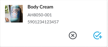 The
The `onClose` property is available during custom component development. When this prop is passed, a close icon will appear in the top right corner of the card.Visualization example: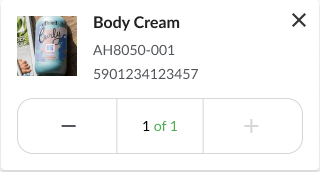