Wizard Component
UI Component
Changed on:
23 Apr 2026
Overview
The Wizard page component is an alternative top-level layout component for displaying multi-step wizard-like flows, like the wave pick/pack process.It takes a set of "step" configurations, and chooses which user actions and other descendants to display based on the conditions provided in those steps. Describes the usage of `fc.page.wizard.action`.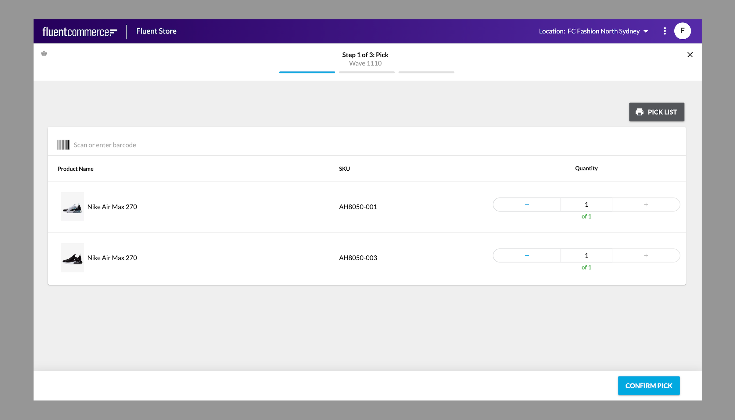
| Plugin Name | Core |
|---|
Alias
fc.page.wizard
Detailed technical description
In case some information should be pre-filled, overrides should be used, e.g.,
1"overrides": {
2    "lodgedLocation" : {
3        "value": "{{location.ref}}"
4    }
5 }Properties
OverviewWizards are used for step-by-step workflows. Mostly used when users need to perform tasks in a set order in which subsequent steps depend on information entered in previous steps. They inform the user about the completed step, the current step, and the number of remaining steps.This is a Fluent OMX component. Usage Examples
 Desktop and tablet example: Pick step of the pick, pack and ship wizard for desktop
Usage Examples- Wizards are shown to reduce user errors because they clearly break tasks out into sequential steps. The following experiences are an example of where wizards can be used:
- Picking, packing and shipping products
- In-store order returns
- Order item exchanges
- Progress tracker visually indicates the number of steps a user needs to take to complete a complicated task. Indicate the current step through a prominent color in conjunction with the title of the step. Ensure the step is highlighted with strong color and contrasts with the de-selected state of the step.
- Use numbers in the title to describe how many steps remain to complete the task. For example, Step 2 of 3.
- Don’t make the process too long. Have a minimum of 3 and a maximum of 6 steps.
- Allow users to exit the wizard at any step and automatically save the wizard to a draft state. This will allow the them to resume the process at a later time.
- Make the progress footer sticky for all devices.
- Don’t use a button to navigate to the previous page unless the user is allowed to make changes on the previous page.
- The number of steps
- Title of steps
- Color of the progress tracker
- Titles of the "Next" and "Previous" buttons
Desktop and tablet example: Pick step of the pick, pack and ship wizard for desktop| Name | Type | Required | Default | Description |
| title | `string` | No | none | Text to be shown on the left of the page header. Accepts a Template String. |
| closePath | `string` | Yes | none | Navigation link of the close button. |
| steps | `Step[]` | Yes | none | List of steps in the wizard. The first step with a matching condition will be displayed as the content of this page. |
| confirmOnExit | `boolean` | No | `false` | Enables a confirmation pop-up when exiting the wizard via the “X” button. When enabled, users must confirm exit. |
Step
| Name | Type | Required | Default | Description |
| title | `string` | No | none | Text to be shown in the page header. Accepts a Template String. |
| condition | `StepCondition[]` | Yes | none | Condition to check as to whether this step should be considered active. Typically this would reference the entity status, so that as user actions are submitted and the status changes the wizard progresses to the next step. For example: `"condition": {`` "value": "{{waveById.status}}",`` "matches": "PICK"``}`` `` ``/* vs */`` `` ``"condition": {`` "value": "{{waveById.status}}",`` "matches": "PACK"``}` |
| action | `UserAction` | No | none | The user action to be displayed on this page. If the user action would display a form, this form will appear in the page body in the location defined in the descendants (or first, if not defined there). Note: in cases where there are more than one User Action of the same name, the first will be selected. Below is an example of how to submit a UserAction then navigate to another page: `"action": { `` "name": "WaveComplete",`` "config": { `` "noSuccessMessage": false, `` "extension": { `` "postSubmit": { `` "type": "navigate",`` "link": "waves" `` } `` } `` } ``}` |
| descendants | `MystiqueComponent[]` | No | show only the user action form on the page | The components to display when this step is active. These are just regular component definitions, aside from a special case to allow positioning the step action between other components. To do this, use the `fc.page.wizard.action` component. E.g:`descendants: [`` { component: 'fc.page.section.header', props: { title:'Before action' } },`` { component: 'fc.page.wizard.action', props: { width:'full' } },`` { component: 'fc.page.section.header', props: { title:'After action' } }``]` |
| icon | `string` | No | none | Icon to be shown in the page header. |
StepCondition
| Name | Type | Required | Default | Description |
| value | `string` | Yes | none | Template string to match against. |
| matches | `string/string []` | Yes | none | Set of values to match the value against. If any match, the condition is true. |
UserAction
| Name | Type | Required | Default | Description |
| name | `string` | yes | none | Name of the user action to submit. |
| config | `UseUserActionFormConfig` | No | none | Configuration of what to do after submitting a user action |
UseUserActionFormConfig
| Name | Type | Required | Default | Description |
| noSuccessMessage | `boolean` | Yes | none | Don't display a toast after clicking the user action button. This is required to be 'false' if you want to navigate to a page after clicking a UserAction button in a step of the wizard See the example in the manifest below. |
| extension | `UserActionExtension` | No | none | Configuration of what to do after submitting a user action |
| overrides | key / value (`ExtendedFormField`) | Yes | none | Field-level overrides to be used when generating a form for the user action. Key is the name of the field. This can be used to change labels, set a source, or replace default field components with SDK-based variants. All values are optional - original values will be used where no override is provided. |
ExtendedFormField
| Name | Type | Required | Default | Description |
| component | `string` | No | none | FieldRegistry alias for an alternate field component that should be used for this field, only for this user action. |
| source | `string` | No | none | The name of a setting that provides options, turning a regular text field into a radio set or dropdown. |
| label | `string` | No | none | Set a different label for this field (supports i18n keys). |
| value | any | No | none | Lock in the value of this field. The field will no longer appear in the form as the provided value will be used instead. |
| defaultValue | any | No | none | Set the initial value of the field. The field will appear in the form and can be changed by the user. |
| helperText | `string` | No | none | User helper text to be presented alongside the field. |
| options | key / value (`string`) | No | none | Value options for this field (e.g. in a 'select' or 'radio group'). |
| sortPrefix | `string` | No | none | Set the position of a field in a form. |
| condition | `string` | No | none | Show a field depending on the condition. Used in cases where the value has one type.`{`` "overrides": {`` "value": {`` "sortPrefix": "5",`` "condition": "{{in valueType 'BOOLEAN' 'INTEGER' 'LOB' 'STRING'}}"`` },`` "lobValue": {`` "component": "fc.attribute.jsoneditor",`` "sortPrefix": "6",`` "condition": "{{in valueType 'JSON'}}"`` }`` }``}` |
| select | `SelectConfig` | No | none | Show a field depending on the condition. Used when a value can have more than one type. First condition which matches the criterion will be applied.`{`` "select": [{`` "inputType": "float",`` "condition": "{{in valueType 'INTEGER'}}"`` }, {`` "inputType": "input",`` "condition": "{{in valueType 'STRING'}}"`` }]``}` |
SelectConfig
| Name | Type | Required | Default | Description |
| condition | `string` | Yes | none | Condition upon which the field will be displayed. |
| inputType | `string` | Yes | none | FieldRegistry alias for an alternate field component that should be used for the field, only for mutation action. |
| label | `string` | No | none | The human-readable label of the field. |
| options | key / value (`string`) | No | none | Value options for the field (e.g. in 'select' or 'radio group'). |
UserActionExtension
| Name | Type | Required | Default | Description |
| postSubmit | `PostSubmitType` | Yes | none | Define the navigation varirables for the user action button |
PostSubmitType
| Name | Type | Required | Default | Description |
| type | `string` | yes | navigate | Specify that the PostSubmitType is a navigation object |
| link | `string` | Yes | none | The link to navigate to. |
Configuration example
1{
2    "type": "page",
3    "path": "waves-wiz/:id",
4    "fullScreen": true,
5    "component": "fc.page.wizard",
6    "props": {
7        "title": "Wave #{{waveById.id}}",
8        "confirmOnExit": true,
9        "closePath": "waves",
10        "steps": [
11            {
12                "title": "Step 1 of 3: Pick",
13                "subTitle": "Wave #${waveById.id}",
14                "action": {
15                    "name": "PickConfirm",
16                    "config":{
17                      "overrides":{
18                         "actionedBy":{
19                            "value":"{{me.username}}"
20                         }
21                       }
22                    }
23                },
24                "condition": {
25                    "value": "{{waveById.status}}",
26                    "matches": "PICK"
27                },
28                "icon": "MdShoppingBasket",
29                "descendants": [
30                    { "component": "fc.page.section.header", "props": { "title":"Pick" } },
31                    { "component": "fc.page.wizard.action", "props": { "width":"full" } }
32                ]
33            },
34            {
35                "title": "Step 2 of 3: Pack",
36                "subTitle": "Wave #${waveById.id}",
37                "action": {
38                    "name": "WaveDispatch"
39                },
40                "condition": {
41                    "value": "{{waveById.status}}",
42                    "matches": "PACK"
43                },
44                "icon": "FaBox",
45                "descendants": [
46                    {
47                        "component": "fc.button.bar",
48                        "descendants": [
49                            {
50                                "component": "fc.button.print.download",
51                                "props": {
52                                    "label": "i18n:fc.sf.ui.waves.detail.action.packingSlip.download.label",
53                                    "href": "/api/v4.1/wave/{{id}}/pickingList",
54                                    "filename": "packing-slip.pdf"
55                                }
56                            }
57                        ]
58                    },
59                    {
60                        "component": "fc.list",
61                        "dataSource": "fulfilments",
62                        "props": {
63                            "title": "i18n:fc.sf.ui.wave.pickAndPack.list.pack.title_plural",
64                            "attributes": [
65                                {
66                                    "label": "i18n:fc.sf.ui.waves.detail.list.fulfilments.column.order.heading",
67                                    "value": "{{node.order.ref}}",
68                                    "link": "#/order/{{node.order.id}}"
69                                },
70                                {
71                                    "label": "i18n:fc.sf.ui.waves.detail.list.fulfilments.column.customer.heading",
72                                    "value": "{{node.order.customer.firstName}}, {{node.order.customer.lastName}}"
73                                },
74                                {
75                                    "label": "i18n:fc.sf.ui.waves.detail.list.fulfilments.column.orderType.heading",
76                                    "value": "{{node.order.type}}"
77                                },
78                                {
79                                    "label": "i18n:fc.sf.ui.waves.detail.list.fulfilments.column.carrier.heading",
80                                    "value": "{{node.articles.edges.0.node.consignmentArticles.edges.0.node.consignment.carrier.name}}"
81                                },
82                                {
83                                    "label": "i18n:fc.sf.ui.waves.detail.list.fulfilments.column.fulfilmentStatus.heading",
84                                    "value": "{{node.status}}"
85                                }
86                            ]
87                        }
88                    }
89                ]
90            },
91            {
92                "title": "Step 3 of 3: Dispatch",
93                "subTitle": "Wave #${waveById.id}",
94                "action": {
95                    "name": "WaveComplete",
96                    "config": {
97                        "noSuccessMessage": false,
98                        "extension": {
99                            "postSubmit": {
100                                "type": "navigate",
101                                "link": "waves"
102                            }
103                        }
104                    }
105                },
106                "condition": {
107                    "value": "{{waveById.status}}",
108                    "matches": [
109                        "DISPATCH",
110                        "COMPLETE"
111                    ]
112                },
113                "icon": "FaTruck",
114                "descendants": [
115                    {
116                        "component": "fc.page.refresh"
117                    },
118                    {
119                        "component": "fc.list",
120                        "dataSource": "fulfilments",
121                        "props": {
122                            "title": "i18n:fc.sf.ui.waves.detail.list.fulfilments.title",
123                            "attributes": [
124                                {
125                                    "label": "i18n:fc.sf.ui.waves.detail.list.fulfilments.column.order.heading",
126                                    "value": "{{node.order.ref}}"
127                                },
128                                {
129                                    "label": "i18n:fc.sf.ui.waves.detail.list.fulfilments.column.customer.heading",
130                                    "value": "{{node.order.customer.firstName}} {{node.order.customer.lastName}}"
131                                },
132                                {
133                                    "label": "i18n:fc.sf.ui.waves.detail.list.fulfilments.column.orderType.heading",
134                                    "value": "{{node.order.type}}"
135                                },
136                                {
137                                    "label": "i18n:fc.gql.fulfilment.deliveryType.label",
138                                    "value": "{{node.order.fulfilmentChoice.deliveryType}}"
139                                },
140                                {
141                                    "label": "i18n:fc.sf.ui.waves.detail.list.fulfilments.column.fulfilmentStatus.heading",
142                                    "value": "{{node.status}}"
143                                },
144                                {
145                                    "label": "i18n:fc.sf.ui.waves.detail.list.fulfilments.column.carrier.heading",
146                                    "value": "{{node.articles.edges.0.node.consignmentArticles.edges.0.node.consignment.carrier.name}}"
147                                },
148                                {
149                                    "label": "i18n:fc.sf.ui.courierCollections.detail.list.awaitingCollection.column.consigmentStatus.heading",
150                                    "value": "{{node.articles.edges.0.node.consignmentArticles.edges.0.node.consignment.status}}"
151                                }
152                            ]
153                        }
154                    }
155                ]
156            }
157        ]
158    },
159    "data": {
160        "query": "query ($id: ID!) { waveById(id: $id) { id ref status location { id ref } fulfilments { edges { node { id ref status toAddress { id ref } items { edges { node { ref } } } order { id ref type status fulfilmentChoice{ deliveryType } customer { firstName lastName primaryEmail primaryPhone } } articles { edges { node { ref consignmentArticles { edges { node { consignment { id ref carrier { name } trackingLabel status updatedOn } } } } } } } } } } } me { username } } ",
161        "variables": {
162            "id": "{{params.id}}"
163        }
164    }
165}Version History
See previous versions
2023-08-01
v23.8.1
2023-08-01Recommended Placement
None