UX Configuration - Common Concepts
Essential knowledge
Intended Audience:
Technical User
Author:
Fluent Commerce
Changed on:
24 Feb 2026
Overview
Some common types and conventions are used across many component definitions. These items are not directly configurable in the manifest but will often be referenced in other component definitions that use them.Key points
- The Mystique manifest configures icons, cards, and template strings. Icons come from React Icons.
- Cards have common fields, and template strings allow dynamic values. Dynamic attributes (standard, image, component) offer flexibility based on conditions.
- A selection of helper functions are also available to control and transform these values as required, for example, number, logic, i18n, array, date, and string functions.
- Additional options like TextOptions and ImageOptions provide styling choices.
Icons
There are many places where icons can be configured in the Mystique manifest, whether to represent the app itself, different routes, or within component configurations.In most cases, the list of available icons comes from the React Icons library - specifically the Material Design and Font Awesome packages.Card
Many content-centric components are embedded in a card and will, therefore, share some common fields.| Name | Type | Required | Description |
`title` | string | no | Title text of the card |
`highlight` | MystiqueThemeColour / string (hex value) | no | Show a colored highlight above the card to denote status in cases like dashboard cards. |
`width` | "quarter" / "third" / "half" / "two-thirds" / "full" / number (1-12) | no | Define the width of this card on a 12-column grid. You can use the named widths for readability or numbers directly. On mobile devices, all widths will automatically change to 12 for the best responsive experience. The default is "full" and will take up the full width of the containing component. |
Template Strings
Many string values accepted by components are Template Strings. This means you can use a Mustache syntax to create dynamic values, mapping and transforming data from GraphQL or other sources into the UI.As an example, configuring a card to display a customer's name might look something like:`"{{order.customer.firstName}} {{order.customer.lastName}}"`If you come across a component property that does not support templates as expected, please reach out to us with the details and your use case. A selection of helper functions are also available to control and transform these values as required:
| Name | Body | Description | Examples |
| String functions | |||
`toLowerCase` | body: single string value | Convert a string to lowercase. | `"{{toLowerCase order.type}}"` |
`toUpperCase` | body: single string value | Convert a string to upper case. | `"{{toUpperCase order.customer.lastName}}"` |
`humanify` | body: single string value | Convert the first letter of a string to upper-case. | `"{{humanify order.ref}}"` |
`stringify` | body: single JSON object | Convert a JSON object into a string representation. | `"{{stringify order.attributes.byName.invoicePayload}}"` |
`concat` | body: two string values(Optional separator argument) | Concatenates two strings together using the specified separator. (Default separator = "") | `"{{concat order.customer.firstName order.customer.lastName}}"``"{{concat order.customer.firstName order.customer.lastName separator=' '}}"` |
`partialStringMatch` | body: two string values | Returns true if the first string appears in the second string. (Case Insensitive) | `{{partialStringMatch "eM1" "item1"}} = true``{{partialStringMatch "eM2" "item1"}} = false |
`currentUrlParams` | body: single string value | Returns the part of the URL containing the query parameters located after the`?` symbol. The template dynamically appends the query parameters from the current page to a newly generated link. | `"#/inventorySearch/product/{{node.productRef}}/{{node.product.catalogue.ref}}/{{node.product.type}}?{{{currentUrlParams}}}"``"inventorySearch?{{{currentUrlParams}}}"` |
`preserveWhitespace` | body: single string value | Keeps content's white space as-is, unlike HTML's default of collapsing it into a single space. | `"{{preserveWhitespace node.ref}}"` |
`placeholderText` | body: string.Default configuration: `color` (#00A9E0), `fontWeight` (bold), `defaultValue` ([…]) | Inserts plain text with optional formatting (color, weight) and fallback value if text is missing. | `"{{placeholderText text}}"``"{{placeholderText text color="#fffaaa" fontWeight="normal" defaultValue="-"}}"` |
`decodeUrlParams` | body: single string value | Decodes URL parameters. | input:`{{decodeUrlParams 'TEST_PRODUCT%3A%3AL%2FXL%2FFREE_SIZE'}}`output:`'TEST_PRODUCT::L/XL/FREE_SIZE'` |
`encodeUrlParams` | body: single string value | Encodes URL parameters. | input: `{{encodeUrlParams 'TEST_PRODUCT::L/XL/FREE_SIZE'}}`output: `'TEST_PRODUCT%3A%3AL%2FXL%2FFREE_SIZE'` |
`readFromParams` | body: string | Takes in the name of a url parameter, and returns the value of that parameter | input:`{{readFromParams 'param1'}}`url: url.com/index?param1=1&other_param=2output:`'1'` |
`readArrayFromParams` | body: string | Takes in the name of a url parameter, and returns the array of values of that parameter. Useful for when a parameter appears more than once in the url. | input:`{{readArrayFromParams 'retailer_ref[]'}}`url: url.com/index?retailer_ref[]=1&other_param=2&retailer_ref[]=3output:`[1, 3]` |
| Date functions | |||
`dateFormat`(aka `dateStringFormatter`) | body: 0: date object or date-formatted string 1: optional format string (ISO 8601) 2: optional boolean — output in UTC ( `true`) or user's timezone (`false`, default)locale (optional): override output locale (e.g., `'en'`) | Formats a date string based on user locale, optional format pattern, and timezone. When used for backend query variables, `_locale='en'` must be added to avoid localized digits (for example, Arabic).Use UTC formatting ( `true`) and `_locale='en'` to ensure dates are sent in standard ISO format with Latin digits. | Display in user’s locale: `"{{dateStringFormatter order.createdOn}}"`ISO format (UI-level): `"{{dateStringFormatter order.createdOn 'YYYY-MM-DD[T]HH:mm:ss.SSS[Z]'}}"`Backend query safe version (recommended): `"{{dateStringFormatter (dateAdd day=-1) 'YYYY-MM-DD[T]HH:mm:ss.SSS[Z]' true _locale='en'}}"` |
`dateAdd` | body: optional date object modifier: <period>=<amount> | Add or subtract an amount of time from a given date. Passing a date is optional, and the default is now. This is often used with `dateFormat` to provide a date range for GQL queries, for example, fetching all orders created in the last 24 hours. | `"expiry: {{dateAdd node.createdOn day=3}}"``{{dateStringFormatter (dateAdd day=-1) 'YYYY-MM-DD[T]HH:mm:ss.SSS[Z]'}}` |
`dateRelative` | body: date object | Convert a date object into a relative format, e.g. "10 minutes ago" | `{{dateRelative node.expiryTime}}` |
`dateSubtract` | body: optional date object modifier: <period>=<amount> | Subtract an amount of time from a given date. Passing a date is optional, and the default is now. This is often used with `dateFormat` to provide a date range for GQL queries, for example, fetching all orders created in the last 24 hours. | `"WorkWeekStart: {{dateSubtract node.createdOn day=5}}"``{{dateFormat (dateSubtract day=params.filter_value) 'YYYY-MM-DD[T]HH:mm:ss.SSS[Z]'}}` |
`dateFormatByLocale` | body: 0: date object or date-formatted string 1: optional boolean to show in UTC time ( `true`) instead of the user's timezone (`false`). The default is `false`. | Format a date based on user's browser language:
| `"{{dateFormatByLocale order.createdOn}}"` |
`placeholderDate` | body: date object.Default configuration: `color` (#00A9E0), `fontWeight` (bold), `defaultValue` ([…]) | Inserts a formatted date with styling options and a fallback if no date is provided. | `"{{placeholderDate date}}"``"{{placeholderDate date color="#fffaaa" fontWeight="normal" defaultValue="-"}}"` |
`currentTimezone` | body: none | Returns the user's current system timezone. The format follows the TZ identifier format (E.G. America/New_York)For best experience, the current timezone should also be listed in any timezone related settings such as `fc.analytics.timezone` | `"{{currentTimezone}}"` |
| Array functions | |||
`arraySum` | body: 0: array of objects 1: JSONPath from the object root to the field to be summed. | Total up values from within an array of objects. | `"{{arraySum order.items 'node.totalPrice'}}"` |
`placeholderArray` | body: array of strings / numbers / objects.Default configuration: `color` (#00A9E0), `fontWeight` (bold), `defaultValue` ([…]), `separator` (","), `path` (""), `charCutoff`(50) | Inserts a list of values, joined by a separator, with optional truncation (charCutoff), formatting, or object path extraction. | `"{{placeholderArray arr}}"``"{{placeholderArray arr separator="*" charCutoff=10 color="#fffaaa" fontWeight="normal"}}"` |
| i18n functions | |||
`i18n` | body: any number of strings that are joined together into an i18n key _fallback: optional fallback value if the key does not exist. | Translate a value into another language. | `{{i18n 'fc.om.order.type.' node.type _fallback=node.type}}` |
| Logic Functions | |||
`eq` | body: two values that are equal | Compare two values, true if equivalent. | `{{eq order.status 'BOOKED'}} // true` |
`ne` | body: two values that are not equal | Compare two values, true if not equivalent. | `{{ne order.status 'BOOKED'}} // false` |
`lt` | body: two values to be compared | Compare two values, true if a is less than b | `{{lt order.items.count 3}}` |
`gt` | body: two values to be compared | Compare two values, true if a is more than b | `{{gt order.items.count 3}}` |
`lte` | body: two values to be compared | Compare two values, true if a is less or equal to b | `{{lte order.items.count 3}}` |
`gte` | body: two values to be compared | Compare two values, true if a is more than or equal to b | `{{gte order.items.count 3}}` |
`and` | body: one or more values (expressions) | Compare two booleans, true if both are true. In JavaScript, strings, numbers, and objects are `true`, and null/undefined are `false`. | `{{and (eq order.status 'BOOKED') (gt order.items.count 3)}}``{{and order.status order.items.count}}``{{and order.status}}` |
`or` | body: one or more values (expressions) | Compare two booleans; `true` if either is `true`.In Java Script, strings, numbers, and objects are `true`, and null/undefined are `false`. | `{{or (eq order.status 'BOOKED') (gt order.items.count 3)}}``{{or order.status order.items.count}}``{{or order.status}}` |
`firstDefinedValue` | body: one or more values | This template returns the first valid value. Valid values are anything that isn't either `null` or `undefined` (empty). | `{{ firstDefinedValue null undefined 10 }} returns 10``{{ firstDefinedValue null undefined false 10 }} returns false ``{{ firstDefinedValue null undefined null }} returns null` |
`anyMatch` | The body consists of three values: the path, the function, and the value | anyMatch template is used for performing conditional checks on structured data (i.e lists, arrays), typically JSON. More examples can be found here | `{{anyMatch "node.entity.field.subfield2" "delta" "eq"}}` |
| Number Functions | |||
`currency` | number, currency, _locale (optional), _decimalPlaces (optional, default: 2) | Convert a number to currency format; this template uses the Intl.NumberFormat function with the 4 parameters described to the left | `{{currency totalPrice items.edges.0.node.currency _locale='en-AU' _decimalPlaces=3 }} = $99.990``{{currency 123.586 'AUD'}} = A$123.59``{{currency 10000000.123 'GBP' _decimalPlaces=1}} = £10,000,000.1``{{currency 123.87862 'AUD' _locale='en-AU' _decimalPlaces=3}} = $123.879``{{currency totalPrice 'INR' _locale='hi-IN' _decimalPlaces=2}} = ₹99.99``{{currency 10000000.123 'EUR' _locale='es-ES'}} = 10.000.000,12 €``{{currency totalPrice items.edges.0.node.currency}}``{{currency (subtract 50.32 20.11) "AUD" _decimalPlaces=2}} = A$30.21` |
`add` | body: two values to be added, _decimalPlaces (optional, default: 2) | Adds two numbers together. | `{{add 1 2}} // 3``{{add 2.345 1.432 _decimalPlaces=3}} // 3.777` |
`subtract` | body: two values to be subtracted, _decimalPlaces (optional, default: 2) | Subtracts one number from another | `{{subtract 1 2}} // -2``{{subtract 2.345 1.432 _decimalPlaces=3}} // 0.913` |
`multiply` | body: two values to be multiplied, _decimalPlaces (optional, default: 2) | Multiplies two numbers together | `{{multiply 3 4}} // 12``{{multiply 1.348 3.472 _decimalPlaces=3}} // 4.680` |
`divide` | body: two values to be divided, _decimalPlaces (optional, default: 2) | Divides one number from another | `{{divide 12 4}} // 3``{{divide 5.298 2.252 _decimalPlaces=3}} // 2.352` |
`pow` | body: raise the first value to the power of the second, _decimalPlaces (optional, default: 2) | Raises one number to the power of the second | `{{pow 3 2}} // 9``{{pow 3.994 3 _decimalPlaces=3}} // 63.712` |
`getMetricStepByTimePeriod` | body: any number | This template calculates the step’s size by a set time period. Depending on the specified time period, the template returns different values:
| `{{getMetricStepByTimePeriod params.filter_value}}` |
| Other | |||
`barcode` | body: two string values and one boolean(Optional format and displayText arguments) | Generate a barcode for a given string. 1.If the format is not specified, it will be detected automatically.Supported barcode formats:
`displayText` argument determines if the text will be rendered, defaulting to `true`. If not specified, the text will appear unless explicitly set to `false`. | `{{ barcode '1234 abc' 'CODE128B' }}``{{ barcode fulfilmentById.ref }}``{{ barcode '1234 abc' 'CODE128B' false}}` |
Accessing entity attributes by name
In GraphQL, any entity attributes are returned as an array. This can make it difficult to configure a component to show a specific attribute.To help with this, attribute arrays have a`byName` property that allows specific attributes to be directly referenced in template strings.For example, if an Order has a custom attribute `vipStatus`, you can add this attribute to a card or list with the following syntax:`"{{order.attributes.byName.vipStatus}}"`Plugin-specific Template Strings
Some additional templates are available only when certain plugins are loaded.| Name | Body | Description | Examples | Plugin |
| Array functions | ||||
`arrayFieldSum` | body: 0: array of objects 1: JSONPath from the object root to the field to be summed. | Total up values from within an array of objects. Supports summation of elements with zero value. | datasource:`[{price: 1},{price: 2},{price: 3},]``"{{arraySum items 'price'}}" // 6` | OMS |
`getMaxValue` | array of objects | Get the max value from an array of objects | datasource: 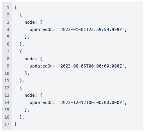 `{{getMaxValue` `node.updatedOn}} // '2023-12-12T00:00:00.000Z'` | Inventory |
`getTotalActiveFeeds` | object | Get total active feeds from a query on the Feeds Dashboard | `{{getTotalActiveFeeds inventoryFeeds.edges}}` | Inventory |
| Date functions | ||||
`timeAgo` | date object | Convert a date object or date-formatted string into a relative format:
| `{{timeAgo node.updatedOn}}` | Inventory |
`convertMsToDate` | number | Convert milliseconds to date. | `{{convertMsToDate 1691054160}} // '1970-01-20T13:44:14.160Z'` | Inventory |
`convertISODateToMS` | string | Convert an ISO-formatted date string to milliseconds. | `{{convertISODateToMS '2023-12-12T00:00:00.000Z'}} // 1702339200000` | Inventory |
| Number functions | ||||
`round` | number | Round a number | `{{round 5.4}} // 5` | Inventory |
| String functions | ||||
`compactNumberFormat` | string | Convert a number to a compact format | `{{compactNumberFormat 15000}} // 15k` | Inventory |
Using Contextual Inheritance in Nested Components
Contextual inheritance makes it easy to access and reuse shared data across multiple components. It defines a common structure that holds the current user, their active retailer and location, and other relevant settings. This shared context is automatically available in both visible components (like lists or cards) and invisible parts, like query variables.Template Strings like``{{activeContext.id}}`` can be used anywhere inside component configuration or query definitions. These expressions dynamically resolve to the correct context values without requiring manual input or duplication. It ensures consistency across the page and keeps the logic simple and centralized.Instead of configuring each component separately, the same data can be passed down and used in various ways — for filtering, display, or behavior toggles.Here’s an example of the shared context structure:1{
2 "activeContext": {
3 "id": "3353",
4 "ref": "Sports_1686296685026"
5 },
6 "activeLocation": {
7 "id": "1",
8 "ref": "RJT_3",
9 },
10 "activeRetailer": {
11 "id": "3353",
12 "ref": "Sports_1686296685026"
13 },
14 "activeUser": {
15 "username": "1686296685026_admin",
16 "firstName": "Sports_1686296685026",
17 "lastName": null,
18 "timezone": "Australia/Sydney",
19 "language": {
20 "label": "en",
21 "value": "en"
22 },
23 "primaryRetailer": {
24 "id": "3353",
25 "ref": "Sports_1686296685026"
26 },
27 "primaryLocation": {
28 "id": "1",
29 "ref": "RJT_3",
30 "name": "Virtual Rejection Location for Retailer 3"
31 },
32 "attributes": null,
33 "roles": [
34 {
35 "role": {
36 "id": "1",
37 "name": "ADMIN"
38 },
39 "contexts": [
40 {
41 "contextType": "RETAILER",
42 "contextId": "3353"
43 },
44 {
45 "contextType": "RETAILER",
46 "contextId": "6904"
47 }
48 ]
49 }
50 ]
51 }
52}Dynamic Attribute
Dynamic Attribute is a common convention used when defining key/value type information in the manifest, such as card attributes or table columns.The "value" and "link" fields are both Template Strings (see above), which is how dynamic values can be defined. For example, a table column might be defined as:1{
2 "label":"i18n:fc.om.orders.index.list.column.customer.heading", // "Customer" in English
3 "value": "{{customer.firstName}} {{customer.lastName}}",
4 "link": "#/customer/{{customer.id}}",
5 "condition": "{{and customer.id}}"
6}Standard (or Text) Attribute
| Name | Type | Required | Description |
`type` | `"standard"` (or not present) | no | Choose whether the value should be displayed as text or used to render an image. The default is "standard". |
`label` | `string` | yes | String key of the key/value pair. Used as text labels in `AttributesCard` component and column headers in the List component. Not actually used by DynamicValue. |
`value` | `string` (with templates) | yes | The templatised string is to be transformed into the output value. Has access to DynamicValue context (e.g., GraphQL response data) and any available template helpers (e.g., i18n, date formatters, etc.). |
`link` | `string` (with templates) | no | If present, render the text as a link to the location defined in the "link" value. This also has access to DynamicValue context (e.g., GraphQL response data) and any available template helpers (e.g., i18n, date formatters, etc.). |
`options` | `TextOptions` | no | Type-specific configurations for the Dynamic Attribute |
`condition` | `string` (with templates) | no | If `true`, render the text a link to the location defined in the "link" value. Otherwise, render defaultValue. |
TextOptions
In text-based attributes, a set of optional styles can be applied.Each style option has a`matches` condition, and for each instance of an attribute, the style options are evaluated in order until the first match is found, at which point that style is applied.| Name | Type | Required | Description |
`styles` | `TextStyle[]` | no | Set of styles to apply to this text attribute. |
TextStyleOption
| Name | Type | Required | Description |
`value` | `string` | no | Value to compare matches to. Default is the rendered value of the overall attribute itself. |
`matches` | `string[]` | no | If any of these match the value, apply this style. If empty, treat this as a `default` style (and apply to all). |
`icon` | `IconStyle` | no | Icon and coloring to apply to this attribute. |
`text` | `TextStyle` | no | Text coloring to apply to this attribute. |
IconStyle
| Name | Type | Required | Description |
`name` | `loading`/`string` (icon name) | yes | Name of the icon to show with this text attribute. To show a loading spinner, use `loading`; otherwise, this should be a reference to a supported icon (see Icons above). |
`colour` | `string` | no | Optionally apply a color to the icon. Named theme colors (e.g. `primary` or `secondary`) are recommended, but direct CSS hex values (e.g., `#00FF00`) are also supported.` |
TextStyle
| Name | Type | Required | Description |
`colour` | `string` | no | Optionally apply a color to the text. Named theme colors (e.g. `primary` or `secondary`) are recommended, but direct CSS hex values (e.g., `#00FF00`) are also supported.` |
Sample usage
The following attribute is used to embed a link into a component.1{
2 "label": "i18n:fc.products.category.label",
3 "value": "{{ref}}",
4 "link": "#/category/{{catalogue.ref}}/{{ref}}",
5 "condition": "{{and catalogue.ref ref}}"
6}
7Image Attribute
| Name | Type | Required | Description |
`type` | `"image"` | yes | Choose whether the value should be displayed as text or used to render an image. |
`label` | `string` | yes | String key of the key/value pair. Used as text labels in `AttributesCard` component and column headers in the List component. Not actually used by DynamicValue. |
`value` | `string` (with templates) | yes | The templatised string is to be used as the URL for the image. Has access to DynamicValue context (e.g., GraphQL response data) and any available template helpers (e.g., i18n, date formatters, etc). |
`link` | `string` (with templates) | no | If present, render the image as a link to the location defined in the "link" value. This also has access to DynamicValue context (e.g. GraphQL response data) and any template helpers that are available (e.g. i18n, date formatters, etc). |
`options` | `ImageOptions` | no | Type-specific configurations for the Dynamic Attribute |
`condition` | `string` (with templates) | no | If it returns `true`, render an image. Otherwise, render defaultValue.The Condition field can stop an image from displaying if it contains no `src`. |
ImageOptions
| Name | Type | Required | Description |
`height` | `number` | no | Height of the image (width will auto-scale) |
`width` | `number` | no | Width of the image (height will auto-scale) |
`alt` | `string` | no | Alt text of the image |
`noModal` | `boolean` | no | True to prevent the default modal on click of an image |
Sample Usage
Example 1.In the following example:- the first option would be applied when the wave is in
`CREATED`or`PICK`states - the second when the wave has a custom attribute of the value "customValue" but is not in
`CREATED`or`PICK`states (as that would have stopped at the first style) - the third, in any other case
1{
2  "type": "image",
3  "label":"i18n:fc.om.order.status.label",
4   "value":"{{wave.status}}",
5   "options":{
6      "styles":[
7         {
8            "matches":[
9               "CREATED",
10               "PICK"
11            ],
12            "icon":{
13               "name":"MdShoppingBasket"
14            }
15         },
16         {
17            "value":"{{wave.attributes.byName.customAttribute}}",
18            "matches":[
19               "customValue"
20            ],
21            "icon":{
22               "name":"FaBoxOpen"
23            }
24         },
25         {
26            "icon":{
27               "name":"FaTruck"
28            }
29         }
30      ]
31   }
32}1{
2 "type": "image",
3 "value": "{{node.attributes.byName.imageUrl}}",
4 "options": {
5 "width": 50,
6 "height": 50
7 },
8 "condition": "{{and node.attributes.byName.imageUrl}}"
9}`
`Component Attribute
The component-type attribute allows you to embed components inside of other components that accept DynamicAttributes.Please be aware that not all components will work particularly well in all positions!| Name | Type | Required | Description |
`type` | `"component"` | yes | Choose whether the value should be displayed as text or used to render an image. |
`label` | `string` | yes | String key of the key/value pair. Used as text labels in `AttributesCard` component and column headers in the List component. Not actually used by DynamicValue. |
`value` | `string` | no | Not used in `component` attributes. |
`link` | `string` | no | Not used in `component` attributes. |
`options` | `MystiqueComponentInstance` | no | Component props, as you would define them anywhere else in the manifest. |
`condition` | `string` (with templates) | no | If it returns `true`, render an image. Otherwise, render defaultValue.The Condition field can stop a component from displaying if it contains no data. |
Sample usage
The following attribute is used to embed the print button component into a table column.1{
2 "label": "i18n:fc.om.orders.index.list.column.orderValue.heading",
3 "type": "component",
4 "options": {
5 "component": "fc.button.print.download",
6 "props": {
7 "label": "Print",
8 "href": "api/v4/consignment/{{articleById.id}}/labelStream",
9 "filename": "pack-label.pdf"
10 }
11 },
12 "condition": "{{and articleById.id}}"
13}