UX Framework - Component Library
Essential knowledge
Intended Audience:
Business User
Author:
Boris Pocatko
Changed on:
23 June 2025
Overview
The OMX UX Component Library contains a suite of UI Components, ready to be configured and used in Fluent Web Apps. The Library contains Foundation, Content, Layout, Interaction and Field Components.Key points
- Foundation Components, such as Page Components which form the base of a screen
- Content Components for displaying data and media
- Layout Components for structuring pages
- Interaction Components for capturing user input, and
- Field Components which are automatically rendered in User Action forms.
Foundation Components
Foundation Components are a category of components within the OMX Component Library. They are top level components that map to a specific URL path within the Web App.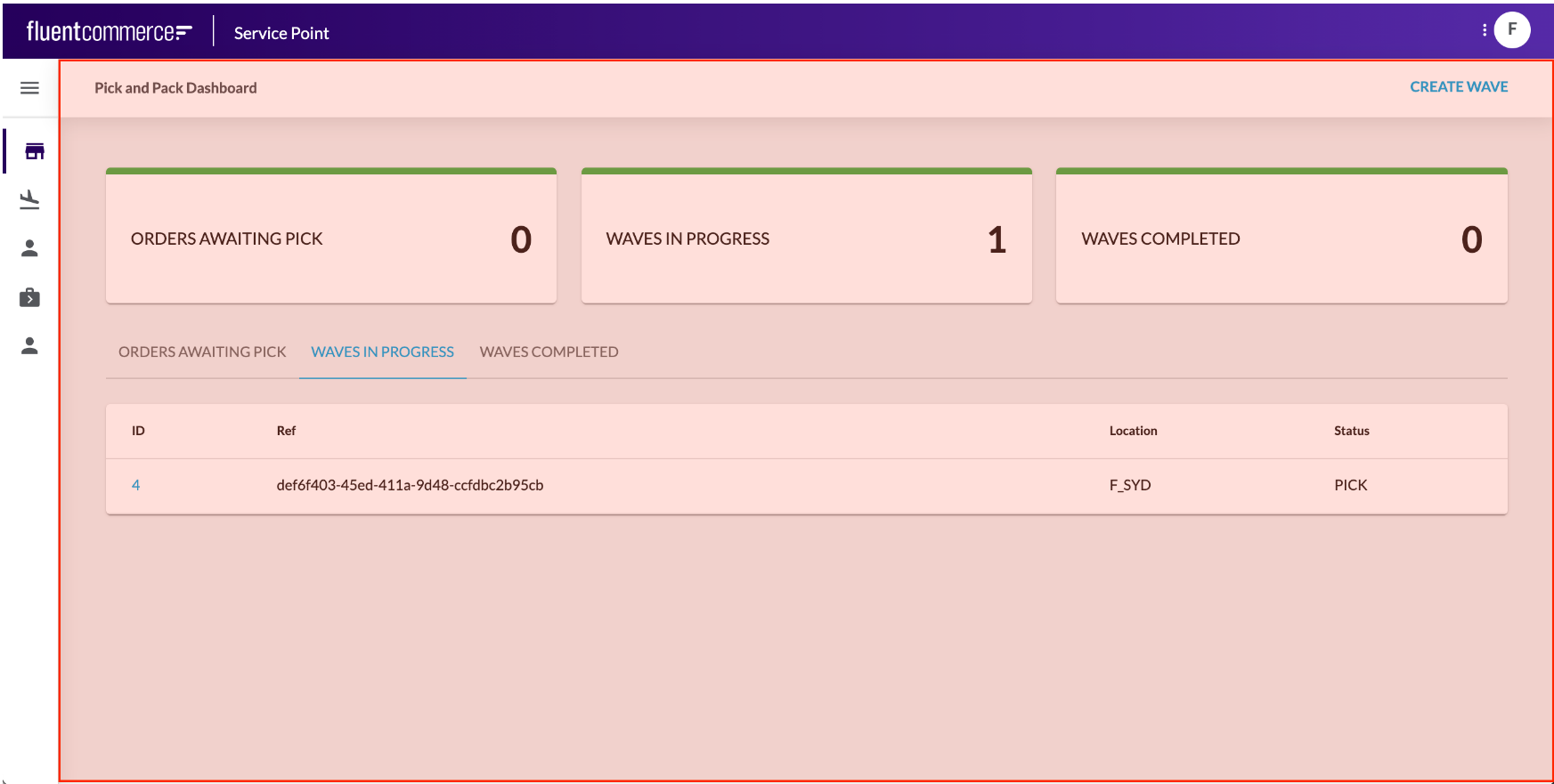 Page Components are the primary foundation component, as they layout the page area and provide a content area for child components to be displayed.Page components are mobile responsive, so the screens render perfectly for any device.Different Page Components are available within the Library, and you can create your own too. For example, you may wish to use a simple, clean page component with minimal header information or a more advanced wizard-style page to help users through a step-by-step process.Learn more about the Foundation Components:
Content Components
Content Components are components that display information, including data or media. They can range from simple card components to advanced multimedia or graphical components.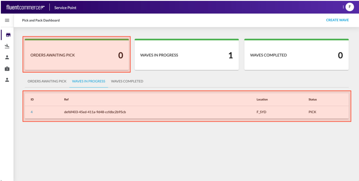 Content Components typically display data from the configured Page query, but some may display information retrieved via a component-specific API call.Content Components are typically added as descendants to Page components to form screens.Learn more about the Content Components
Layout Components
Layout Components provide additional structural elements to the screen. For example, you may wish to layout your page into multiple sections, each with a header and actions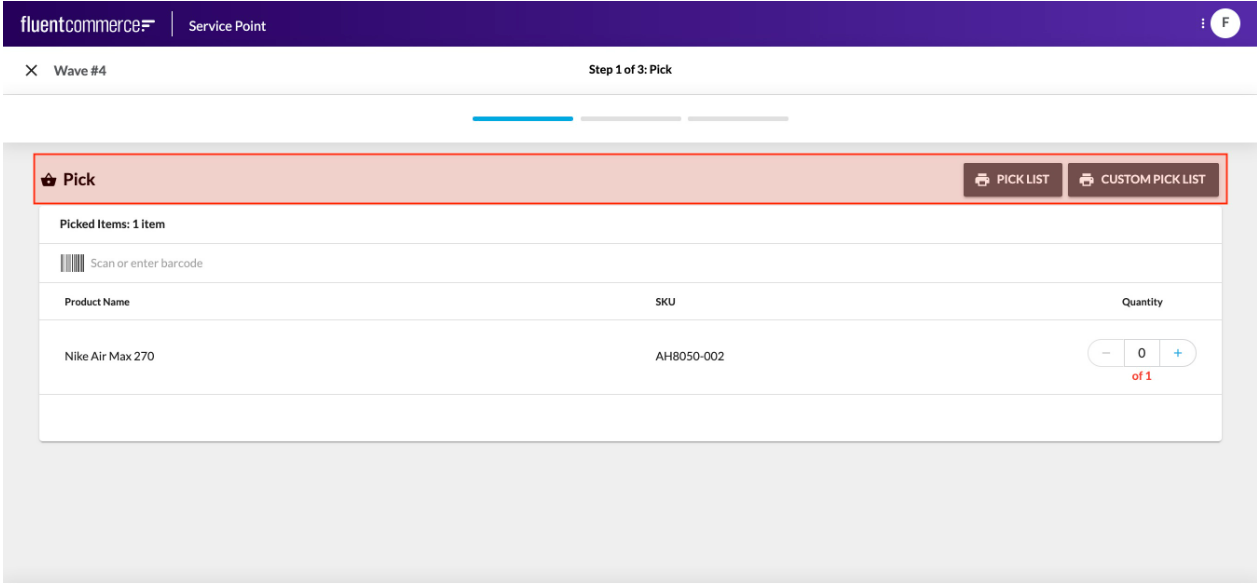 Or, you may want to display tabs that show different components or data based on which is active.
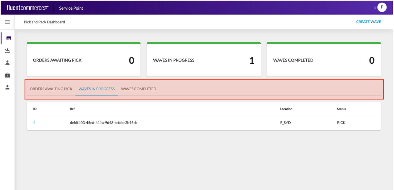 Another example is to conditionally display components, based on an entity type for example.Like Foundation Components, Layout Components have descendants, which identify what should be displayed for that layout.Learn more about the Layout Components
Interaction Components
Interaction Components allow users to interact with the OMS.Interaction Components could be a form to capture information or a button to execute an action.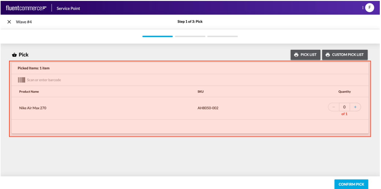
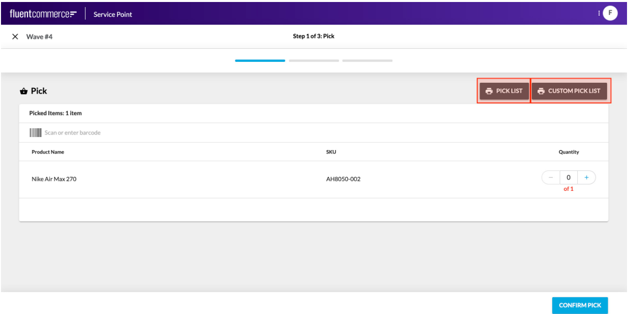 These are not to be confused with the standard user actions, which display buttons in the page header, and slide out a right hand drawer for form display.Rather, these components can be added directly to a screen just like any other component.Learn more about the Interaction Components
Field Components
Field Components are a different kind of component all together.They cannot be configured via the manifest. Rather, they are automatically rendered based on the data type to be captured.Field Components are essentially form based elements. They could be as simple as a text box or more advanced with multiple input fields and types.Field Components are key in delivering flexibility and enhanced user experience to complex user actions driven by the workflow. Workflows can require complex data input for the expected trigger event, and Field components enable full control over the user experience provided for those cases.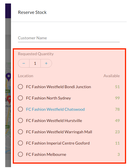
For example, in the screenshot above, the Requested Quantity and the Location selection are 2 parts to a single field, which map to an Event Attribute structured as follows:
`{`` "name": "StockReserveDetails",`` "value": {`` "locationRef": "F_NSYD",`` "requestedQuantity": 2`` },`` "type": "STOCK_RESERVE_DETAILS"``}`Since Field Components are rendered automatically based on the User Action definition, there is no configuration reference required.Learn more about the Field Components
