Date Range Field Component
UI Component
Changed on:
23 May 2025
Overview
This document describes the Date Range Field Component properties and sample usage. The component allows users to select a date and time range in the relevant form.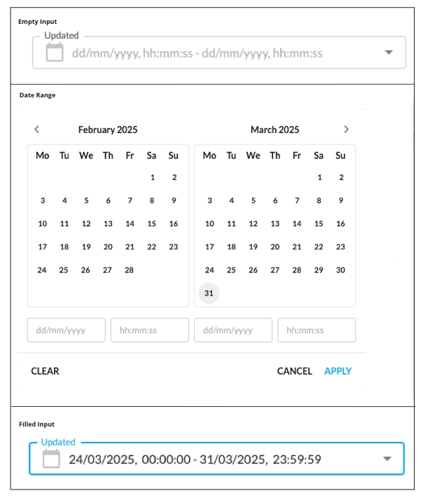
| Plugin Name | Core |
|---|
Alias
fc.field.daterange , daterange
Detailed technical description
Layout
The layout displays two calendar components and navigation icons.- The current month (on the left)
- The next month (on the right)
- Date
- Time
Date Field
The date field format depends on the preferred browser language. The default format is`dd/mm/yyyy`, where:- dd – Day
- mm – Month
- yyyy - Year
Supported date formats
| Preferred browser language | Date format |
| English (United Kingdom)/English (Australia) | dd/mm/yyyy |
| English (United States) | mm/dd/yyyy |
| English/French (Canada) | yyyy/mm/dd |
| Other languages | dd/mm/yyyy |
- dd - Allowed values from 01 to 31 (Days from 1 to 9 are displayed prefixed with 0 (e.g. 01 / 07 / 2021 )
- mm - Allowed values from 01 to 12
- yyyy - Allowed values from 1970 up to the current year
`disableFuture`.Time Field
The time field has the following format`hh:mm:ss`, where:- hh – Hours
- mm – Minutes
- ss – Seconds
The following validations are applied:
- hh – Allowed values are from 00 to 23
- mm – Allowed values are from 00 to 59
- ss – Allowed values are from 00 to 59
- The
`from`input field - 00:00:00 - The
`to`input field - 23:59:59
Navigation Icons
The date and time range filter component contains`<` and `>` icons to navigate to the previous/next month. `<` / `>` icons are disabled if January 1970 / next to current month is displayed respectively.Buttons Block
The buttons block contains the following buttons:- Clear button:
- Cancel button:
- Apply button:
Properties
| Name | Type | Required | Default | Description |
| value | `{ from: string | null; to:string | null;}` | no | none | Property sets initial dates. Note: On date selection, the component returns the value in the ISO string format:`'2024-04-18T13:50:49.030Z'`.Using the component in the workflow, the `defaultValue` property is used to set up the component's `value`. |
| label | `string` | no | none | Set a label (supports i18n keys). |
| disableFuture* | `Boolean` | yes | false | Property sets the possibility of filtering data in the future. When the property is set to `true`, the date and time range filter should not allow the selection of date values in the future. When the property is set to `false`, the date and time range filter should allow the selection of date values in the future. |
| isError* | `Boolean` | no | false | Marks input as invalid with the red border. |
| helperText* | `String` | no | none | Helper text under the input field. |
| minDate* | `String` | no | none | Sets the minimum date available for selection in the calendar. |
| maxDate* | `String` | no | none | Sets the maximum date available for selection in the calendar. |
1String name;
2String label;
3String type;
4String source;
5Object value;
6Object options;
7Object defaultValue;
8Boolean mandatory = false;1 {
2 "userActions": [
3 {
4 "context": [
5 {
6 "label": "Date",
7 "type": "SECONDARY",
8 "modules": [
9 "adminconsole"
10 ],
11 "confirm": true
12 }
13 ],
14 "attributes": [
15 {
16 "name": "daterange",
17 "label": "Dates",
18 "type": "daterange",
19 "source": "",
20 "defaultValue": {
21 "to": "",
22 "from": ""
23 },
24 "mandatory": false
25 }
26 ]
27 }
28 ]
29}Configuration example
1  {
2    "component": "fc.filterPanel",
3    "props": {
4        "overrides": {
5            "createdOn": {
6              	// filterPanel props
7                "component": "fc.field.daterange",
8              	"sortPrefix": 1,
9								// daterange props
10                "disableFuture": true,
11              	"label": "Created"
12            }
13        },
14        "additionalFields": [
15            {
16                "component": "fc.field.daterange",
17                "props": {
18                  	// daterange props
19                    "label": "Updated",
20                    "maxDate": "2025-06-20",
21                    "minDate":"2025-01-01",
22                  	// filterPanel props
23                  	"variableName": "updatedOn"
24                }
25            }
26        ]
27    }
28}Version History
See previous versions
2024-04-29
24.4.29
The Date Range component is moved to the Mystique core. This enables its seamless integration into various Fluent applications. The`disableFuture` property is enhanced to be configured via the Manifest.0000-00-00
v1.0.0
Initial changelog entry.Recommended Placement
This component was designed to be used when the date and time range filter is part of a form.