Complex Filter Component
UI Component
Changed on:
1 Oct 2025
Overview
The Complex Filter Component dynamically fetches and filters data based on a configurable GraphQL request. Depending on the configuration, it enables users to search for entities using tailored filters and displays results in either Standard Card or Product Card formats. This adaptability ensures precise data retrieval and a consistent, user-friendly presentation.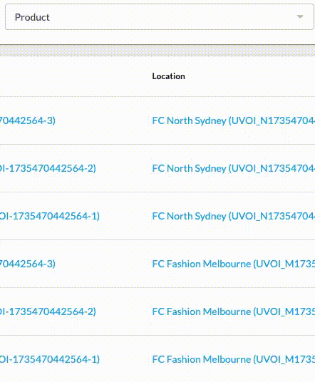
| Plugin Name | Core |
|---|
Alias
fc.field.filterComplex
Detailed technical description
The Complex filter consists of the following parts:
- Main Input
- Displays selected values as a comma-separated list.
- Clicking on the input opens a modal dialog for filter configuration.
- Modal Dialog
- Form Fields:
- Located in the middle section of the modal.
- Dynamically generated based on the GraphQL query provided in the manifest.
- Search Results:
- Displays the results of the GraphQL query below the form fields.
- If no records are found, the message ‘No records available’ is shown.
- Items remain visible in the search results list even after selection.
- The display layout can be configured using Product Card or Standard Card properties (e.g., image, title, attributes).
- Selected Items:
- Represented by chips at the top of the modal.
- Each chip derives its value from the corresponding search item data.
- Buttons Block:
- Clear: Resets all input fields to their default empty state.
- Cancel: Restores the initial values and closes the modal.
- Apply: Confirms selected values and closes the modal.
- Form Fields:
Properties
| Name | Type | Required | Default Value | Description |
| value | `string[]` | No | None | The value of the field to be displayed as an array of selected items. |
| extensions | `Extensions` | No | None | Additional properties to extend the field’s functionality, allowing for advanced configurations. |
| label | `string` | No | None | Component label to be displayed in the main input field |
Extensions
| Name | Type | Required | Default Value | Description |
| filtersSource | `string` | No | None | Specifies the data source for the filter. |
| query | `string` | Yes | None | Defines a custom GraphQL query for implementing advanced filtering requirements. |
| variables | `Map<string, any>` | No | None | GraphQL query variables to parameterize filtering. |
| overrides | `ExtendedFormField` | No | None | Allows field-level customization, including changing labels, default values, or field components. Overrides are optional; default values are used where no override is provided. |
| searchItemConfig | `MystiqueComponentInstance` | Yes | None | Configuration for displaying search results and supporting layouts like Product Card or Standard Card. |
| chipItemConfig | `{ label: string, query: string, variables: Map<string, any>}` | Yes | None | The path string to extract a value for the display chip from the search item, graphql, and variables are used to perform an initial query to get data for pre-selected items.The path string specifies where to extract a value for the display chip from the search item. GraphQL queries and variables execute an initial query, retrieving the necessary data for any pre-selected items. |
| onChangeValues | `onChangeValues` | Yes | None | This configuration object specifies which parts of the search item should be used as filter values. |
| exclude | `string[]` | No | None | Lists filter fields to hide, e.g., `createdOn`. |
| mode | `single | multiple` | No | `multiple` | Defines the output.Accepted values: `"single"` or `"multiple`:
|
| selectionLimit | `number` | No | None | Defines the maximum number of selectable elements.
|
| displayColumns | `number` | No | `1` | Specifies how many columns of fields to display within the layout. Use this to control the visual density of the form. For example, set to `2` or `3` to create a multi-column arrangement when you have more space to utilize. |
| modalDimension | `small | medium` | No | `small` | Controls the size of the modal window. Choose `"medium"` when more space is needed to display content clearly. |
ExtendedFormField
| Name | Type | Required | Default | Description |
| component | `string` | No | None | FieldRegistry alias for an alternate field component that should be used for this field, only for this mutation action. |
| source | `string` | No | None | The name of a setting that provides options, turning a regular text field into a radio set or dropdown. |
| label | `string` | No | None | Set a different label for this field (supports i18n keys). |
| value | any | No | None | Lock in the value of this field. The field will no longer appear in the form as the provided value will be used instead. |
| defaultValue | any | No | None | Set the initial value of the field. The field will appear in the form and can be changed by the user. |
| helperText | `string` | No | None | User helper text to be presented alongside the field. |
| options | key / value (`string`) | No | None | Value options for this field (e.g. in a 'select' or 'radio group'). |
| sortPrefix | `string` | No | None | Set the position of a field in a form. |
OnChangeValues
| Name | Type | Required | Default | Description |
| value | `string` | No | None | Defines which part of the search item should appear in the input field. |
| variableName | `string` | No | None | Sets the name for the GraphQL query variable. |
| visibleItemsThreshold | `number` | No | 2 | Specifies the minimum number of items to display in the input as a positive integer. |
| outputTemplate | `string` | No | None | Defines how a field’s value is transformed before being sent to the backend. The property should be used when the backend expects data in a specific format other than a string/array of strings, such as an object/array of objects.Example:`"outputTemplate": "{\"ref\": \"{{value}}\", \"catalogue\": {\"ref\": \"{{values.catalogue}}\"}}"` |
MystiqueComponentInstance
| Name | Type | Required | Default | Description |
| component | `string` | Yes | None | Component alias. |
| roles | `string` | No | None | Roles assigned to the user. |
| descendants | `string` | No | None | List of components that can be nested inside. |
| props | `Record <string, any>` | No | None | Key-value set unique to the nested component. |
Configuration example
1{
2  "locationRef": {
3    "component": "fc.field.filterComplex",
4    "label": "Location",
5    "extensions": {
6      "filtersSource": "locations",
7      "query": "query($locations_first: Int){ locations(first: $locations_first){edges{node{ id ref type status name primaryAddress{ id city state country } }}}}",
8      "variables": {
9        "locations_first": 100,
10        "product_catalog": "{{productCatalogue}}"
11      },
12      "overrides": {
13        "ref": {
14          "sortPrefix": 2
15        },
16        "name": {
17          "sortPrefix": 1
18        }
19      },
20      "mode": "single",
21      "searchItemConfig": {
22        "component": "fc.card.product",
23        "props": {
24          "title": "{{node.name}}",
25          "attributes": [
26            {
27              "value": "{{node.ref}}"
28            },
29            {
30              "value": "{{node.primaryAddress.city}}"
31            }
32          ]
33        }
34      },
35      "chipItemConfig": {
36        "label": "{{node.name}}"
37      },
38      "onChangeValues": {
39        "value": "node.ref",
40        "visibleItemsThreshold": 3,
41        "variableName": "locations_ref"
42      },
43      "exclude": [
44        "createdon",
45        "updatedon",
46        "type",
47        "status",
48        "supportphonenumber",
49        "defaultcarriername",
50        "defaultcarrier"
51      ]
52    }
53  }
54}Version History
See previous versions
2025-06-16
v25.06.16
The component is extended to include the modalDimension and displayColumns properties.2025-04-01
v25.4.1
The component is extended with the`mode` and `selectionLimit` properties.2025-01-08
v1.0.0
Initial releaseRecommended Placement
The component can be placed on a standalone page or embedded within a list, depending on the intended use case.