Filter Panel: Configuration, Customization, and Best Practices
How-to Guide
Author:
Yulia Andreyanova
Changed on:
30 May 2025
Key Points
- This guide provides step-by-step instructions on setting up and customizing the Filter Panel component to filter data effectively, whether on standalone pages or embedded within the List component to filter an inner list.
- Discover how to define data sources, integrate custom queries, and display query results seamlessly using descendant components.
- Explore options to customize fields: modify field types, set default values, rearrange the field order, and remove unnecessary fields.
- Unlock the component's key functionality—synchronizing filter data with the URL. This enables easy sharing of pre-filtered views through links.
- Learn how to configure default filter values using settings for a streamlined and consistent user experience.
Prerequisites
Steps
 Add the Component Skeleton to the Manifest
First, add the basic structure for the
`fc.filterPanel` in the manifest:Define the Data Source for the Filter Panel
- If you are using the default Page query, no further steps are needed.
- For custom queries, add the
`query`,`variables`, and`descendants`properties.
`query`defines the GraphQL query for filtering.`variables`supply query parameters.`descendants`define components to display the query results.
Result
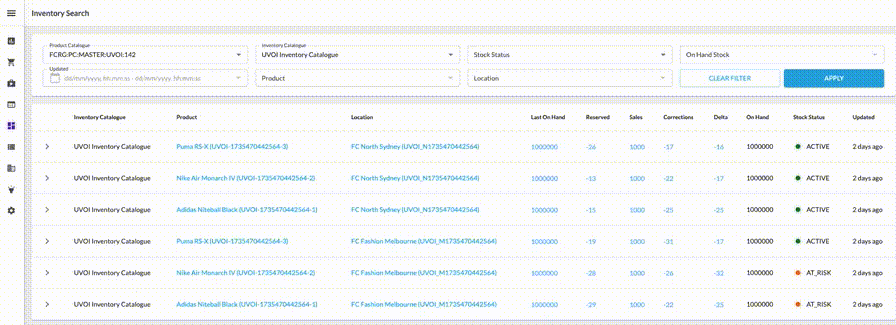
Once configured, the filter panel will display all available default fields based on the page query or custom query.Exclude Unnecessary Fields
If you see fields that you don’t need, exclude them by adding their names to the
`exclude` property: `"exclude": ["createdon", "ref", "type", "onhand"]`.Customize Fields Using Overrides
Using the
`overrides` property, you can change the type, label, default values, or field order. Additionally, you can enable multi-select functionality for dropdowns, populate dropdown options dynamically, and customize the behavior of filters on the filter panel to align with specific business requirementsFor more details on `overrides`, refer to the Component description.Format Filter Data with inputTemplate and outputTemplate
Use
`outputTemplate` to define how filter values are formatted before being sent to the backend. This is especially important when the backend expects structured data, like objects or arrays, instead of plain strings.`inputTemplate` does the reverse—it transforms values from the URL or default values into a shape that the field understands when loading or refreshing the page.Configure Default Values Using Settings
Add settings as follows to define default values for fields.
