Select Field Component
UI Component
Changed on:
11 Aug 2025
Overview
The Select Component is a field component designed for use in any form. It allows users to view a list of options as a drop-down regardless of the number of items in the list. This sets it apart from the field, which displays a drop-down only when the list contains more than three items; otherwise, it switches to a radio button group. The component supports flexible value sourcing. It can retrieve options either via a query, from a predefined setting, or from a manifest.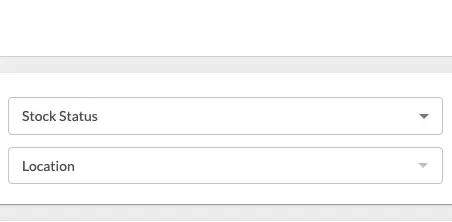
| Plugin Name | Core |
|---|
Alias
select
Detailed technical description
The Select Component supports three primary methods for retrieving options:Additional Information
- Query: Fetches options dynamically using a GraphQL query.
1{
2    "component": "select",
3    "props": {
4        "extensions": {
5            "queryValues": {
6                "query": "...",
7                "variables": {
8                    "retailerRefs": "{{activeRetailer.ref}}"
9                },
10                "label": "{{node.name}}",
11                "value": "{{node.ref}}",
12            }
13        }
14    },
15},- Setting: Loads options from a predefined setting.
1{
2    "component": "select",
3    "props": {
4        "extensions": {
5            "source": "fc.mystique.inventory.search.inventory.position.stock.statuses"
6        }
7    },
8},- Manifest: Extracts options from the component’s manifest file.
1{
2    "component": "select",
3    "props": {
4        "options":[
5            {
6                "label":"ACTIVE",
7                "value":"ACTIVE"
8            },
9            {
10                "label":"INACTIVE",
11                "value":"INACTIVE"
12            }
13        ],
14    }
15},1"overrides": {
2 "status": {
3 "extensions": {
4 "hideDefaultValue": true,
5 "source": "fc.mystique.inventory.search.inventory.position.stock.statuses"
6 }
7 },
8},Properties
| Name | Type | Required | Default Value | Description |
| label | `string` | No | None | The label that will be displayed on the field. |
| defaultValue | `string` | No | None | The default value for the field. |
| options | `Options` | No | None | Defines the available options for the dropdown. |
| extensions | `Extensions` | No | None | Allows additional customization through extra properties. |
Extensions
| Name | Type | Required | Default Value | Description |
| hideDefaultValue | `boolean` | No | `false` | If enabled, it displays the field with no preselected options. |
| source | `string` | No | None | Defines the name of the JSON setting that specifies the available options for the component. The structure of the JSON can vary based on the required format.Example Configurations:Basic List: A simple array of values for straightforward use cases.`["value1","value2"]`Options with Labels: Suitable for components that need both a display label and a corresponding value.`[``{"label":"Label 1","value":"value1"},``{"label":"Label 2","value":"value2"}``]`Custom Naming: Offers flexibility by using `name` instead of `label`. Ideal for unique naming conventions.`[``{"name":"name1","value":"value1"},``{"name":"name2","value":"value2"}``]` |
| queryValues | `QueryValues` | No | None | Defines parameters for retrieving options through a query. |
Options
| Name | Type | Required | Default Value | Description |
| name | `string` | No | None | The display name of the option in the dropdown. Defaults to `value` if omitted. |
| value | `string/number/boolean/object` | Yes | None | The required value associated with the option. |
QueryValues
| Name | Type | Required | Default Value | Description |
`query` | string | Yes | None | The GraphQL query used to retrieve the options. |
`variables` | object | No | None | Variables used in the query. |
`label` | string | No | None | Path to extract the labels from the query. |
`value` | string | No | None | Path to extract the values from the query. |
Configuration example
1{
2    "component": "select",
3    "props": {
4        "label": "Product catalogue",
5        "defaultValue": "DEFAULT:1",
6        "extensions": {
7            "queryValues": {
8                "query": "query productCatalogues($retailerRefs: [[String]]) {\n  productCatalogues(retailerRefs: $retailerRefs) {\n    edges {\n      node {\n        ref\n      }\n    }\n  }\n}\n",
9                "variables": {
10                    "retailerRefs": "{{activeRetailer.ref}}"
11                },
12                "label": "{{node.name}}",
13                "value": "{{node.ref}}"
14            }
15        }
16    }
17}Version History
Recommended Placement
The Select Component is ideal for use in forms as an additional field type. It can also be configured to replace existing radio button groups with dropdown menus for improved usability and a more compact UI.