Multi-Value Search Component
UI Component
Changed on:
1 Oct 2025
Overview
The Multi-Value Search Component enables flexible entry and management of multiple values in a single field by converting inputs into chips while removing duplicates and ignoring invalid entries. It supports two search modes: Context Search (default, partial matches) and Exact Search (`exactSearch: true`, strict case-sensitive matching). The output format is configurable via the `type` property, returning either an array of strings (`text`, default) or an array of numbers (`number`).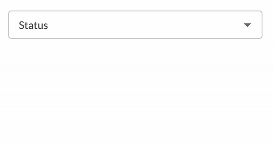
| Plugin Name | Core |
|---|
Alias
fc.field.multistring
Detailed technical description
The Multi-Value Search Component includes an input field that allows users to enter free-text values, dynamically converting them into chips. It prevents duplicate values and supports two search modes: Context Search (default) and Exact Search (optional, configurable via
`exactSearch`).Clicking the input activates the component, allowing users to enter values and interact with the following elements:- Chip Display Area:
- Displays selected values as individual chips.
- Automatically removes duplicate entries.
- Trims leading and trailing spaces from input values.
- Ignores empty strings, preventing them from being added.
- Supports the
`visibleItemsThreshold`property to limit displayed chips before collapsing excess into a dropdown.
- Search Mode Selection (Configurable Property):
- Context Search (default): Matches input within existing values.
- Exact Search (
`exactSearch: true`): Enforces strict, case-sensitive matching.
- Data Type Handling (Type Property):
- Defines the output format of the component.
- When
`type = text`(default) → component output is an array of strings. - When
`type = number`→ component output is an array of numbers, ensuring proper type conversion and validation for numeric-only values. - Invalid inputs (e.g., non-numeric strings when
`type = number`) are automatically rejected, preserving data integrity.
- Button Block:
- Clear: Removes all selected values.
- Cancel: Restores the initial values and closes the input field.
- Apply: Confirms the entered values and finalizes selection.
Properties
| Name | Type | Required | Default Value | Description |
| exactSearch | `boolean` | No | `false` | Defines search behavior. When set to `true`, the component enforces exact, case-sensitive matching for search terms. When `false` (default), it allows partial matches (context search). |
| visibleItemsThreshold | `number` | No | 2 | Specifies the minimum number of items to display in the input as a positive integer. |
| type | `text | number` | No | `text` | Determines the output format of the component: • `text` → returns an array of strings • `number` → returns an array of numbers |
Configuration example
1{
2  "descendants": [
3    {
4      "component": "fc.filterPanel",
5      "props": {
6        "allowReadWriteUrlParams": true,
7        "overrides": {
8          "status": {
9            "component": "fc.field.multistring",
10            "label": "fc.gql.status.label",
11            "exactSearch": true,
12            "visibleItemsThreshold": 3
13          }
14        }
15      }
16    }
17  ]
18}Version History
See previous versions
2025-04-01
v1.0.0
Initial releaseRecommended Placement
The Multi-Value Search Component is best placed as part of a form or as a standalone filter for datasets.