Complex Filter Configuration: Tips and Techniques
How-to Guide
Author:
Yulia Andreyanova
Changed on:
12 Dec 2025
Key Points
- This guide offers step-by-step instructions for setting up and customizing the Complex Filter component to achieve precise and efficient data filtering.
- Learn how to set up data sources, use GraphQL queries, and display results easily with card components like Standard Card and Product Card.
- Discover how to customize fields by changing their types, adjusting the field order, and removing unnecessary ones to make the filter simple and effective for your needs.
Prerequisites
Steps
 Add the Component Skeleton to the Manifest
Begin by defining the structure for the
`fc.field.filterComplex` component in the manifest. Include properties for filters, queries, and configurations:Configure Data Source
Define the
`query` and `variables` to retrieve the desired data. This enables the component to fetch entities dynamically.Customize Fields
To refine the displayed data, unwanted fields can be excluded by adding their names to the
`exclude` property. The `overrides` property can be used to customize field types, labels, and order.Configure Wildcard Search Behavior for Complex Filter Fields
To control how text-based values (such as name, ref, city, etc.) are matched inside a Complex Filter modal, you can configure wildcard search behavior directly at the field level using the two-layer wildcard model.By applying the
`wildcardFilter` property inside a field’s override, you can fine-tune how filter input is translated into search patterns:`prefix: true`→ allow leading wildcard (`%value`)`postfix: true`→ allow trailing wildcard (`value%`)`prefix: false`&`postfix: false`→ exact match`undefined`→ treated as false (no wildcard)
- The
`wildcardFilter`property is evaluated before the account-level wildcard configuration. - Wildcard behavior applies only to the search input inside the Complex Filter modal.
Configure Selection Behavior
Control how users interact with the filter using the
`mode` and `selectionLimit` properties.The `mode` property controls how many items a user can select. When set to `single`, only one item can be chosen, and the selected value is returned as a string. When set to `multiple` (the default), users can select multiple items, and the output is returned as an array. The `selectionLimit` property, which only applies when `mode` is `multiple`, restricts the number of selectable items to a specified maximum (e.g., 5 means users can choose up to five items).Set Modal Size and Layout Columns
Use 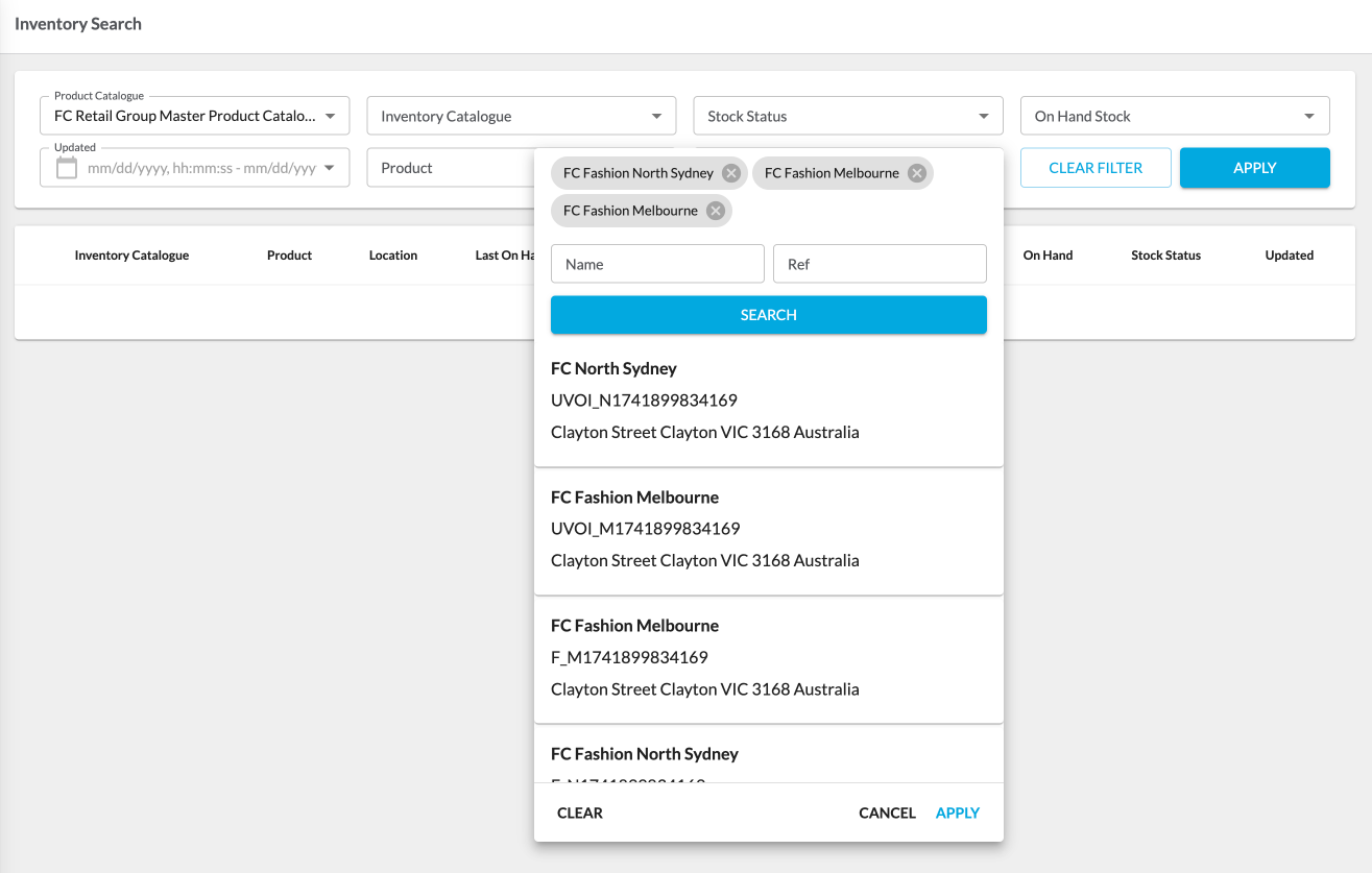
`modalDimension` and `displayColumns` to configure the filter modal layout.`modalDimension`: This controls the modal size. It accepts`small`(the default) or`medium`. This is useful when you expect longer labels or want more visual breathing room.`displayColumns`: This setting defines the number of columns for the field layout. Set it to`2`or`3`to group more fields horizontally, making better use of screen space.
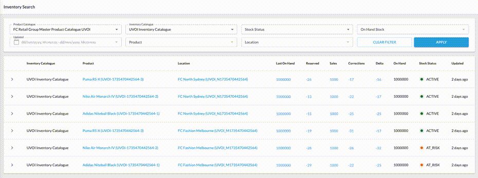
Display Search Results
Choose between the fc.card.product or fc.card.attribute components to visualize search results. Configure how results are presented using the
`searchItemConfig` property.Configure Selected Items Display
Use the
`chipItemConfig` property to define how selected items are displayed in the filter’s modal window. This configuration can include additional query and variable properties to specify a GraphQL query for preselected items. For instance, the filter panel might supply a list of references already selected without opening the complex filter. If these properties are not defined, the main query will be used by default.Handle Selected Values
When items are selected and the modal window is closed, the chosen values are displayed in the main input field according to the
`chipItemConfig` property. This behavior is managed through `onChangeValues`.The `onChangeValues` property defines how selected values are mapped to query variables, ensuring that the correct data is sent to the backend when filters are applied.The `outputTemplate` property specifies how a field’s value is transformed before being passed to the backend. It is required when the backend expects a format other than a simple string or array of strings, such as an object or an array of objects. This mechanism ensures compatibility with backend requirements and removes the need for additional client-side transformation logic.Full Configuration Example
Below is a comprehensive example of the fully configured
`fc.field.filterComplex` component: