Major Usability Improvements & Bug Fix to the UX Framework 2022-08-09
Release
Author:
Fluent Commerce
Changed on:
18 Mar 2024
| Target release date: | 2022-08-09 |
|---|---|
| Release status: | Released |
Description
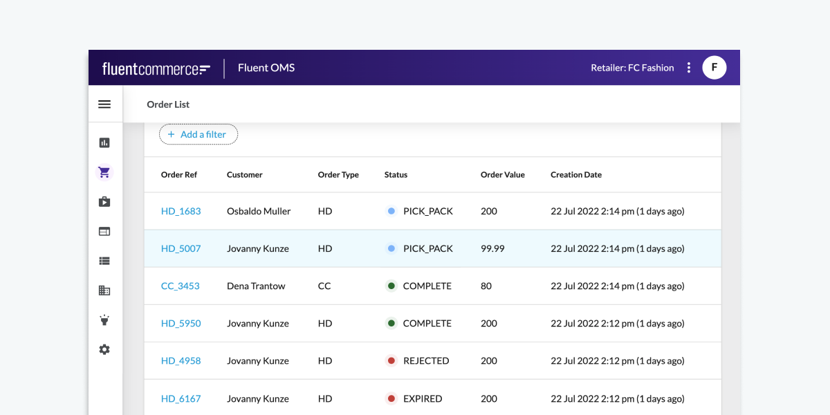
UX Framework Usability Improvements:Quickly identify an Order’s Status with Colored Status Dots- The status of an order can now be indicated with a colored Status Dot, allowing users to quickly identify where an order is in its workflow or when issues arise. Colored dots can be added into any cell for the attribute column component, allowing you to extend beyond just an order status.
- 📖 Read an overview of colored dots and configure them to your needs.
- To simplify event analysis, Word Wrapping is added for Event Details in the Event Drawer Component. Lengthy JSON messages will be split into multiple lines and accurately displayed in the drawer.
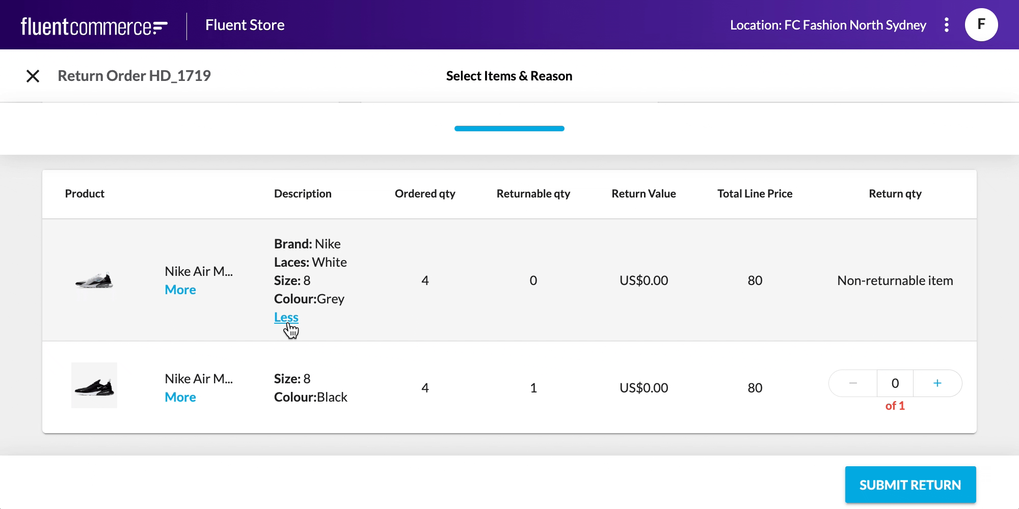
- The Wizard Component can now be configured to display summary information, enabling real-time feedback to the user as they interact with a form. For example, the expected refund amount on the return wizard will update dynamically as items are added or removed.
- Collapsible Text and Entity Attribute components allow you to improve the readability and reduce unnecessary information displayed to the end user in Fluent Web Apps. Both components are designed to work anywhere you typically show text-based content such as lists and cards.
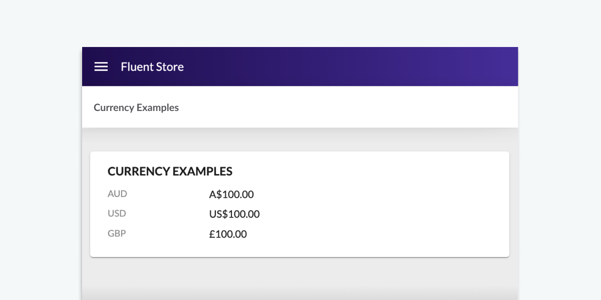
- Numbers now support Currency Formats improving readability for end users. For example, present total return refund amounts in USD to two decimal places.
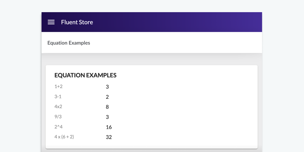
- You can now perform equations on numbers. Add, subtract, divide, and multiply numbers together to display relevant information to the end user. For example, calculate and display a total refund value by summing up all of the items selected by a user and their respective prices.
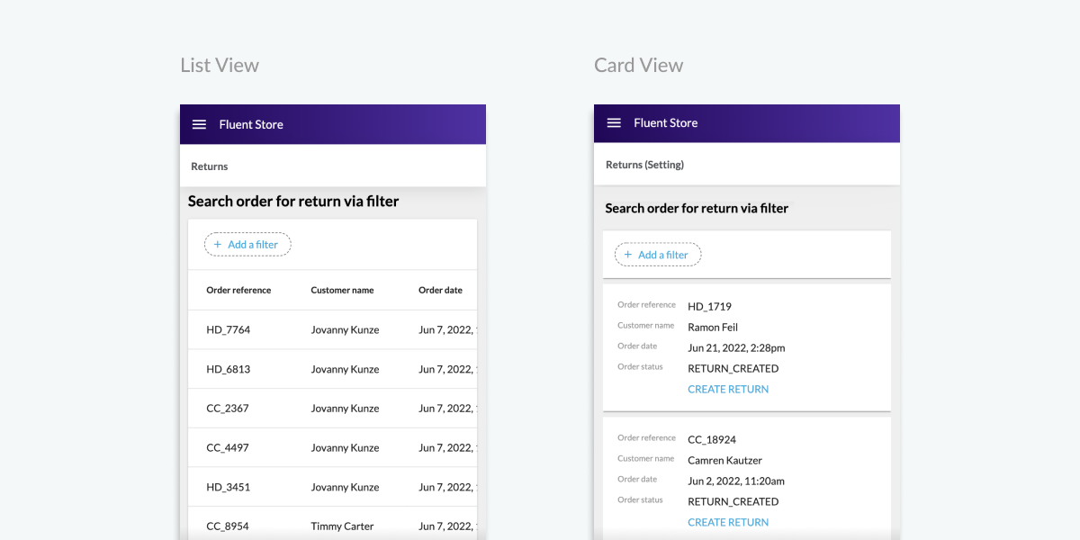
- The List Component can now be configured to switch from a table view to a series of cards on mobile devices.
- The card shows the same columns as the table version but avoids the need to scroll horizontally. This can be paired with the "hideBelow" and "hideAbove" attribute configurations to create tailored experiences that work on both mobile and desktop.
- When creating and editing a JSON setting, the JSON Value Field with JSON editor will now be displayed automatically.
- 📄 Create and Edit Settings with the new “condition” parameter in the page component.
Bug Fix:List Component
- An issue that occasionally caused columns to appear twice in the List Component has been fixed.
Changelog
Details as listed above.Screenshots

| Released capability depth: | Enhancement, Fix |
|---|---|
| Release bundle / Capability type: | Platform |