Collapsible Attributes Component
UI Component
Changed on:
4 July 2024
Overview
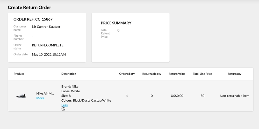
Collapsible Entity Attributes is a component that can be used to improve the user experience when interacting with a lot of attributes. It has the ability to:- Display these attributes on one line separated by commas
- Display these attributes line by line.
- Collapse and expand based on the number of characters (for one-line)
- Collapse and expand based on the number of lines (for line-by-line).
| Plugin Name | Core |
|---|
Alias
fc.mystique.collapsible.attributes
Detailed technical description
Usage
The data must start at an array of attributes or a connection of attributes. To enable this, use the`dataSource` property to map the base page query to the specific attributes that you want this component to display. For example in the sample below the `dataSource` is mapped to `node.product.attributes`Properties
| Name | Type | Required | Default | Description |
`collapseOn` | `'characters' | 'lines'` | No | `lines` | `collapseOn` controls both how the component displays and how the collapseLimit cutoff property works. Possible values are `characters` and `lines`. When set to 'characters' each attribute is shown as a comma-separated list. When set to 'lines' each attribute is shown on an individual line. |
`collapseLimit` | `number` | Yes | `collapseLimit` defines the cutoff value for when the string is truncated. When `collapseOn=characters` this cutoff represents the number of characters to display before truncation. When `collapseOn=lines`, this cutoff value represents the number of lines to display before truncation Characters/Lines past that exceeds the `collapseLimit` value will not display until the more button is clicked on. | |
`hideKeys` | `boolean` | No | `false` | By default, the component shows each attribute as “Name: value”. To hide the name, set this property equal to `true`. |
`exclude` | `string[]` | No | An optional array specifying attributes to hide. The values should be the attribute name. |
Configuration example
1        {
2            "label": "i18n:fc.sf.ui.returns.orders.createReturnOrder.list.column.description.label",
3            "type": "component",
4            "options": {
5                "component": "fc.mystique.collapsible.attributes",
6                "dataSource": "node.product.attributes",
7                "props": {
8                    "exclude": [
9                        "imageUrl",
10                        "imageUrlRef"
11                    ],
12                    "collapseOn": "",
13                    "collapseLimit": 10,
14                    "hideKeys": true
15                }
16            }
17 }Version History
Recommended Placement
List