Event Details Drawer Component
UI Component
Changed on:
19 Jan 2024
Overview
This new component adds a drawer functionality to event searching, when a user clicks on an event it will now open a drawer with the event details instead of navigating to another page. This allows users not to lose search results and stop waiting for page navigation while going back and forth between the list of events. Learn more about the functionality of this component below.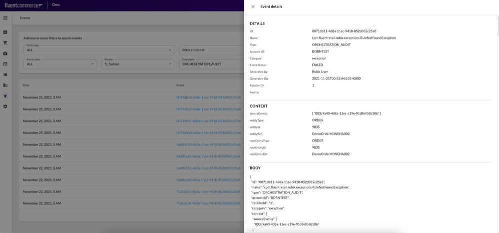
| Plugin Name | OMS |
|---|
Alias
fc.event.detail
Detailed technical description
The drawer functionality is a part of the SDK, so the on-click function for the table rows is:
1const EventComp = ComponentRegistry.get('fc.event.detail');
2pushDrawer({
3  title: event.name,
4  body: <EventComp data={event} />
5}); `fc.event.detail` is a new component that renders the keys and values of the `data` object in the same manner and style as `fc.card.attribute` (but without a card). It is used as the onClick function of `fc.events.search` component.Data source: Whole event body JSON.Event Drawer block
The drawer consists of:- A header block: The header block contains:
- Event details (header)
- Icon “Close”
- Details block: The Details block contains:
- ID
- Name
- Type
- Account ID
- Category
- Event Status
- Generated By
- Generated On
- Retailer ID
- Source
- Context block: The Context block contains:
- sourceEvents
- entityType
- entityId
- entityRef
- rootEntityType
- rootEntityId
- rootEntityRef
- Body block: The Body block contains raw JSON data
Properties
| Name | Type | Required | Default | Description |
`width` | quarter / third / half / two-thirds / full / number (1-12) | ❌ | full | Define the width of this component on a 12-column grid. Can use the named widths for readability or numbers directly. On mobile devices all widths will automatically change to 12 for the best responsive experience. Default is "full" and will take up the full width of the containing component |
Version History
Recommended Placement
None