Add colours to statuses to highlight important information
Essential knowledge
Author:
Fluent Commerce
Changed on:
16 May 2024
Overview
This document provides an overview of enhancing visual representation within a system by displaying coloured dots. These dots serve as a quick reference to different statuses of orders or items, making it easier to recognize and prioritize tasks at a glance. You will learn how to customize the appearance of these dots by changing their colour through hex codes and understand the default settings. The guide also includes recommendations for a colour palette to optimize the utility of status indicators.Key points
- Feature Benefits: Utilize colourful dots to easily identify and prioritize different statuses.
- Status Color Palette: Use recommended hex codes to customize dot colours for optimal status indication.
- Configuration Guide: Follow step-by-step instructions to implement coloured status dots in your system. notify and prioritize different statuses.
- Default Settings: The system defaults to a grey colour for statuses that are not configured, ensuring consistency across various status indicators.
- Customization: Hex codes allow for full customization of dot colours to match your company's branding or to signify specific statuses.
- Visual Prioritization: Assign colours to statuses based on the level of urgency or importance, aiding in quick decision-making.
- Colour System Best Practices: Refer to the detailed best practices in the Colour section to effectively apply theming and enhance user experience.
Feature Benefits
- Highlight your statuses with colourful dots to focus on what matters most.
- Configure Status Dots as you like by changing the hex code in settings.
- Default grey colour for non-configurable statuses to preserve the same structure if you want to skip a configuration for some values.
Status Color Palette
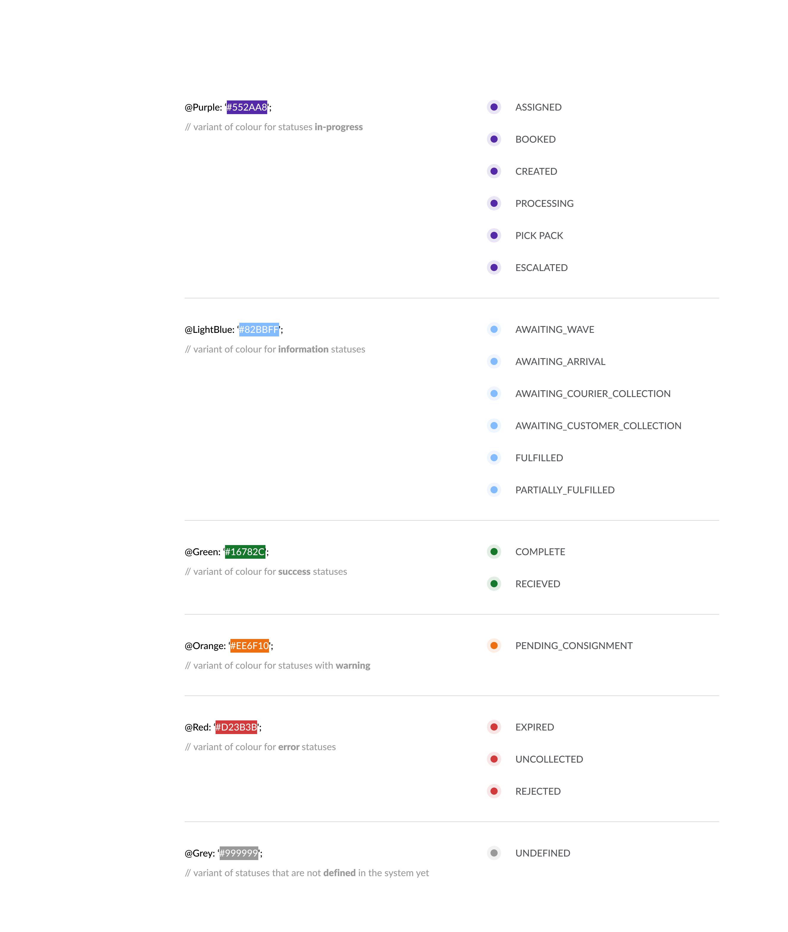
Recommended colours and their code values that can be used to highlight statuses are defined in the image below. We advise splitting status values according to the required attention. Green in the picture means that the order has been successfully processed and doesn’t require any urgent actions. Red can signal that the order needs attention.Detailed Colour system best practices and theming information are available in Colour. Follow the Configuration Guide to add the functionality.