UI Components Update: Filters, Context, and Usability
Release
Author:
Yulia Andreyanova
Changed on:
5 Sept 2025
| Target release date: | 2025-06-10 |
|---|---|
| Release status: | Released |
Description
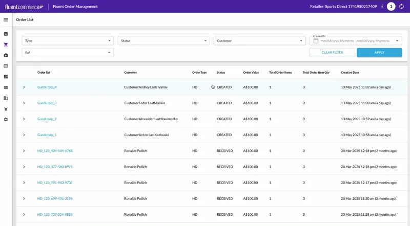
This release introduces several usability and layout enhancements for filter components, extended configuration options, and improved label rendering and data templating behavior.The Complex Filter Component now supports two new properties—`modalDimension` and `displayColumns`—for better control over modal layout and visibility.The Filter Panel Component has been enhanced to support more complex output templates. It now allows values from multiple filters to be composed into a single query variable. Filters like "Customer First Name" and "Customer Last Name" can now map to nested structures in query variables (e.g., `customer.firstName`, `customer.lastName`). Additionally, the component now correctly renders labels defined in the manifest, even when translations are not available.Usability improvements have also been made across filters: predefined filter options will now always display as checkboxes, ensuring a consistent and intuitive multi-select experience.The Page Query Decorator has been extended to propagate active context through nested components, enabling dynamic behavior and improved query templating across the page. Read more about contextual inheritance in nested components here.We've also addressed several user experience issues:- Copy icons are now supported on lists and cards via a new
`enableCopyIcon`property, providing a fast and intuitive way to copy text values. Users can also select and copy text from list cells without triggering accidental navigation. - The Multi-Value Search Component has been improved to better reflect the filter state when cleared and now supports both the Enter key and the Apply button for setting values.
- A label translation issue affecting shared date fields (e.g., in BPP Metrics Dashboard and IPU/IPC reports) was fixed, ensuring localized display of "(UTC)" text across supported languages.
Changelog
- Variant Product Activation & Deactivation Improvements:
- Activation and deactivation actions for variant products are now available out of the box in the Fluent OMS and Fluent Big Inventory Web Apps, requiring no additional configuration.
- Extended Complex Filter Component:
- New property
`modalDimension`:`small `(default): Keeps existing modal size.`medium`: Enlarges modal height and width for better field visibility.
- Added property
`displayColumns`: Accepts a number (default:`1`) to define how many columns are shown in the modal layout. - A pointer cursor was added for all clickable filter items to provide consistent UX cues.
- New property
- Standardised Multi-Select UI:
- Predefined filters (e.g.,
`fc.filter.status`,`fc.filter.order.tag1`) now consistently use checkboxes for multi-select, regardless of the number of options available. - The logic that previously toggled between radio buttons and dropdowns based on the option count was removed.
- Predefined filters (e.g.,
- Filter Panel Enhancements:
- Complex variable support:
- Filters can map to structured fields. Nested values are supported via field filters and rendered as structured variables:
`{"customer": {"firstName": ["%Ron%"],"lastName": "%Poll%"}}`
- Filters can map to structured fields. Nested values are supported via field filters and rendered as structured variables:
- Extended template context:
- The
`outputTemplate`can now reference multiple values across filters within the same panel and enable complex outputs like:`"outputTemplate": "{\"ref\": \"{{value}}\", \"catalogue\": {\"ref\": \"{{values.catalogue}}\"}}"`.
- The
- Non-translatable label support:
- Labels defined in the manifest are now displayed even when translations are missing.
- Complex variable support:
- List Component Improvements:
- The
`fc.list`component now distinguishes between text selection and intentional clicks. - Users can select and copy text from list cells without triggering navigation.
- The
- The new
`enableCopyIcon`property is on the`fc.list`and`fc.card.attribute`:`displayOnHover`– shows icon on hover (desktop only);`displayAlways`– icon is always visible.
- Improvements to Multi-Value Search Interaction:
- The Multi-Value Search Component (
`fc.field.multistring`) now correctly clears its visible values when the Filter Panel’s Clear button is used. This prevents confusion and keeps the visual state aligned with the actual filter state. - Previously, users had to press Enter to add a value and then click Apply to apply it. Now, just clicking the Apply button is enough—the value is added and the filter is applied simultaneously. This eliminates the need for an extra click and streamlines the filtering process.
- The Multi-Value Search Component (
- Page-level context is now passed down to all nested components
- Shared data includes:
`activeUser`,`activeRetailer`,`activeLocation`,`activeContext`, etc.
- Allows Template Strings (e.g.,
`{{activeContext.id}}`) to dynamically populate variables; - Improved proxy fallback logic when the primary context is unavailable.
- Shared data includes:
- Translation Fix:
- Fixed an issue where the label
`Date/time from and to (UTC)`was missing the (UTC) suffix in some languages.
- Fixed an issue where the label
Screenshot
| Released capability depth: | Enhancement, Fix, New capability |
|---|---|
| Release bundle / Capability type: | Web apps |
