Fluent Commerce Logo
Docs
Sign In

Using the Setting Form Component

How-to Guide

Author:

Christopher Tse

Changed on:

14 Oct 2024

Key Points

  • This page will guide you through placing the Setting Form Component on a page and customizing it for use by a business user. Key topics covered include:
    • Adding the component to a page
    • Using the component within an Accordion component
    • Generating a schema for a setting
    • Adding titles to individual fields
    • Using the component with custom fields

Steps

Step arrow right iconYou will need:

  • A setting of any type (Other than LOB)
  • A web app page where you want to add the setting

Step arrow right iconStep 1 - Generating a schema for the setting

To generate a schema for your setting, we recommend using an online tool that converts JSON into a JSON schema. You can retrieve an example here.

Here’s how to use it:

  • Copy and paste an example setting into the tool.
  • The tool will generate the schema for the setting.

Once you have the schema, store it as its own setting. The setting type should be JSON, and we recommend storing it at the account level to ensure global accessibility.

Example:

Let’s use the RETURN_REASON setting as an example. This setting is made up of label-value pairs, represented in schema terms as an array of objects. Each object contains two strings: one for the label and one for the value. Using a JSON schema converter, you should expect a schema that looks something like this:

1{
2  "$schema": "http://json-schema.org/draft-07/schema#",
3  "title": "Generated schema for Root",
4  "type": "array",
5  "items": {
6    "type": "object",
7    "properties": {
8      "label": {
9        "type": "string"
10      },
11      "value": {
12        "type": "string"
13      }
14    },
15    "required": [
16      "label",
17      "value"
18    ]
19  }
20}

Language: json

Name: Sample JSON schema

Description:

[Warning: empty required content area]

As explained above, you can now take the generated schema and create a new setting with the following details:

Name

RETURN_REASON_SCHEMA

Context

ACCOUNT

Context ID

0

Type

JSON

Value

{{schema from above}}

Step arrow right iconStep 2 - Adding titles to each field

In the schema, you can assign titles to each field using the

`title`
property. The value in the
`title`
property is passed to the field's
`label`
property, which controls how the title is displayed.

Depending on the JSON schema generator you used, titles may already be present in your schema. In this example, only the top-level title was added initially, but we also need titles for the

`label`
and
`value`
fields. Titles for
`object`
types can be skipped, as they do not require labels. Here's an example:

1{
2    "title": "Return Reasons",
3    "type": "array",
4    "items": {
5        "type": "object",
6        "properties": {
7            "label": {
8                "title": "Label",
9                "type": "string"
10            },
11            "value": {
12                "title": "Value",
13                "type": "string"
14            }
15        }
16    }
17}

Language: json

Name: Modified Schema

Description:

[Warning: empty required content area]

(Note: i18n strings are currently not supported)

For schemas that already include titles, you can use this step to update them with more appropriate labels. Ensure that each field has a clear and descriptive title.

We will later demonstrate how these titles are reflected in the settings component when we review how it is laid out on a page.

Step arrow right iconStep 3 - Adding the Settings Component onto a Page

To add the settings component to a page, you need to open the manifest fragment for that page. 

In this example, we will incorporate the return reason setting into a new tab called Settings under the Retailer detail page in OMS.

The retailer page is located in the

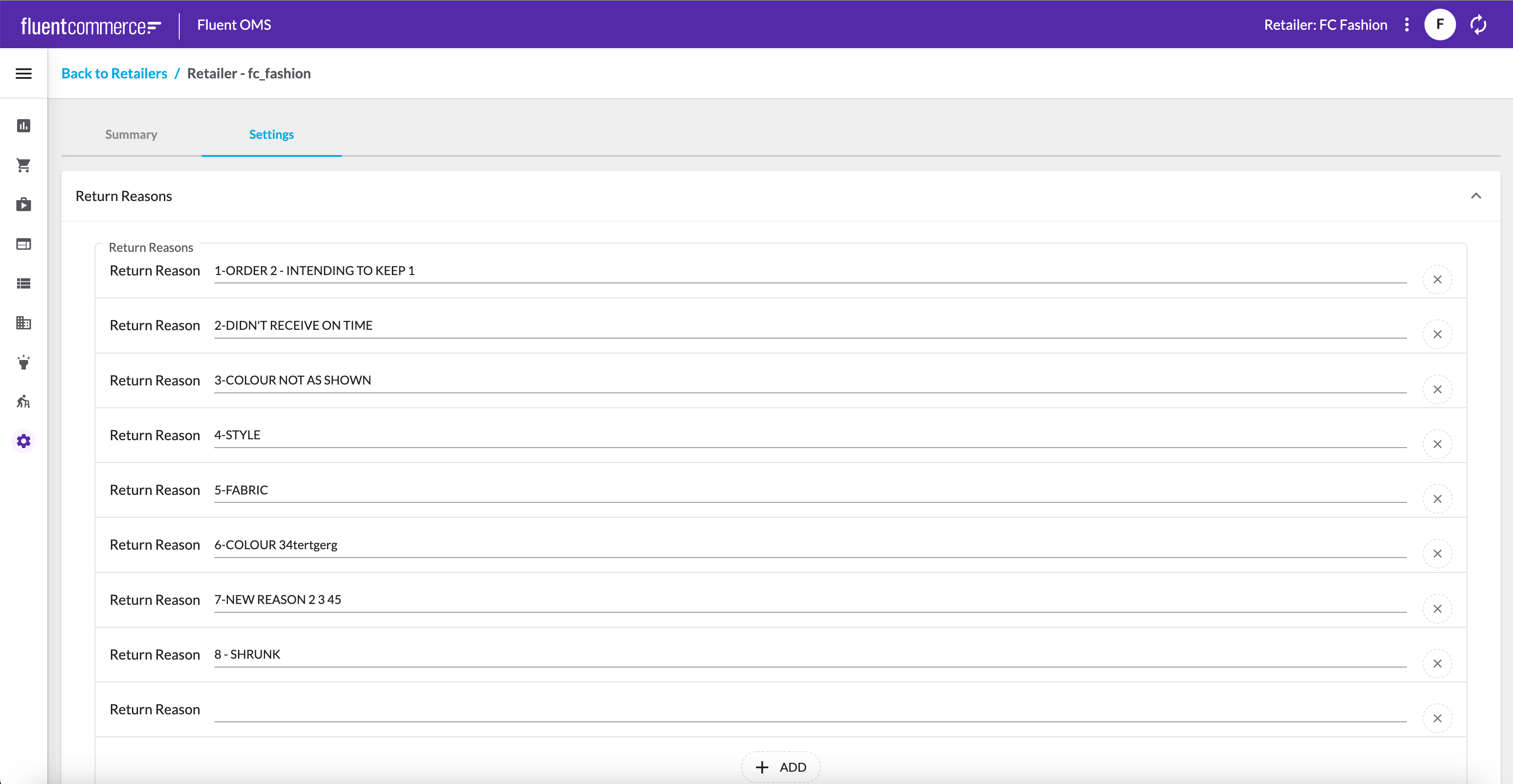
`fc.mystique.manifest.oms.fragment.admin`
setting. Since this doesn't exist by default, first retrieve the default manifest by referring to this guide

Once you’ve created the setting, the next step is to edit the Retailer details page to split it into two tabs. The first tab will be named Details and will retain the existing layout currently defined in the manifest. The second tab, called Settings, will host the new component for editing the return reasons.

1{
2  "path": "retailers/:id",
3  "type": "page",
4  "component": "fc.page",
5  "data": {
6    "query": "query ($id: ID!) {  retailerById(id: $id) {    id    ref    tradingName    createdOn    websiteUrlName    websiteUrl    supportContactName    supportEmail    primaryEmail    supportPhone    summary    updatedOn  }}",
7    "variables": {
8      "id": "{{params.id}}"
9    }
10  },
11  "props": {
12    "title": "Retailer - {{retailerById.ref}}",
13    "backButtons": [
14      {
15        "path": "retailers",
16        "menuLabel": "i18n:fc.admin.retailers.detail.breadcrumb.backToRetailers"
17      }
18    ]
19  },
20  "descendants": [
21    {
22      "component": "fc.tabs",
23      "props": {
24        "layouts": [
25          {
26            "label": "Summary"
27          },
28          {
29            "label": "Settings"
30          }
31        ]
32      },
33      "descendants": [
34        {
35          "component": "fc.page.section",
36          "descendants": [
37            {
38              "component": "fc.card.attribute",
39              "props": {
40                "title": "i18n:fc.admin.retailers.detail.card.summary.title",
41                "width": "half",
42                "dataSource": "retailerById",
43                "attributes": [
44                  {
45                    "label": "i18n:fc.admin.retailers.detail.card.summary.attribute.id.label",
46                    "template": "{{id}}"
47                  },
48                  {
49                    "label": "i18n:fc.admin.retailers.detail.card.summary.attribute.ref.label",
50                    "template": "{{ref}}"
51                  },
52                  {
53                    "label": "i18n:fc.admin.retailers.detail.card.summary.attribute.creationDate.label",
54                    "template": "{{dateStringFormatter createdOn}} ({{dateRelative createdOn}})"
55                  },
56                  {
57                    "label": "i18n:fc.admin.retailers.detail.card.summary.attribute.updatedDate.label",
58                    "template": "{{dateStringFormatter updatedOn}} ({{dateRelative updatedOn}})"
59                  }
60                ]
61              }
62            },
63            {
64              "component": "fc.card.attribute",
65              "props": {
66                "title": "i18n:fc.admin.retailers.detail.card.details.title",
67                "width": "half",
68                "dataSource": "retailerById",
69                "attributes": [
70                  {
71                    "label": "i18n:fc.admin.retailers.detail.card.details.attribute.tradingName.label",
72                    "template": "{{tradingName}}"
73                  },
74                  {
75                    "label": "i18n:fc.admin.retailers.detail.card.details.attribute.websiteUrl.label",
76                    "template": "{{websiteUrl}}",
77                    "link_template": "{{websiteUrl}}",
78                    "condition": "{{and websiteUrl}}"
79                  },
80                  {
81                    "label": "i18n:fc.admin.retailers.detail.card.details.attribute.supportPhone.label",
82                    "template": "{{supportPhone}}"
83                  },
84                  {
85                    "label": "i18n:fc.admin.retailers.detail.card.details.attribute.supportEmail.label",
86                    "template": "{{supportEmail}}"
87                  }
88                ]
89              }
90            }
91          ]
92        },
93        {
94          "component": "fc.page.section",
95          "descendants": [
96            {
97              "component": "fc.settingForm",
98              "props": {
99                "context": "RETAILER",
100                "contextId": "1",
101                "setting": "RETURN_REASON",
102                "schema": "RETURN_REASON_SCHEMA"
103              }
104            }
105          ]
106        }
107      ]
108    }
109  ]
110}

Language: json

Name: Manifest Snippet

Description:

[Warning: empty required content area]
No alt provided

Step arrow right iconStep 4 - Styling the Page

Now that you have added the settings component to the page, it doesn't look very appealing on its own, as it currently occupies the entire screen while the form only takes up about half of that space. To enhance the appearance, you can place the settings component within an Accordion Component, adjust its width, and use empty components to center the Accordion.

1{
2  "path": "retailers/:id",
3  "type": "page",
4  "component": "fc.page",
5  "data": {
6    "query": "query ($id: ID!) {  retailerById(id: $id) {    id    ref    tradingName    createdOn    websiteUrlName    websiteUrl    supportContactName    supportEmail    primaryEmail    supportPhone    summary    updatedOn  }}",
7    "variables": {
8      "id": "{{params.id}}"
9    }
10  },
11  "props": {
12    "title": "Retailer - {{retailerById.ref}}",
13    "backButtons": [
14      {
15        "path": "retailers",
16        "menuLabel": "i18n:fc.admin.retailers.detail.breadcrumb.backToRetailers"
17      }
18    ]
19  },
20  "descendants": [
21    {
22      "component": "fc.tabs",
23      "props": {
24        "layouts": [
25          {
26            "label": "Summary"
27          },
28          {
29            "label": "Settings"
30          }
31        ]
32      },
33      "descendants": [
34        {
35          "component": "fc.page.section",
36          "descendants": [
37            {
38              "component": "fc.card.attribute",
39              "props": {
40                "title": "i18n:fc.admin.retailers.detail.card.summary.title",
41                "width": "half",
42                "dataSource": "retailerById",
43                "attributes": [
44                  {
45                    "label": "i18n:fc.admin.retailers.detail.card.summary.attribute.id.label",
46                    "template": "{{id}}"
47                  },
48                  {
49                    "label": "i18n:fc.admin.retailers.detail.card.summary.attribute.ref.label",
50                    "template": "{{ref}}"
51                  },
52                  {
53                    "label": "i18n:fc.admin.retailers.detail.card.summary.attribute.creationDate.label",
54                    "template": "{{dateStringFormatter createdOn}} ({{dateRelative createdOn}})"
55                  },
56                  {
57                    "label": "i18n:fc.admin.retailers.detail.card.summary.attribute.updatedDate.label",
58                    "template": "{{dateStringFormatter updatedOn}} ({{dateRelative updatedOn}})"
59                  }
60                ]
61              }
62            },
63            {
64              "component": "fc.card.attribute",
65              "props": {
66                "title": "i18n:fc.admin.retailers.detail.card.details.title",
67                "width": "half",
68                "dataSource": "retailerById",
69                "attributes": [
70                  {
71                    "label": "i18n:fc.admin.retailers.detail.card.details.attribute.tradingName.label",
72                    "template": "{{tradingName}}"
73                  },
74                  {
75                    "label": "i18n:fc.admin.retailers.detail.card.details.attribute.websiteUrl.label",
76                    "template": "{{websiteUrl}}",
77                    "link_template": "{{websiteUrl}}",
78                    "condition": "{{and websiteUrl}}"
79                  },
80                  {
81                    "label": "i18n:fc.admin.retailers.detail.card.details.attribute.supportPhone.label",
82                    "template": "{{supportPhone}}"
83                  },
84                  {
85                    "label": "i18n:fc.admin.retailers.detail.card.details.attribute.supportEmail.label",
86                    "template": "{{supportEmail}}"
87                  }
88                ]
89              }
90            }
91          ]
92        },
93        {
94          "component": "fc.page.section",
95          "descendants": [
96            {
97              "component": "fc.page.section.column",
98              "props": {
99                "width": 2
100              }
101            },
102            {
103              "component": "fc.accordion",
104              "props": {
105                "width": 8,
106                "summary": "Return Reasons",
107                "details": {
108                  "direction": "column",
109                  "components": [
110                    {
111                      "component": "fc.settingForm",
112                      "props": {
113                        "context": "RETAILER",
114                        "contextId": "1",
115                        "setting": "RETURN_REASON",
116                        "schema": "RETURN_REASON_SCHEMA"
117                      }
118                    }
119                  ]
120                }
121              }
122            },
123            {
124              "component": "fc.page.section.column",
125              "props": {
126                "width": 2
127              }
128            }
129          ]
130        }
131      ]
132    }
133  ]
134}

Language: json

Name: Manifest Snippet

Description:

[Warning: empty required content area]

In the snippet above, we've enclosed the settings component in an Accordion with a width set to 8. Additionally, we've added empty column components on either side of the Accordion. This arrangement allows us to center the Accordion, resulting in a more aesthetically pleasing layout.

No alt provided

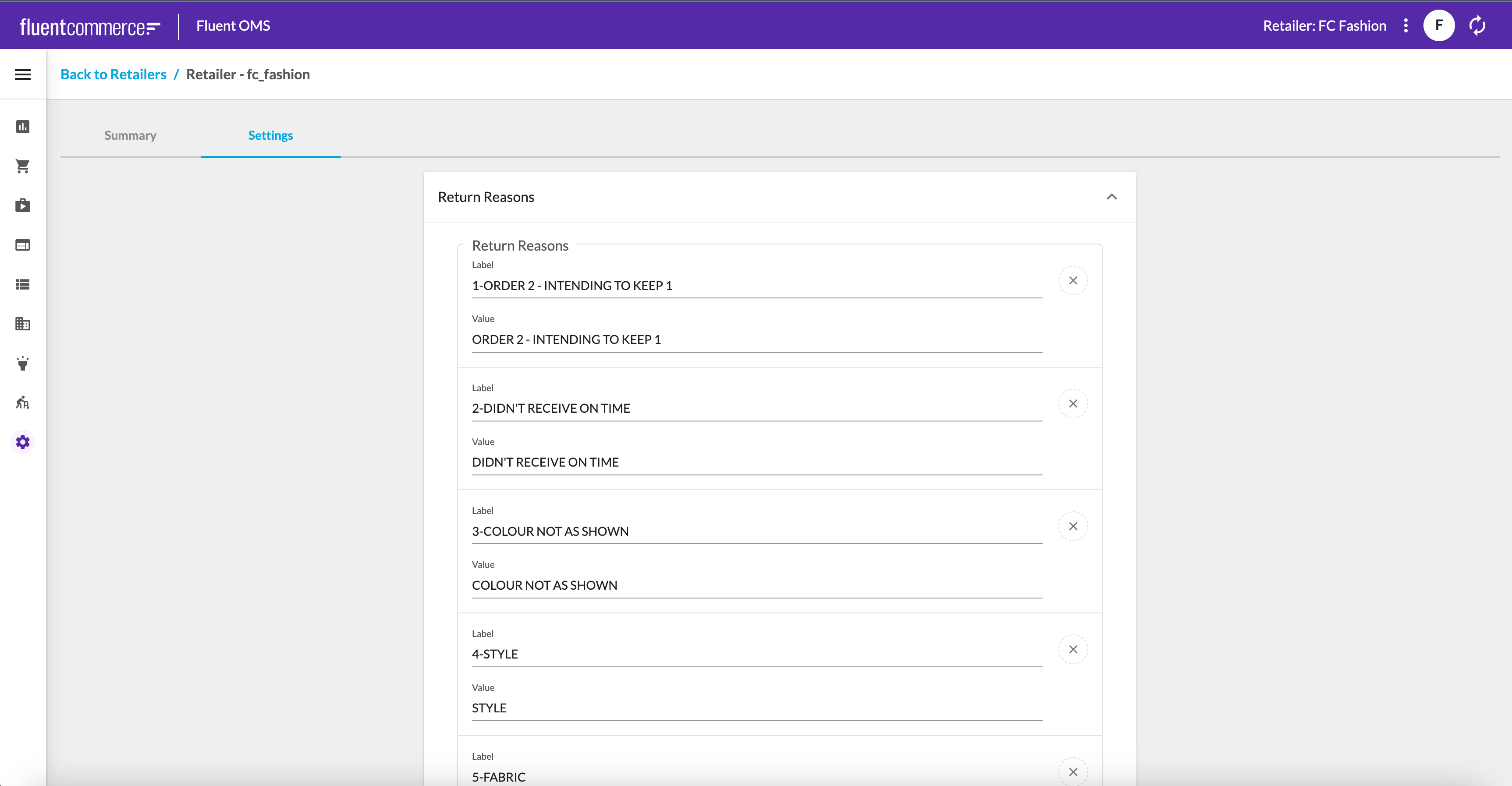
Now it looks much better.

Advanced

Step arrow right iconAdvanced - Using a Custom Component

At this point, the page is functional for business users to edit return reasons.

However, there's some room for improvement here. For example, there's the fact that return reasons consist of a label and a value. The setting structure was designed this way so that the dropdown label could be changed without changing the value sent to the backend. 

Since our audience are business users, they are primarily concerned with editing the label, which affects what is displayed in the dropdown menu. This raises the question: can we configure the form so that users only need to input the label, and the value auto-populates? The answer is yes, and we can achieve this by using a custom field.

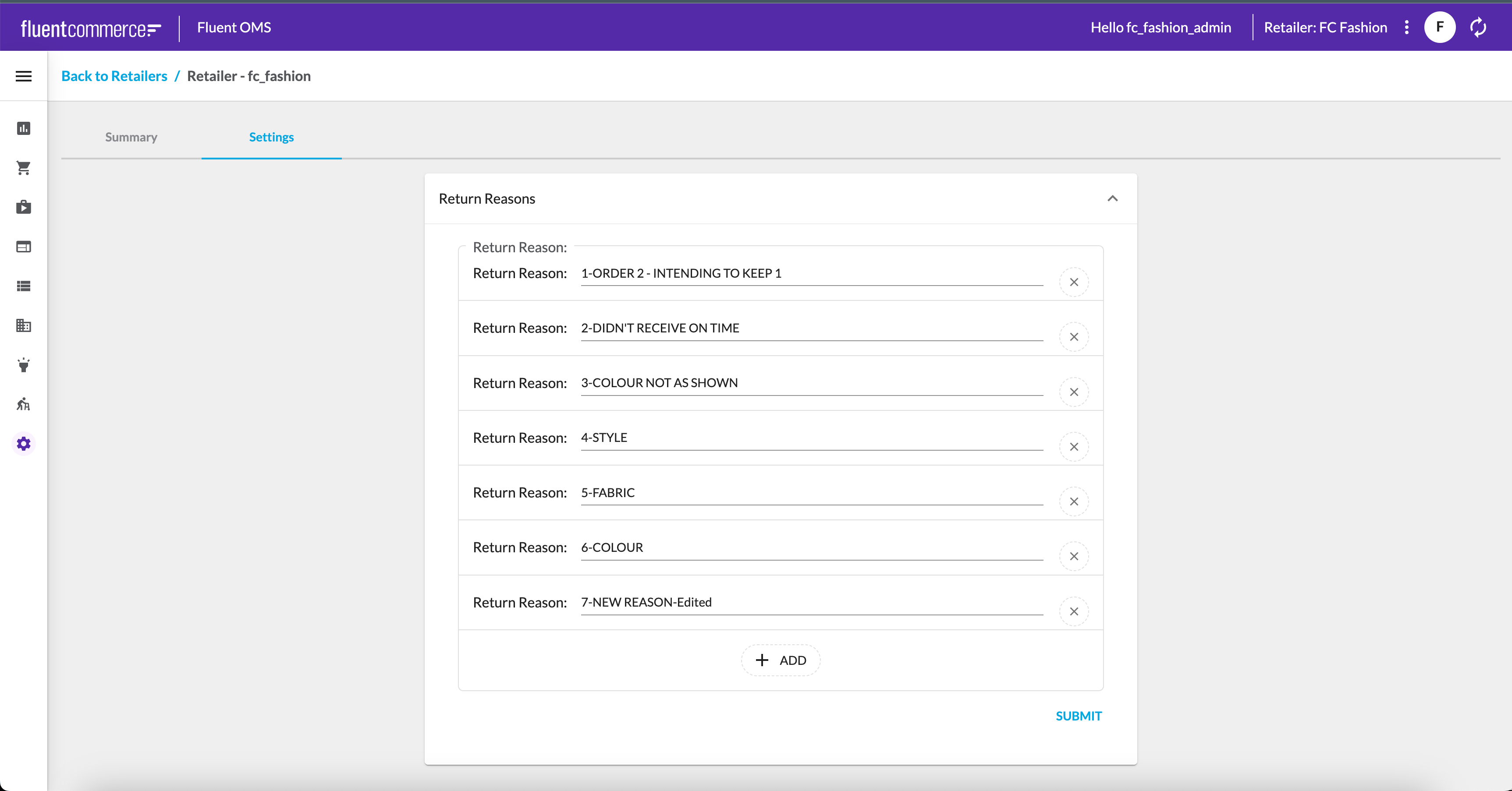
Setting Up the Custom Field:

1. Components SDK
First, ensure you have access to the Components SDK. If you don't already have it, you can download it from the Components SDK page.

2. Create the Custom Field
We will design a field that outputs a JSON object similar to the following:

1{
2    "label": "string",
3    "value": "string"
4}

Language: plain_text

Name: Contract for the Field's Output

Description:

[Warning: empty required content area]

You can use the following boilerplate code to get started on creating the new custom field:

1import { FormFieldProps } from 'mystique/registry/FieldRegistry';
2import { FC } from 'react';
3
4
5interface LabelValuePair {
6    label: string
7    value: string
8}
9
10export const LabelValuePairField : FC<FormFieldProps<LabelValuePair>> = ({onChange}) => {
11    
12  return <></>;
13};

Language: plain_text

Name: Basic Framework for the field

Description:

[Warning: empty required content area]

3. Register the Custom Field
To register this field in the field registry, add the following line to your

`index.tsx`
:

1FieldRegistry.register(['labelValuePair'], LabelValuePairField);

Language: plain_text

Name: Registering the field in index.html

Description:

[Warning: empty required content area]

4. Use the Custom Field in the Schema
Now you can utilize this custom field in your schema. To do this, add the

`fcField`
keyword to your items, which allows you to specify the field by its name in the
`name`
property. The updated schema will look like this:

1{
2    "$schema": "http://json-schema.org/draft-07/schema#",
3    "title": "Return Reasons",
4    "type": "array",
5    "items": {
6        "title": "Return Reason",
7        "type": "object",
8        "fcField": {
9            "name": "labelValuePair"
10        },
11        "properties": {
12            "label": {
13                "title": "Label",
14                "description": "Put the label you want the business user to see here",
15                "type": "string"
16            },
17            "value": {
18                "title": "Value",
19                "description": "The internal code for a reason. This should stay constant whiel thelabel can change.",
20                "type": "string"
21            }
22        }
23    }
24}

Language: json

Name: RETURN_REASON_SCHEMA

Description:

[Warning: empty required content area]

5. Add UI to Your Field
Let's add some UI to the field. You can use the label prop, which gets passed the value of the item's

`title`
from the schema. Then you can add a simple text field next to the label to capture the user's input to change or add a return reason.

1import { css } from '@emotion/react';
2import { Box, TextField } from '@material-ui/core';
3import { FormFieldProps } from 'mystique/registry/FieldRegistry';
4import { FC } from 'react';
5
6interface LabelValuePair {
7    label: string
8    value: string
9}
10
11export const LabelValuePairField : FC<FormFieldProps<LabelValuePair>> = ({label, onChange}) => {
12  const boxCss = css`
13    display: flex;
14    align-items: center;
15  `;
16  const textFieldCss = css`
17    padding-left: 16px;
18    flex-grow: 1;
19  `;
20
21  return <Box css={boxCss}>
22    {label} <TextField css={textFieldCss} />
23  </Box>;
24};

Language: typescript

Name: Field Code

Description:

[Warning: empty required content area]

6. Handle Value and Label Logic
Next, you need to pass both the label and value back to the form via the

`onChange`
method. The label will come from the text field, and you will also initialize the text field with the existing label value if it exists.

1import { css } from '@emotion/react';
2import { Box, TextField } from '@material-ui/core';
3import { FormFieldProps } from 'mystique/registry/FieldRegistry';
4import { FC } from 'react';
5
6interface LabelValuePair {
7    label: string
8    value: string
9}
10
11export const LabelValuePairField : FC<FormFieldProps<LabelValuePair>> = ({label, onChange, defaultValue}) => {
12  const boxCss = css`
13    display: flex;
14    align-items: center;
15  `;
16  const textFieldCss = css`
17    padding-left: 16px;
18    flex-grow: 1;
19  `;
20
21  const onTextChange = (e: React.ChangeEvent<HTMLTextAreaElement | HTMLInputElement>) => {
22    onChange({
23      label: e.target.value,
24      value: ''
25    });
26  };
27
28  return <Box css={boxCss}>
29    {label} <TextField css={textFieldCss} onChange={onTextChange} defaultValue={defaultValue?.label || ''}/>
30  </Box>;
31};

Language: typescript

Name: Code

Description:

[Warning: empty required content area]

7. Managing Value State
For the value, we want it to equal the label when creating a new entry, but it shouldn't change if we're editing an existing return reason. To achieve this, we'll use state to track whether the value should be the label or the previous value.

1import { css } from '@emotion/react';
2import { Box, TextField } from '@material-ui/core';
3import { FormFieldProps } from 'mystique/registry/FieldRegistry';
4import { FC, useState } from 'react';
5
6interface LabelValuePair {
7    label: string
8    value: string
9}
10
11export const LabelValuePairField : FC<FormFieldProps<LabelValuePair>> = ({label, onChange, defaultValue}) => {
12  const [value] = useState(defaultValue?.value);
13  const boxCss = css`
14    display: flex;
15    align-items: center;
16  `;
17  const textFieldCss = css`
18    padding-left: 16px;
19    flex-grow: 1;
20  `;
21
22  const onTextChange = (e: React.ChangeEvent<HTMLTextAreaElement | HTMLInputElement>) => {
23    onChange({
24      label: e.target.value,
25      value: value ? value : e.target.value,
26    });
27  };
28
29  return <Box css={boxCss}>
30    {label} <TextField css={textFieldCss} onChange={onTextChange} defaultValue={defaultValue?.label || ''}/>
31  </Box>;
32};

Language: typescript

Name: Code

Description:

[Warning: empty required content area]

Conclusion
By following these steps, you have created a custom field that simplifies the editing process for return reasons, allowing users to focus on changing the label while automatically managing the value. This approach enhances the usability of your form for business users, aligning the technical functionality with user-friendly design.

Feel free to expand or adjust this implementation based on user feedback or additional requirements!

No alt provided

Step arrow right iconAdvanced - Enhancing the Field with Custom Properties

We now have a custom field for return reasons that can be utilized wherever a label-value pair is needed, with the user only able to modify the label.

However, what if we want the value field's functionality to change dynamically based on the label? In some instances, we may want the value to automatically update whenever the label is changed.

To accommodate this, we can introduce an extension to the field that allows toggling this behavior on and off. Here’s how we can implement this.

Extensions can be added through the

`fcField`
's
`extension`
keyword. The extension is a dictionary of key-value pairs, allowing you to specify any keys and values you desire. Everything defined in the
`extension`
keyword will be passed to the field via its
`extension`
prop.

Let's modify our field to include an

`alwaysChangeValue`
property:

1import { css } from '@emotion/react';
2import { Box, TextField } from '@material-ui/core';
3import { FormFieldProps } from 'mystique/registry/FieldRegistry';
4import { FC, useState } from 'react';
5
6interface LabelValuePair {
7    label: string
8    value: string
9}
10
11export const LabelValuePairField : FC<FormFieldProps<LabelValuePair>> = ({label, onChange, defaultValue, extensions}) => {
12  const [value] = useState(defaultValue?.value);
13  const boxCss = css`
14    display: flex;
15    align-items: center;
16  `;
17  const textFieldCss = css`
18    padding-left: 16px;
19    flex-grow: 1;
20  `;
21
22  const onTextChange = (e: React.ChangeEvent<HTMLTextAreaElement | HTMLInputElement>) => {
23    const oldValue = value ? value : e.target.value;
24    const newValue = extensions?.alwaysChangeValue ? e.target.value : oldValue;
25    onChange({
26      label: e.target.value,
27      value: newValue,
28    });
29  };
30
31  return <Box css={boxCss}>
32    {label} <TextField css={textFieldCss} onChange={onTextChange} defaultValue={defaultValue?.label || ''}/>
33  </Box>;
34};

Language: typescript

Name: New Field

Description:

[Warning: empty required content area]

And here’s how the schema would look:

1{
2    "title": "Return Reason:",
3    "type": "array",
4    "items": {
5        "title": "Return Reason",
6        "type": "object",
7        "fcField": {
8            "name": "labelvaluepair",
9            "extensions": {
10                "alwaysChangeValue": true
11            }
12        },
13        "properties": {
14            "label": {
15                "title": "Label",
16                "type": "string"
17            },
18            "value": {
19                "title": "Value",
20                "type": "string"
21            }
22        }
23    }
24}

Language: json

Name: Schema

Description:

[Warning: empty required content area]

Now we have a field that can adapt its behavior based on the

`alwaysChangeValue`
property in the schema.

Copyright © 2024 Fluent Retail Pty Ltd (trading as Fluent Commerce). All rights reserved. No materials on this docs.fluentcommerce.com site may be used in any way and/or for any purpose without prior written authorisation from Fluent Commerce. Current customers and partners shall use these materials strictly in accordance with the terms and conditions of their written agreements with Fluent Commerce or its affiliates.

Fluent Logo