Accordion Component
UI Component
Changed on:
27 June 2024
Overview
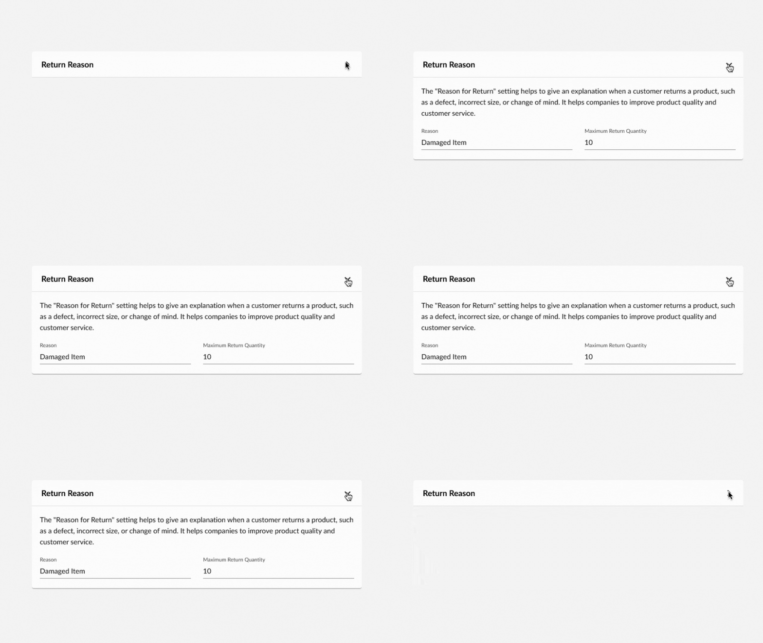
The Accordion component is a Mystique content component that can expand to show its child components. It is useful for hiding details with the ability to pull it up when needed.
| Plugin Name | Core |
|---|
Alias
fc.accordion
Detailed technical description
The Accordion Component is a wrapper component that contains the Summary and Details sections used to display:
- Plain text
- Template
- Set of components
1{
2    "component": "fc.accordion",
3    "props": {
4        "summary": "Accordion Summary",
5        "details": "Accordion Details"
6    }
7}1{
2 "component": "fc.accordion",
3 "props": {
4 "summary": "{{someTemplate}}",
5 "details": "{{someTemplate2}}"
6 }
7}1{
2 "component": "fc.accordion",
3 "props": {
4 "summary": [
5 {
6 "component": "fc.mystique.collapsible.text",
7 "props": {
8 "text": "Text example",
9 "charCutoff": 50
10 }
11 }
12 ],
13 "details": [
14 {
15 "component": "fc.mystique.collapsible.text",
16 "props": {
17 "text": "Text example",
18 "charCutoff": 50
19 }
20 },
21 {
22 "component": "fc.mystique.collapsible.text",
23 "props": {
24 "text": "Text example",
25 "charCutoff": 50
26 }
27 }
28 ]
29 }
30}Properties
| Name | Type | Required | Default | Description |
| expandIcon | `boolean` | No | true | Displays or hides the expand icon in the Summary section. |
| expanded | `boolean` | No | Forces opened or closed state of the Accordion component. | |
| defaultExpanded | `boolean` | No | false | Indicates a predefined state of the Accordion component, allowing change it. |
| disabled | `boolean` | No | false | Restricts interaction with the Accordion component. |
| summary | `string` / `MystiqueComponentInstance[]` | No | Text, template, or an array of custom components to be displayed in the Summary section. | |
| details | `string` / `MystiqueComponentInstance[]` / `{components: MystiqueComponentInstance[], direction: "row" / "column"}` | No | Text, template, or an array of custom components to be displayed in the Details section. | |
| indent | `boolean` | No | true | Padding switcher, which allows removal of the extra padding in the Details section when using nested components. |
Configuration example
1{
2    "component": "fc.accordion",
3    "props": {
4        "summary": "Accordion Summary",
5        "details": "Accordion Details"
6    }
7}Version History
See previous versions
2024-07-22
v24.7.22
The component extension with the`indent` property.Recommended Placement
None
