
Styled Text Component
UI Component
Changed on:
1 Sept 2026
Overview
The Styled Text is a Mystique content component that renders a single run of text using a chosen typographic variant, with optional color, background, and a leading icon.Its`text` is a template interpolated against the component's `data`, and it renders inline alongside other content.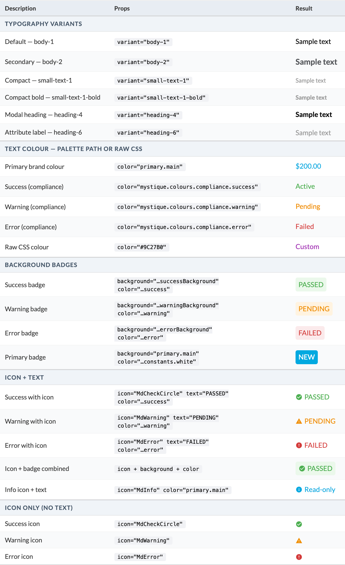
| Plugin Name | Core |
|---|
Alias
fc.styled.text
Detailed technical description
Rendering
The`text` is rendered: - as a string
- as a template against
`data`, which the framework supplies as the current data context (override it by passing the`data`prop) - an unresolved template variable renders as an empty string, and template errors are swallowed and also yield an empty string
Styling
- The
`variant`selects the typographic style and defaults to`body-1` `color`and`background`are each resolved first as a theme palette path; if the path does not resolve, the value is used as a raw CSS color
- When
`background`is set, the whole component renders with chip-like styling, which is how outcome badges such as PASSED or FAILED are styled; it wraps whatever the component shows, so it applies to text, an icon, or both `icon`renders an icon before the text:- It accepts any React Icons name from the Material Design (
`Md*`) or Font Awesome (`Fa*`) sets - for example`MdCheckCircle`or`FaBoxOpen`- and a snake_case name is mapped to its`Md*`equivalent (`check_circle`becomes`MdCheckCircle`) - An unknown name logs a warning and renders no icon
- It accepts any React Icons name from the Material Design (
Behavior
- When neither
`text`nor`icon`is set, the component renders an empty inline element (an empty styled box if`background`is set) - The text renders inline (inline-flex, vertically centered)
It is registered under
`category: content`Properties
| Name | Type | Required | Default | Description |
`text` | `string` | No | None | Template string rendered against `data` (for example `{{order.ref}}`) |
`variant` | `string` | No | `body-1` |
|
`color` | `string` | No | None |
|
`background` | `string` | No | None |
|
`icon` | `string` | No | None |
|
Configuration example
1{
2    "component": "fc.styled.text",
3    "props": {
4        "text": "PASSED",
5        "icon": "MdCheckCircle",
6        "variant": "small-text-1-bold",
7        "color": "mystique.colours.compliance.success",
8        "background": "mystique.colours.compliance.successBackground"
9    }
10}Version History
Recommended Placement
Use the Styled Text as an inline content element inside tables, cards, and lists to render a value or an outcome badge - for example, the PASSED and FAILED condition chips in the Strategy Evaluation section of the Sourcing tab.
