New Date-Time Field and Expanded Functionality in List and Card Components
Release
Author:
Yulia Andreyanova
Changed on:
26 Sept 2025
| Target release date: | 2025-10-06 |
|---|---|
| Release status: | Released |
Description
This release enhances the UX framework with a new reusable date-time input field and introduces additional layout and interaction options for list and card components. The updates improve control over UI behavior by enabling more precise configuration of component alignment, spacing, and user interactions.Changelog
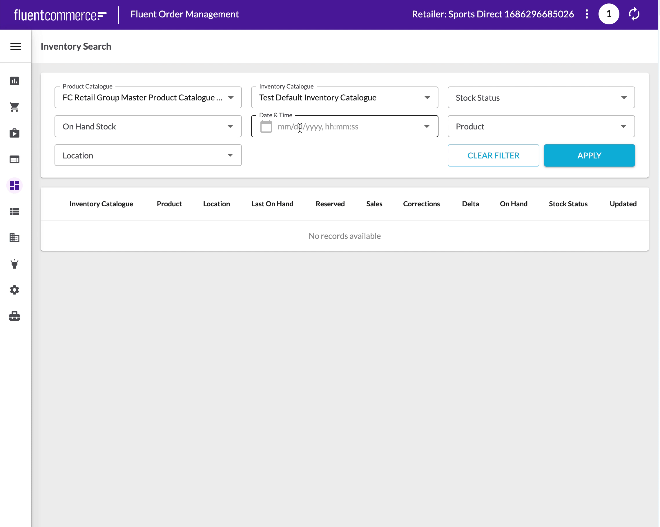
Introduced`fc.field.datetime`:- Reusable date-time picker component with calendar selection and manual input support
- Returns values in standardized ISO string format
`fc.list`:- Added
`cardActions`for custom top-level buttons to enable actions like triggering drawers - Added
`actions`for row-specific controls - Enabled global
`hideLabels`toggle in mobile view for compact attribute display
`fc.card.attribute`:- Added
`hideLabels`to suppress label display for cleaner layouts - Added
`link`to make attribute values clickable and navigable
Screenshot
| Released capability depth: | Enhancement, New capability |
|---|---|
| Release bundle / Capability type: | Platform |
