Date-Time Field Component
UI Component
Changed on:
1 Oct 2025
Overview
This reusable Date-Time Field Component offers an intuitive calendar-based UI for selecting a date. Below the calendar, clearly labeled input fields allow users to enter precise date and time values. Outputs are returned in ISO 8601 format to maintain consistency across systems.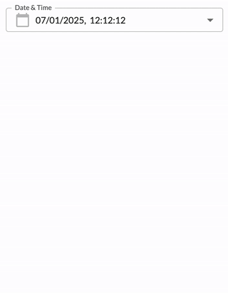
| Plugin Name | Core |
|---|
Alias
fc.field.datetime , datetime
Detailed technical description
Layout
The layout displays one calendar component and navigation icons.- The current month
- Date
- Time
Date Field
The date field format depends on the preferred browser language. The default format is``dd/mm/yyyy``, where:- dd – Day
- mm – Month
- yyyy - Year
Supported date formats
| Preferred browser language | Date format |
| English (United Kingdom)/English (Australia) | dd/mm/yyyy |
| English (United States) | mm/dd/yyyy |
| English/French (Canada) | yyyy/mm/dd |
| Other languages | dd/mm/yyyy |
- dd - Allowed values from 01 to 31 (Days from 1 to 9 are displayed prefixed with 0 (e.g. 01 / 07 / 2021 )
- mm - Allowed values from 01 to 12
- yyyy - Allowed values from 1970 up to the current year
``disableFuture``.Time Field
The time field has the following format``hh:mm:ss``, where:- hh – Hours
- mm – Minutes
- ss – Seconds
The following validations are applied:
- hh – Allowed values are from 00 to 23
- mm – Allowed values are from 00 to 59
- ss – Allowed values are from 00 to 59
Navigation Icons
The date and time field component contains``<`` and ``>`` icons to navigate to the previous/next month. ``<`` / ``>`` icons are disabled if January 1970 / next to the current month is displayed, respectively.Buttons Block
The buttons block contains the following buttons:- Clear button:
- Cancel button:
- Apply button:
Properties
| Name | Type | Required | Default | Description |
| value | `string | null` | No | None | Sets the initial value of the component. Must be an ISO 8601 formatted string (e.g., `'2024-04-18T13:50:49.030Z'`).Using the component in the workflow, the `defaultValue` property is used to set up the component's `value`. |
| label | `string` | No | None | Defines the input label. Supports internationalization via i18n keys. |
| disableFuture | `boolean` | Yes | `false` | If set to `true`, disables the ability to select future dates and times. If `false`, future selections are allowed. |
| helperText | `string` | No | None | Text displayed below the input to guide or inform the user. |
| minDate | `string` | No | None | Sets the minimum selectable date. The value must be a valid ISO string. |
| maxDate | `string` | No | None | Sets the maximum selectable date. The value must be a valid ISO string. |
1String name;
2String label;
3String type;
4String source;
5Object value;
6Object options;
7Object defaultValue;
8Boolean mandatory = false;1 {
2 "userActions": [
3 {
4 "context": [
5 {
6 "label": "Date",
7 "type": "SECONDARY",
8 "modules": [
9 "adminconsole"
10 ],
11 "confirm": true
12 }
13 ],
14 "attributes": [
15 {
16 "name": "datetime",
17 "label": "Date",
18 "type": "datetime",
19 "source": "",
20 "mandatory": false
21 }
22 ]
23 }
24 ]
25}Configuration example
1  {
2    "component": "fc.filterPanel",
3    "props": {
4        "overrides": {
5            "createdOn": {
6              	// filterPanel props
7                "component": "fc.field.datetime",
8              	"sortPrefix": 1,
9				// datetime props
10                "disableFuture": true,
11                "minDate":"2025-01-01",
12              	"label": "Created"
13            }
14        },
15    }
16}Version History
Recommended Placement
This component was designed to be used when the date and time filter is part of a form.