Tile Metric Component
UI Component
Changed on:
8 July 2024
Overview
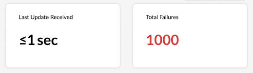
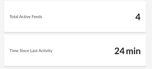
The Tile Metric component can be used to display a metrics data and the title of that metric within a single tile.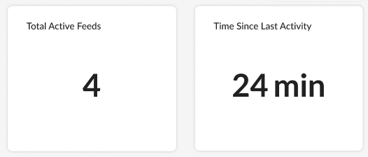
| Plugin Name | Inventory |
|---|
Alias
fc.tile.metric
Detailed technical description
Tile Metric component can be included in any mystique page.
Properties
Properties
| Name | Type | Required | Default | Description |
| label | `string` | yes | none | Main text label of the tile. |
| value | `string` | yes | none | Value that displays on the tile. |
| options | `DynamicValue[]` | no | none | Information about the type and optional link reference for this value. |
| variant | `'large'` / `'small'` | no | `'large'` | Changes value font size and position:`'large' - 54px, center` `'small' - 36px, left`In mobile view ‘large’ and ‘small’ variants are displayed identically. |
| width | CardWidth (`"quarter"` / `"third"` / `"half"` / `"two-thirds"` / `"full"`/ `number` (1-12)) | no | ‘full’ | Define the width of this card on a 12-column grid. Can use the named widths for readability or numbers directly. On mobile devices all widths will automatically change to 12 for the best responsive experience. Default is "full" and will take up the full width of the containing component. |
| link | `string` | no | none | Optional URL to navigate to when the card is clicked. Accepts a Template String (described in the UX Configuration Common Concepts). |
Configuration example
1{
2  "component": "fc.tile.metric",
3  "props": {
4    "label": "i18n:fc.inventory.sources.dashboard.overview.card.totalFailures",
5    "value": "{{compactDisplayNumberFormat (round totalFailures.data.result.0.value.[1])}}",
6    "variant": "small",
7    "width": "third",
8    "link": "#/events"
9    "options": {
10      "styles": [
11        {
12          "expression": "{{gt totalFailures.data.result.0.value.[1] 0}}",
13          "text": {
14            "color": "error"
15          }
16        }
17      ]
18    }
19  }
20},Version History
Recommended Placement
None