Sortable List
UI Component
Changed on:
1 Oct 2025
Overview
The Sortable List component provides an intuitive, drag-and-drop interface for reordering items where the sequence has functional or business significance. It enhances user experience by allowing direct manipulation of list order, eliminating the need for manual priority inputs or complex form controls.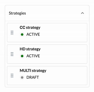
| Plugin Name | Core |
|---|
Alias
fc.field.sortablelist, sourcingstrategy, sourcingfallbackstrategy
Detailed technical description
This component is ideal for scenarios where dynamic reordering is required, such as configuring sourcing strategies or fallback options. For example, for Responsive Sourcing, it allows users to define the priority of strategies by simply rearranging items visually.
Properties
| Name | Type | Required | Default | Description |
| label | `string` | Yes | None | UI label displayed alongside the sortable list. |
| extensions | `Extensions` | Yes | None | Additional parameters for the advanced configuration options. |
| Name | Type | Required | Default | Description |
| allowDraggable | `boolean` | No | `true` | Enables or disables drag-and-drop functionality for list items. |
| defaultExpanded | `boolean` | No | `true` | Sets the initial expansion state of the accordion that wraps the list. |
| uniqueIdentifier | `string` | No | `id` | Defines the key used to identify and track items during reordering uniquely. |
| itemConfig | `MystiqueComponentInstance` | Yes | None | Configuration object for customizing the appearance of each list item. |
| Name | Type | Required | Default | Description |
| component | `string` | Yes | `fc.card.attribute` | Component alias for rendering list items. |
| props | `Record <string, any>` | No | None | Props are to be passed to the nested component to allow full customization. |
Configuration example
1{
2  "sourcingStrategy": {
3    "component": "fc.field.sortablelist",
4    "label": "Strategies",
5    "extensions": {
6      "allowDraggable": true,
7      "defaultExpanded": true,
8      "uniqueIdentifier": "ref",
9      "itemConfig": {
10        "component": "fc.card.attribute",
11        "props": {
12          "hideLabels": true,
13          "attributes": [
14            {
15              "value": "{{bold name}}"
16            },
17            {
18              "type": "component",
19              "options": {
20                "component": "fc.attribute.column",
21                "props": {
22                  "contentColumnSetting": "fc.sourcingprofile.details.strategy.status.column",
23                  "value": "{{status}}"
24                }
25              }
26            }
27          ]
28        }
29      }
30    }
31  }
32}Version History
Recommended Placement
Use this component inside a drawer form where the order of values is meaningful.