Extendable Header Component for Fluent Web Apps
Release
Author:
Matt Salmon
Changed on:
8 Aug 2024
| Target release date: | 2024-07-22 |
|---|---|
| Release status: | Development |
Description
You can now add custom components to the navigation bar on Fluent web apps. Use this to display more information to Store Associates or Customer Service Agents that enable them to better perform their duties. For example, provide links to 'Help & Support' documentation or add a reminder of which location they are using Fluent Store in on mobile views.Get started on adding 'Help & Support' information or your own custom components to your app today using the following How-to guide.Changelog
- Introduced a new
`header`field in the app-level manifest. - Components can be added to this field for both mobile and desktop views, allowing for multiple components with customizable alignment settings.
- Components appear in the header between the app name and context name (if configured).
- Both
`desktop`and`mobile`views accept a standard`MystiqueComponentInstance`array for a familiar configuration experience. - A
`position`property is available to determine the component’s alignment, with values of “left”, “right”, or “center” supported.
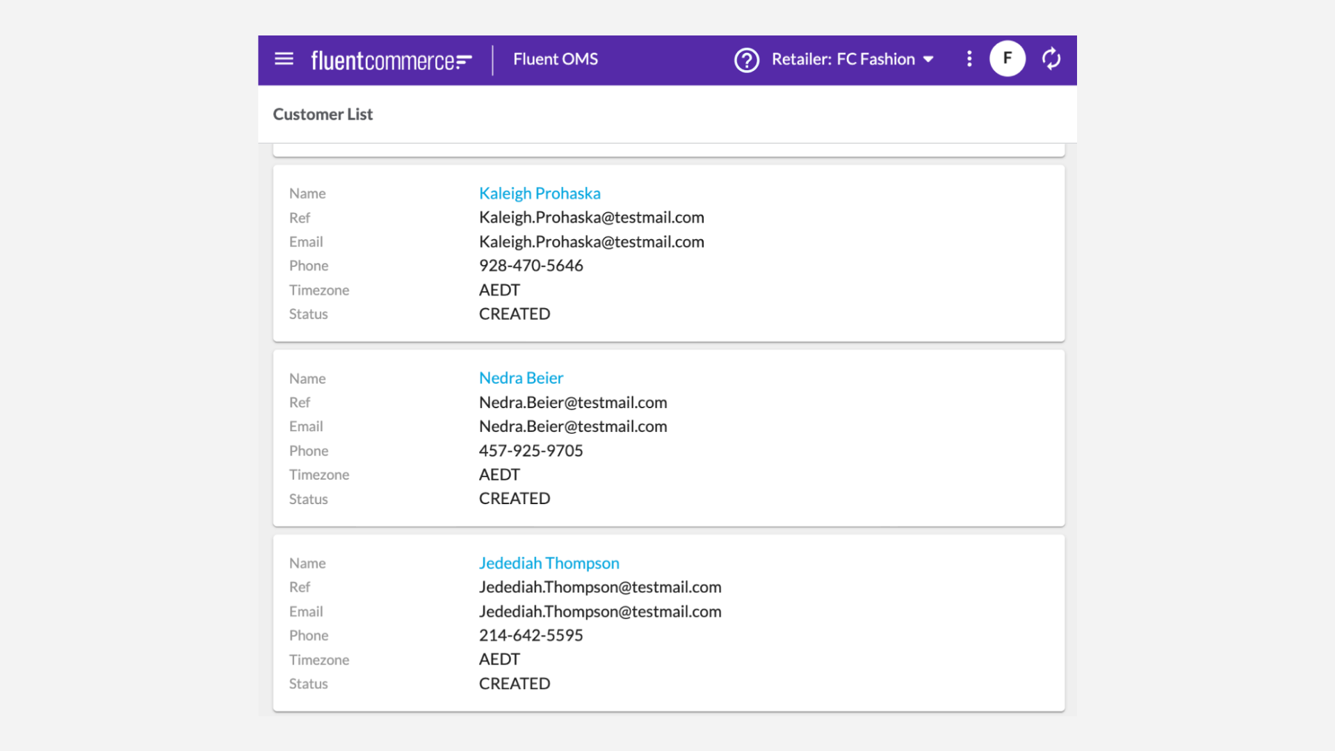
Screenshot

| Released capability depth: | New capability |
|---|---|
| Release bundle / Capability type: | Web apps |

