Line Chart Component
UI Component
Changed on:
19 Apr 2024
Overview
A line chart visually represents data points over a continuous interval, typically along a horizontal axis. It offers a clear depiction of trends, patterns, or fluctuations in the data by connecting points with lines, aiding in easy comprehension of the data's trajectory over time or across categories. The x-axis commonly denotes time or categories, while the y-axis represents the numerical values being measured, providing a quick snapshot of data relationships.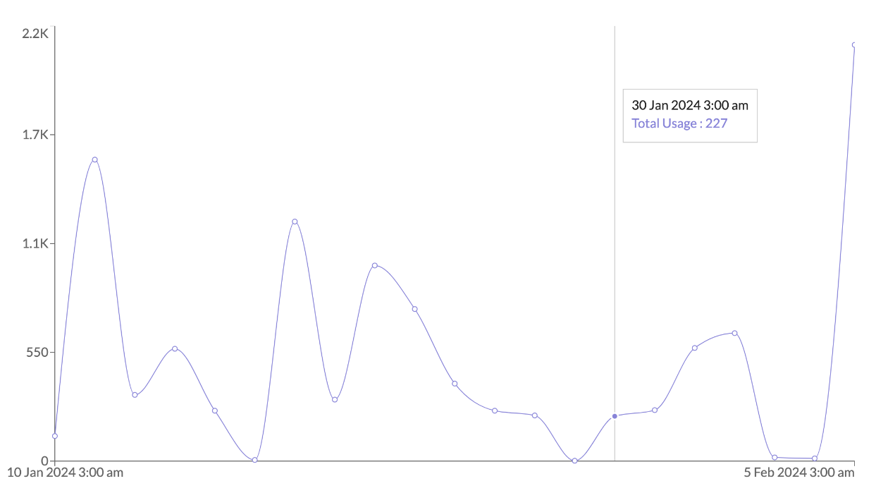
| Plugin Name | Charts |
|---|
Alias
fc.chart.line
Detailed technical description
1[
2    { date: '2024-01-02', value: 100 },
3    { date: '2024-01-03', value: 30 },
4    { date: '2024-01-04', value: 90 },
5    { date: '2024-01-05', value: 50 },
6]1{
2 "component": "fc.chart.line",
3 "props": {
4 "datasource": "path.to.GraphQL.data",
5 "chartContainerConfig": {
6 "height": 170,
7 "maxHeight": 170
8 },
9 "dataKey": "value",
10 "legend": true,
11 "tooltip": {
12 "formatter": "{{value}}"
13 },
14 "XAxis": {
15 "dataKey": "date",
16 "tick": false,
17 "label": "Date"
18 },
19 "YAxis": {
20 "label": "Value"
21 },
22 "lines": [{ "name": "Total Usage"}]
23 }
24}Properties
| Name | Type | Required | Default | Description |
| chartContainer | ChartContainerConfig | No | `{`width: '100%', aspect: 1, maxHeight: 200, debounce: 1 } | The property allows to make charts adapt to the size of parent container. One of the props width and height should be a percentage string. |
| dataSource | string | Yes | none | A string that defines a path to GraphQL data. |
| dataKey | string | Yes | none | The property signifies the specific field in every object of dataSource array that will be presented on the chart. |
| tooltip | Tooltip | No | none | Tooltip configuration visibility. |
| legend | boolean | No | none | Enables legend visibility. |
| XAxis | Axis | Yes | none | X-axis which is corresponding to the data. |
| YAxis | Axis | No | none | Y-axis which is corresponding to the data. |
| title | string | No | none | Chart card title. |
| width | CardWidth ("quarter" / "third" / "half" / "two-thirds" / "full"/ number (1-12)) | No | ‘full’ | Define the width of the card on a 12-column grid. Can use the named widths for readability or numbers directly. On mobile devices all widths will automatically change to 12 for the best responsive experience. Default is "full" and will take up the full width of the containing component. |
| noCard | boolean | No | none | If set to true, allows to use component without card background. |
| lines | LineConfig [] | No | none | An array of lines' configurations. |
| Name | Type | Required | Default | Description |
| width | string / number | No | 100% | The percentage value of the chart's width or a fixed width. |
| aspect | number | No | 1 | width / height. If specified, the height will be calculated by width / aspect. |
| maxHeight | number | No | 200 | The maximum height of the container. |
| height | string / number | No | none | The percentage value of the chart's width or a fixed height.Example:"100px" / 100 |
| minWidth | number / string | No | none | The minimum width of the container.Example:"100px" / 100 |
| minHeight | number / string | No | none | The minimum height of the container.Example:"100px" / 100 |
| Name | Type | Required | Default | Description |
| dataKey | string | No | none | The key of data displayed in the axis. |
| tick | boolean | No | true | If set false, no ticks will be drawn. |
| ticks | [string] / [number] | No | none | Set the values of axis ticks manually. |
| interval | 'preserveStart' | 'preserveEnd' | 'preserveStartEnd' | 'equidistantPreserveStart' | number | No | 'preserveEnd' | If set 0, all the ticks will be shown. If set ‘preserveStart’, ‘preserveEnd’ or "'preserveStartEnd', the ticks which is to be shown or hidden will be calculated automatically. |
| tickLine | boolean | No | true | If set false, no axis tick lines will be drawn. |
| axisline | boolean | No | true | If set false, no axis line will be drawn. |
| label | string | No | none | The property refers to the label of the axis. |
| tickFormatter | string | No | none | Template string to customize data displayed on a tick. |
| Name | Type | Required | Default | Description |
| tooltipFormatter | string | No | none | Initial value to be displayed. Example: `'{{value}}'` |
| tooltipLabelFormatter | string | No | none | Initial label to be displayed. Example: `'{{label}}'` |
| Name | Type | Required | Default | Description |
| name | string | No | none | Line name to be displayed in the tooltip or legend. |
Configuration example
1{
2  "component": "fc.chart.line",
3  "props": {
4    "datasource": "path.to.GraphQL.data",
5    "chartContainerConfig": {
6      "height": 170,
7      "maxHeight": 170
8    },
9    "dataKey": "value",
10    "legend": true,
11    "tooltip": {
12      "formatter": "{{value}}"
13    },
14    "XAxis": {
15      "dataKey": "value",
16      "tick": false,
17      "label": "i18n:fc.inventory.sources.dashboard.line.chart.time"
18    },
19    "YAxis": {
20      "label": "i18n:fc.inventory.sources.dashboard.line.chart.updates",
21      "tickFormatter": "{{compactNumberFormat value}}"
22    }
23  }
24}Version History
Recommended Placement
None