Image Card Component
UI Component
Changed on:
27 Sept 2024
Overview
The Image Card Component enables you to display an image alongside other components within a card.For example, you can place download buttons below an image to prompt the reader to interact with the buttons.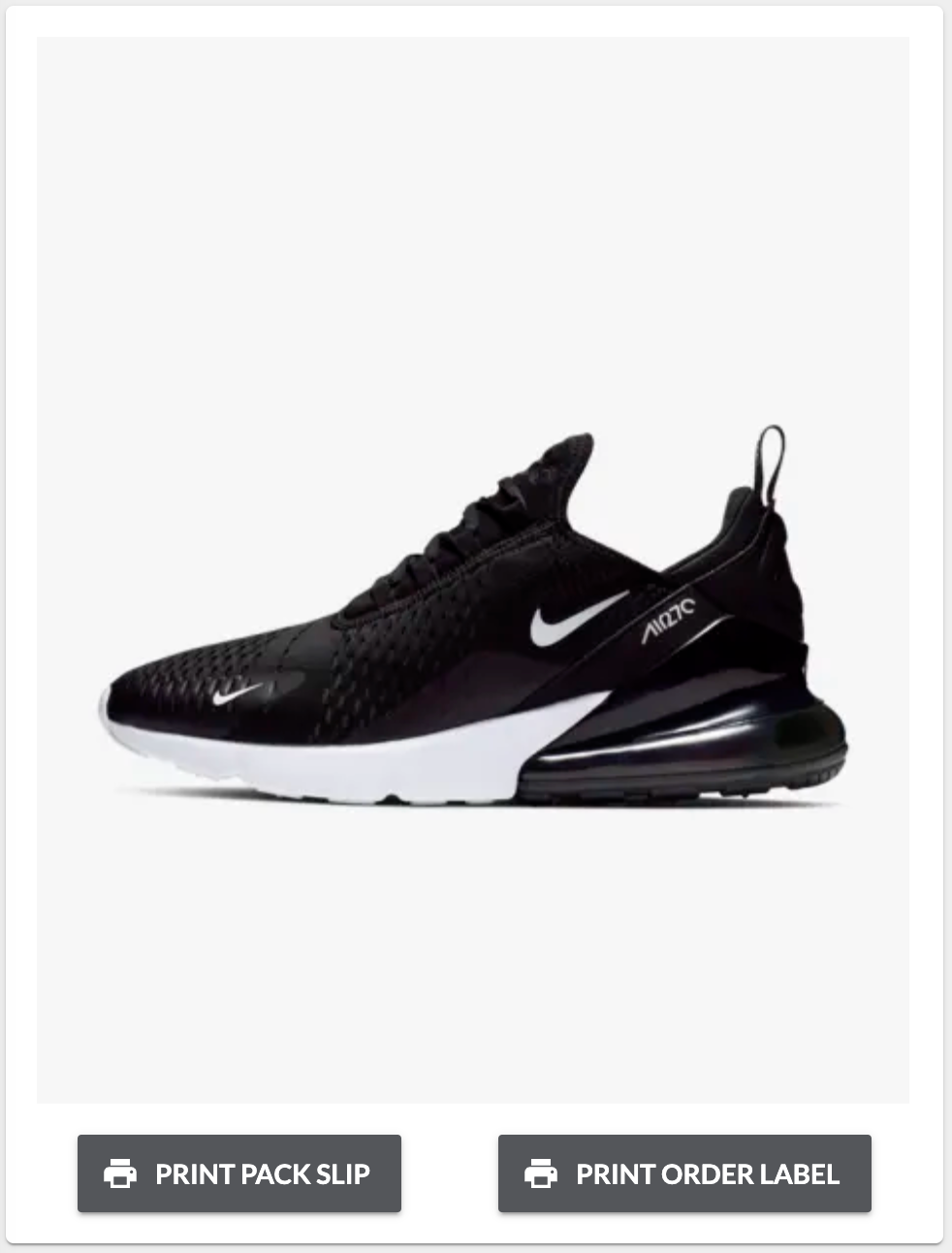
| Plugin Name | Core |
|---|
Alias
fc.card.image
Detailed technical description
The component presents as a card, with an image as the foreground object. You can then add in other components and determine their size and position within the card.Example: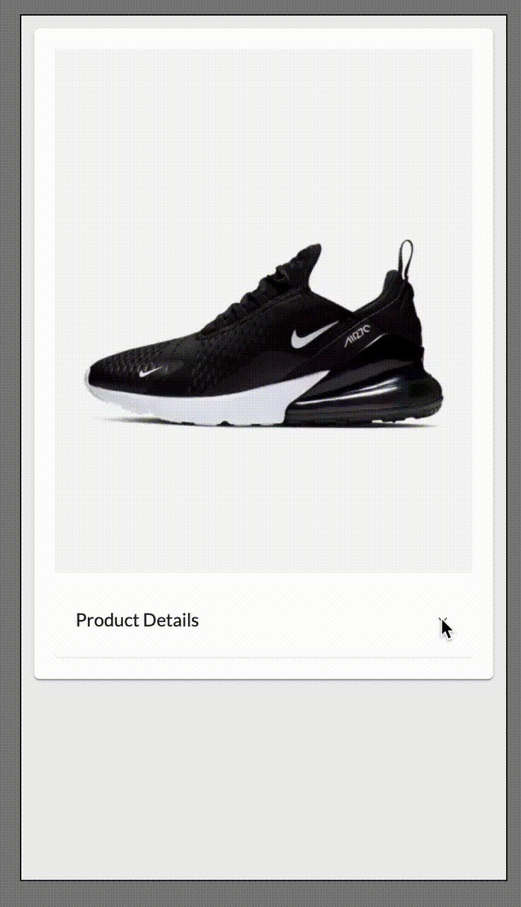 Example:
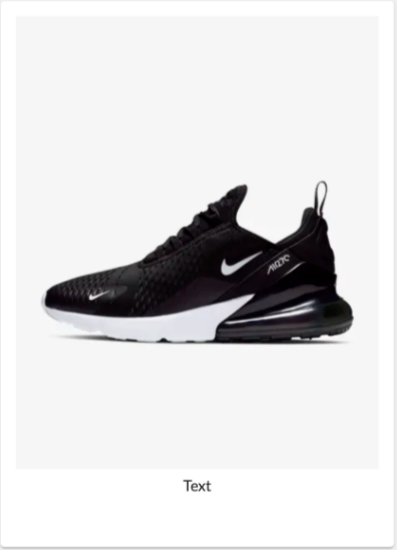 Visualization:
Configuration Options
1{
2  "component": "fc.card.image",
3  "props": {
4    "width": 3,
5    "indent": true,
6    "image": {
7      "imageUrl": "https://c.static-nike.com/a/images/f_auto,b_rgb:f5f5f5,w_440/skwgyqrbfzhu6uyeh0gg/air-max-270-shoe-nnTrqDGR.jpg"
8    }
9  },
10  "descendants": [
11    {
12      "component": "fc.accordion",
13      "props": {
14        "summary": "Product Details",
15        "details": "A blend of cutting-edge comfort and street-smart style, designed for those who demand peak performance and unmatched durability. Elevate your everyday look while enjoying cloud-like cushioning and unbeatable traction with every step."
16      }
17    }
18  ]
19}1{
2 "component": "fc.card.image",
3 "props": {
4 "width": 3,
5 "indent": true,
6 "image": {
7 "imageUrl": "https://c.static-nike.com/a/images/f_auto,b_rgb:f5f5f5,w_440/skwgyqrbfzhu6uyeh0gg/air-max-270-shoe-nnTrqDGR.jpg"
8 }
9 },
10 "descendants": [
11 {
12 "component": "fc.mystique.collapsible.text",
13 "props": {
14 "charCutoff": 1000,
15 "text": "Text"
16 }
17 }
18 ]
19}1{
2 "manifestVersion": "2.0",
3 "routes": [
4 {
5 "type": "page",
6 "path": "collections/carrier/:id",
7 "component": "fc.page",
8 "props": {
9 "title": "i18n:fc.om.article.detail.title"
10 },
11 "descendants": [
12 {
13 "component": "fc.card.image",
14 "props": {
15 "width": 3,
16 "indent": true,
17 "image": {
18 "imageUrl": "https://c.static-nike.com/a/images/f_auto,b_rgb:f5f5f5,w_440/skwgyqrbfzhu6uyeh0gg/air-max-270-shoe-nnTrqDGR.jpg",
19 "height": "300px"
20 }
21 },
22 "descendants": [
23 {
24 "component": "fc.button.print",
25 "props": {
26 "label": "PRINT PACK SLIP"
27 }
28 },
29 {
30 "component": "fc.button.print",
31 "props": {
32 "label": "PRINT ORDER LABEL"
33 }
34 }
35 ]
36 }
37 ]
38 }
39 ]
40}Properties
| Name | Type | Required | Default | Description |
| image | `CardImageProps` | yes | none | An object containing image URL and dimensions (width and height) |
| width | `CardWidth ("quarter"/ "third"/ "half"/ "two-thirds"/ "full"/ number (1-12))` | no | 12 | Define the width of this card on a 12-column grid. Can use the named widths for readability or numbers directly.On mobile devices, all widths will automatically change to 12 for the best responsive experience. |
| indent | `boolean` | no | - | Indent between image and descendants. |
| descendantSpacing | `'center' | 'start' | 'end' | 'space-between' | 'space-around'` | no | `'space-around'` | The property defines the spacing between descendants. It can be parsed from the template string. Examples:  |
| descendantDirection | `'row' | 'column'` | no | `'row'` | The property defines the descendant direction. It can be parsed from the template string. Examples: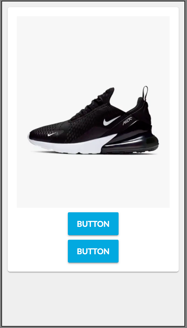 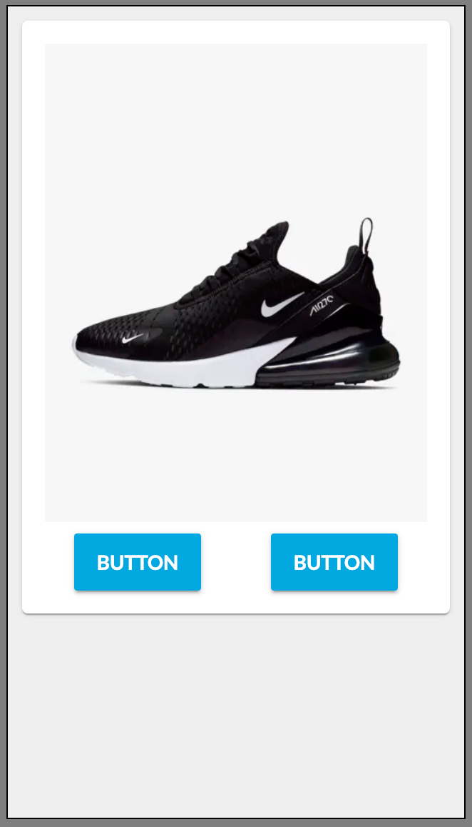 |
CardImageProperties
| Name | Type | Required | Default | Description |
| height | `string` | no | - | Image height.Examples: `'100px', 'auto'` |
| width | `string` | no | - | Image width.Examples: `'100px', '20%', 'auto'` |
| imageUrl | `string` | no | - | Image URL. Template string can be used to define the URL. |
Configuration example
1{
2  "component": "fc.card.image",
3  "props": {
4    "width": 3,
5    "indent": true,
6    "image": {
7      "imageUrl": "https://c.static-nike.com/a/images/f_auto,b_rgb:f5f5f5,w_440/skwgyqrbfzhu6uyeh0gg/air-max-270-shoe-nnTrqDGR.jpg",
8      "height": "300px"
9    }
10  },
11  "descendants": [
12    {
13      "component": "fc.button.print",
14      "props": {
15        "label": "PRINT PACK SLIP",
16        "setting": "example.wave.pick.print",
17        "position": {}
18      }
19    },
20    {
21      "component": "fc.button.print",
22      "props": {
23        "label": "PRINT ORDER LABEL",
24        "setting": "example.wave.pick.print"
25      }
26    }
27  ]
28}Version History
See previous versions
2024-10-08
2024.10.8
The component extension with the`descendantDirection`.Recommended Placement
The component can be placed in pages, drawers, lists.