Grid Component
UI Component
Changed on:
4 July 2024
Overview
A base grid component that lays data out in a four-column format. The primary use case of this component is to display product attributes, as the data must be keys and their corresponding values.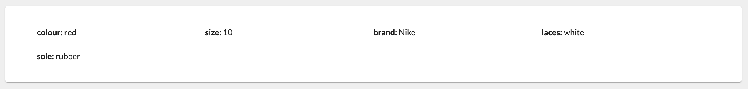
| Plugin Name | Core |
|---|
Alias
fc.card.attributes.grid
Detailed technical description
Sample templateSample attribute
1 {
2    "component": "fc.card.attributes.grid",
3    "dataSource": "product.attributes",
4    "props": {
5        "exclude": ["imageUrl", "imageUrlRef"]
6
7    }
8 }1"attributes": [
2 {
3 "name": "color",
4 "value": "red"
5 }
6]Properties
| Prop | Description |
| Data | An array of attributes (key values of strings) |
| Exclude | An array of the attribute names to hide |
Configuration example
1 {
2    "component": "fc.card.attributes.grid",
3    "dataSource": "product.attributes",
4    "props": {
5        "exclude": ["imageUrl", "imageUrlRef"]
6  }
7
8  "attributes": [
9    {
10        "name": "color",
11        "value": "red"
12    }
13]Version History
Recommended Placement
None