Gauge Chart Component
UI Component
Changed on:
8 Feb 2024
Overview
This component is a chart that indicates progress and consists of an arc with two sectors (active and inactive) and two texts - primary (big bold one) and secondary (normal size and font weight).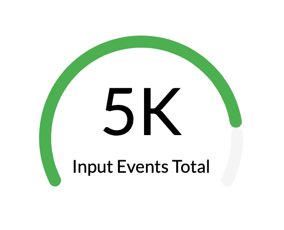
| Plugin Name | Charts |
|---|
Alias
fc.chart.gauge
Detailed technical description
The Gauge chart component can be included in any mystique page. The component takes as a value
`const number` or `template {{ path.to.chart.value }}`.1{
2 "component": "fc.chart.gauge",
3 "props": {
4 "value": "40",
5 "primaryText": "40",
6 "secondaryText": "Secondary text",
7 "colorConfig": {
8 "active": [
9 [0, "#ff6d00"],
10 [50, "#4CAF50"]
11 ]
12 }
13 }
14}Properties
Properties
| Name | Type | Required | Default | Description |
| value | `number` | no | none | Number in the range [0, 100] - percent that will be used to indicate the active part of the chart arc. |
| template | `string` | no | none | A Handlebars template to calculate chart value based on the datasource field. |
| primaryText | `string` | no | none | Big bold text in the center of the chart. |
| secondaryText | `string` | no | none | Small text to be displayed under the primary text. |
| colorConfig | `ColorConfig` | no | none | Color configuration object - allows the change of default colors of the chart. |
| arc | `Arc` | no | {startAngle: 210, endAngle: -30, cx: "50%", cy: 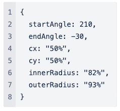 | The property allows the display of data percentage line. |
| chartContainerConfig | `ChartContainerConfig` | no | 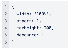 | The property allows to make charts adapt to the size of the parent container. One of the props width and height should be a percentage string. |
| title | `string` | no | none | Chart card title. |
| width | CardWidth (`"quarter"` / `"third"` / `"half"` / `"two-thirds"` / `"full"`/ `number` (1-12)) | no | `"full"` | Define the width of the card on a 12-column grid. Can use the named widths for readability or numbers directly. On mobile devices, all widths will automatically change to 12 for the best responsive experience. The default is "full" and will take up the full width of the containing component. |
| noCard | `boolean` | no | none | If set to `true`, it allows to use component without a card background. |
Arc
| Name | Type | Required | Default | Description |
| startAngle | `number` | no | 210 | The start angle of 1st sector. |
| endAngle | `number` | no | -30 | The end angle of the last sector. |
| innerRadius | `number | string` | no | “82%” | The inner radius of all sectors. |
| outerRadius | `number | string` | no | “93%” | The outer radius of all the sectors. |
| cx | `number | string` | no | “50%” | The x coordinate of the center. |
| cy | `number | string` | no | “50%” | The y coordinate of center. |
| Name | Type | Required | Default | Description |
| active | `string` / `[[number, string]]` | no | none | Color for the active sector. Set in HEX-format.Example for string:`"active": "#CCCCCC"`Example for ColorMap (`[[number, string]]`):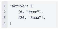 |
| inactive | `string / [[number, string]]` | no | none | Color for the inactive sector. Set in HEX-format.Example for string:`"inactive": "#CCCCCC"`Example for ColorMap (`[[number, string]]`):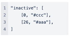 |
| primaryText | `string` | no | none | Color for primary text. Set in HEX-format.Example:`"#CCCCCC"` |
| secondaryText | `string` | no | none | Color for secondary text. Set in HEX-format.Example:`"#CCCCCC"` |
| Name | Type | Required | Default | Description |
| width | `string/number` | no | `"100%" / 100` | The percentage value of the chart's width or a fixed width. |
| aspect | `number` | no | `1` | Width/height. If specified, the height will be calculated by width/aspect. |
| maxHeight | `number` | no | `200` | The maximum height of the container. |
| height | `string/number` | no | none | The percentage value of the chart's width or a fixed height.Example:`"100px" / 100` |
| minWidth | `string/number` | no | none | The minimum width of the container.Example:`"100px" / 100` |
| minHeight | `string/number` | no | none | The minimum height of the container.Example:`"100px" / 100` |
Configuration example
1{
2    "component": "fc.chart.gauge",
3    "props": {
4        "value": "{{node.edges.0.percent}}",
5        "primaryText": "5k",
6        "secondaryText": "Input Events Total",
7        "colorConfig": {
8          "active": [
9            [0, "#ff6d00"],
10            [50, "#4CAF50"]
11          ]
12        }
13    }
14}Version History
Recommended Placement
None