Circular Progress Component
UI Component
Changed on:
30 Sept 2024
Overview
The Circular Progress Component visually indicates the ongoing progress of a loading process.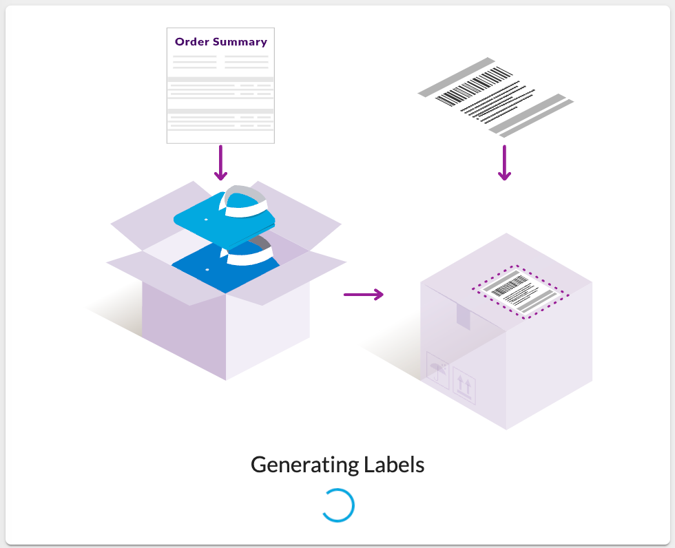
| Plugin Name | Core |
|---|
Alias
fc.progress.circular
Detailed technical description
The component is used to indicate the ongoing progress of a loading process. The
`fc.progress.circular` component itself doesn't have the logic to determine when the loading process is complete. In the manifest, there’s a condition component (`fc.conditional`) that controls `fc.progress.circular` visibility based on specified conditions. Properties
| Name | Type | Required | Default | Description |
| size | `number` | No | none | Sets the size of the circle. If a number is used, it assumes pixels. |
| color | `‘primary’| ‘secondary’` | No | `‘primary’` | Defines the color of the component, aligning with the project theme colors. |
| value | `number` | No | none | Represents the progress value for the determinate variant, ranging from 0 to 100. |
| variant | `'determinate' | 'indeterminate' | 'static'` | No | `'indeterminate'` | Specifies the variant to use. Select `'indeterminate'` when there is no specific progress value available. |
Configuration example
1{
2  "component": "fc.progress.circular",
3  "props": {
4    "size": 25,
5    "color": "secondary",
6    "variant": "determinate",
7    "value": 55
8  }
9}Version History
Recommended Placement
This component can be placed within any other component that supports child elements.