Bar Chart Component
UI Component
Changed on:
19 Apr 2024
Overview
A chart that represents categorical data with rectangular bars with heights or lengths proportional to the values that they represent.
| Plugin Name | Charts |
|---|
Alias
fc.chart.bar
Detailed technical description
The Bar chart component can be included on any mystique page.
1[
2    {  date:'2024-01-02', param1: 30, param2: 50, param3: 5 },
3    {  date:'2024-01-03', param1: 60, param2: 30, param3: 10  },
4    {  date:'2024-01-04', param1: 10, param2: 90, param3: 100  },
5    {  date:'2024-01-05', param1: 57, param2: 50, param3: 40  },
6]1{
2 "component": "fc.chart.bar",
3 "props": {
4 "datasource": "path.to.GraphQL.data",
5 "YAxis": {
6 "label": "Value"
7 },
8 "XAxis": {
9 "dataKey": "date",
10 "label": "Date"
11 },
12 "bars": [
13 { "dataKey": "param1", "stackId": "a", "fill": "#8B45E4", "name": "customName1" },
14 { "dataKey": "param2", "stackId": "a", "fill": "#4568E4", "name": "customName2" },
15 { "dataKey": "param3", "stackId": "a", "fill": "#45B4E4", "name": "customName3" }
16 ],
17 "chartContainerConfig": {
18 "height": 500
19 },
20 "legend": true,
21 "tooltip": true
22 }
23}Properties
| Name | Type | Required | Default | Description |
| XAxis | ` Axis` | yes | none | X-axis, which corresponds to the data. The property is used for the tiny axis configuration. |
| YAxis | ` Axis` | no | none | Y-axis, which corresponds to the data. The property is used for the tiny axis configuration. |
| bar | `Bar[]` | yes | none | The key of data that is displayed in the chart. |
| tooltip | `boolean` | no | none | Display detailed information when hovering the bars. |
| legend | `boolean` | no | none | The content of the legend is generated by the name of Bar. Alternatively, if no name has been set, the dataKey will be used to generate legend content. |
| chartContainerConfig | `ResponsiveContainerConfig` | no | 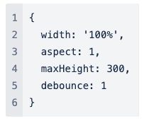 | The property allows to make charts to adapt to the size of the parent container. One of the props width and height should be a percentage string. |
| title | `string` | no | none | Chart card title. |
| width | CardWidth (`"quarter"` / `"third"` / `"half"` / `"two-thirds"` / `"full"`/ `number` (1-12)) | no | `"full"` | Define the width of the card on a 12-column grid. Can use the named widths for readability or numbers directly. On mobile devices, all widths will automatically change to 12 for the best responsive experience. The default is "full" and will take up the full width of the containing component. |
| noCard | `boolean` | no | none | If set to `true`, it allows using component without a card background. |
Axis
| Name | Type | Required | Default | Description |
| dataKey | `string` | no | none | The key of data that is displayed in the axis. |
| tick | `boolean` | no | `true` | If set to `false`, no ticks will be drawn. |
| tickLine | `boolean` | no | `true` | If set to `false`, no axis tick lines will be drawn. |
| axisline | `boolean` | no | `true` | If set to `false`, no axis line will be drawn. |
| label | `string` | no | none | The property refers to the label of the axis. |
| offset | `number` | no | for y-axis: `-20` | The offset to the specified "position". |
| angle | `number` | no | for y-axis: `-90` | The angle of axis labels. |
| position | `"top" | "left" | "right" | "bottom" | "inside" | "outside" | "insideLeft" | "insideRight" | "insideTop" | "insideBottom" | "insideTopLeft" | "insideBottomLeft" | "insideTopRight" | "insideBottomRight" | "insideStart" | "insideEnd" | "end" | "center"` | no | The key of a group of data which should be unique in a bar chart.or x-axis: `"insideBottom"`for y-axis: `"insideLeft"` | The position of the label relative to the view box. |
| tickFormatter | `string` | no | none | Template string to customize data displayed on a tick. |
Bar
| Name | Type | Required | Default | Description |
| dataKey | `string` | yes | none | The key of a group of data which should be unique in a bar. |
| stackId | `string` | no | none | The stack id of bar, when two bars have the same value axis and same stackId, then the two bars are stacked in order. |
| fill | `string` | no | none | Bar color in the HEX-format:`"fill": "#8B45E4"` |
| name | `string` | no | none | Bar name to be displayed in the tooltip or legend. |
| Name | Type | Required | Default | Description |
| width | `string/number` | no | `100%` | The percentage value of the chart's width or a fixed width.Example:`"100px" / 100` |
| aspect | `number` | no | `1` | Width/height. If specified, the height will be calculated by width/aspect. |
| maxHeight | `number` | no | `300` | The maximum height of the container. |
| height | `string/number` | no | none | The percentage value of the chart's width or a fixed height. Example:`"100px" / 100` |
| minWidth | `string/number` | no | none | The minimum width of the container.Example:`"100px" / 100` |
| minHeight | `string/number` | no | none | The minimum height of the container.Example:`"100px" / 100` |
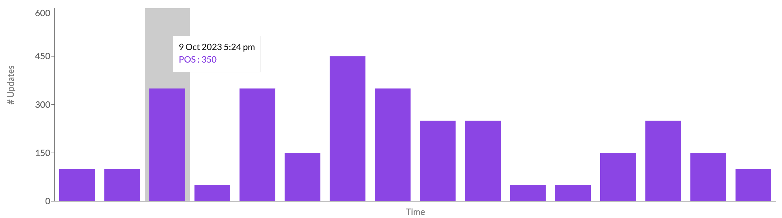
Configuration example
1{
2  "component": "fc.chart.bar",
3  "props": {
4    "datasource": "path.to.GraphQL.data",
5    "YAxis": {
6      "label": "i18n:fc.inventory.sources.dashboard.bar.chart.updates",
7      "tickFormatter": "{{compactNumberFormat value}}"
8    },
9    "XAxis": {
10      "dataKey": "name",
11      "label": "i18n:fc.inventory.sources.dashboard.bar.chart.time",
12      "tick": false
13    },
14    "bars": [
15      { "dataKey": "ERP", "stackId": "a", "fill": "#8B45E4" },
16      { "dataKey": "RFID", "stackId": "a", "fill": "#4568E4" },
17      { "dataKey": "FluentOMS", "stackId": "a", "fill": "#45B4E4" }
18    ],
19    "chartContainerConfig": {
20      "height": 500
21    },
22    "legend": true,
23    "tooltip": true
24  }
25}Version History
See previous versions
2024-04-29
v24.4.29
The component is extended by adding a property`name` to be displayed in the tooltip and the legend.Recommended Placement
None