Add Item Dialogue Component
UI Component
Changed on:
23 July 2024
Overview
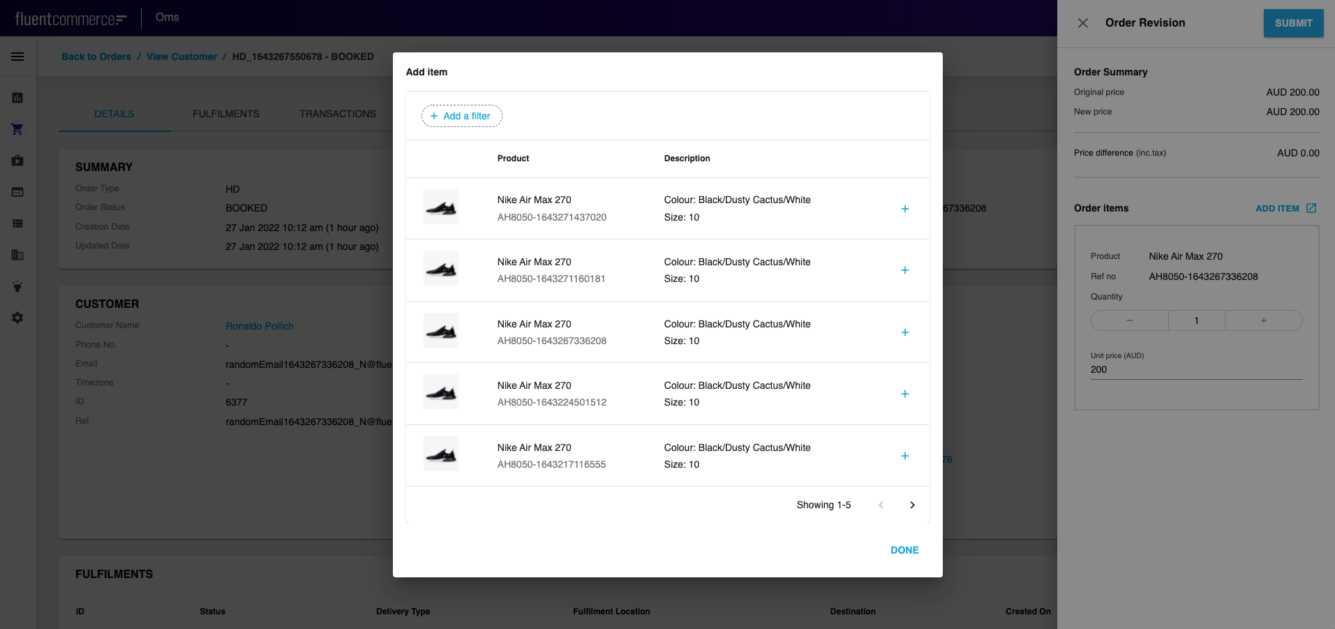
- This article describes how to add Add item button (
`OpenDataModalButton`) to the drawer and display the list of product items in a modal window ('Add Item' dialogue).
| Plugin Name | Core |
|---|
Alias
fc.modal.button
Detailed technical description
Add Item Button Configuration
- To add
`OpenDataModalButton`to a form, call it from Mystique core and add the configuration (query, modal window title and content, button label, label color and icon (before/after button label)). See the Sample Configuration below. - Thus, the drawer will contain a button, clicking on which the ‘Add Item’ dialogue appears. The dialogue contains the
`fc.list`component displaying product items.
1import { FC, useEffect } from 'react';
2import { IconButton, Typography } from '@material-ui/core';
3import { IoMdOpen } from 'react-icons/io';
4import { GoPlus } from 'react-icons/go';
5import _ from 'lodash';
6import { ComponentRegistry } from 'mystique/registry/ComponentRegistry';
7import { useI18n } from 'mystique/hooks/useI18n';
8import { useSettings } from 'mystique/hooks/useSettings';
9import { useData } from 'mystique/hooks/useData';
10
11interface AddItemButtonProps {
12    onAddItem: (item: any) => void;
13}
14export const AddItemButton: FC<AddItemButtonProps> = ({ onAddItem }) => {
15    const item = useData().context.data.node;
16    return (
17        <IconButton color="primary" onClick={() => onAddItem(item)}>
18            <GoPlus />
19        </IconButton>
20    );
21};
22const query = `query products {
23    variantProducts (first: 5) {
24        edges {
25            node {
26                id
27                catalogue {
28                    ref
29                }
30                ref
31                name
32                attributes {
33                    name
34                    value
35                }
36                categories {
37                    edges {
38                        node {
39                            name
40                        }
41                    }
42                }
43                prices {
44                    type
45                    currency
46                    value
47                }
48            }
49        }
50    }
51}`;
52const defaultComponent = {
53    component: 'fc.list',
54    dataSource: 'variantProducts',
55    props: {
56        defaultPageSize: 5,
57        rowsPerPageOptions: [5],
58        attributes: [
59            {
60                type: 'image',
61                value: '{{node.attributes.byName.imageUrl}}',
62                options: {
63                    width: 50,
64                    height: 50,
65                },
66            },
67            {
68                label: 'Product',
69                type: 'component',
70                options: {
71                    component: 'fc.attribute.column',
72                    props: {
73                        value: [
74                            {
75                                name: 'name',
76                            },
77                            {
78                                name: 'ref',
79                                style: { color: 'grey' },
80                            },
81                        ],
82                    },
83                    dataSource: 'node',
84                },
85            },
86        ],
87        filter: {
88            enabled: true,
89            exclude: [
90                'type',
91                'summary',
92                'createdOn',
93                'updatedOn',
94                'status',
95                'gtin',
96            ],
97        },
98    },
99};
100const SEARCH_PRODUCT_LIST = 'fc.mystique.search.product.list';
101
102interface ProductSearchModalProps {
103    onAddItem: (item: any) => void;
104}- The drawer will contain a button, clicking on which ‘Add Item’ dialogue appears. The dialogue contains
`fc.list`component displaying product items.
Properties
| Name | Type | Description |
| label | `String` | The label is shown on the add item dialogue |
| endIcon | `IoMdOpen` | Icon to open each row of the list |
| color | `String` | Color of the icon |
| query | `String` | query with which the list is shown |
| title | `String` | To translate the label into the desired language |
Configuration example
1const ProductSearchModal: FC<ProductSearchModalProps> = ({ onAddItem }) => {
2    const ProductSearchButton = ComponentRegistry.get('fc.modal.button');
3    const { translate } = useI18n();
4    const setting = useSettings({ list: SEARCH_PRODUCT_LIST });
5    const descendants =
6        setting.list.result?.value || _.cloneDeep(defaultComponent);
7
8    useEffect(() => {
9        descendants.props.attributes.push({
10            type: 'component',
11            align: 'right',
12            options: {
13                component: 'fc.modal.button.addItem',
14                props: {
15                    onAddItem: (data: any) => {
16                        onAddItem(data);
17                    },
18                },
19            },
20        });
21    }, [descendants]);
22
23    return (
24        <ProductSearchButton
25            data={{
26                descendants: [descendants],
27                label: (
28                    <Typography variant="h5">
29                        {translate('fc.order.orderRevision.add.item')}
30                    </Typography>
31                ),
32                endIcon: <IoMdOpen />,
33                color: 'primary',
34                query: query,
35                title: translate('fc.order.orderRevision.add.item'),
36            }}
37        />
38    );
39};
40
41export default ProductSearchModal;Version History
Recommended Placement
N/A